But here’s the thing… before I make this decision,
I REALLY love hearing which bag YOU would choose to be on the cover if you were ME. Do you think it might be because pattern designing is such a solitary business and I like need the interaction… who knows? At any rate, I get a kick out of learning which would be your choice and hearing the reasoning behind your choice.
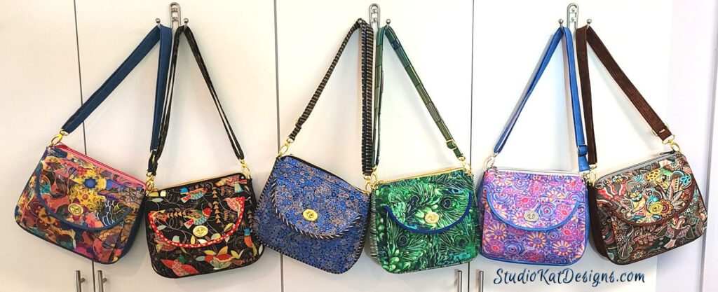
So with that, here’s the choices to consider for the Katalina pattern.

7/4/22: Church Windows
7/9/22: Australia Bound
7/19/22: Serious Whimsey
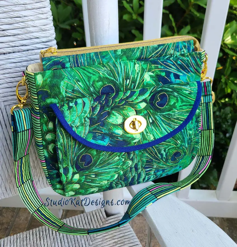
7/24/22: Knock Me Over with a Feather

8/1/22: Gustav Revisited

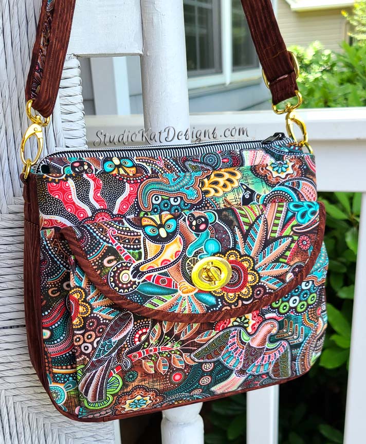
8/5/22: Folklorico
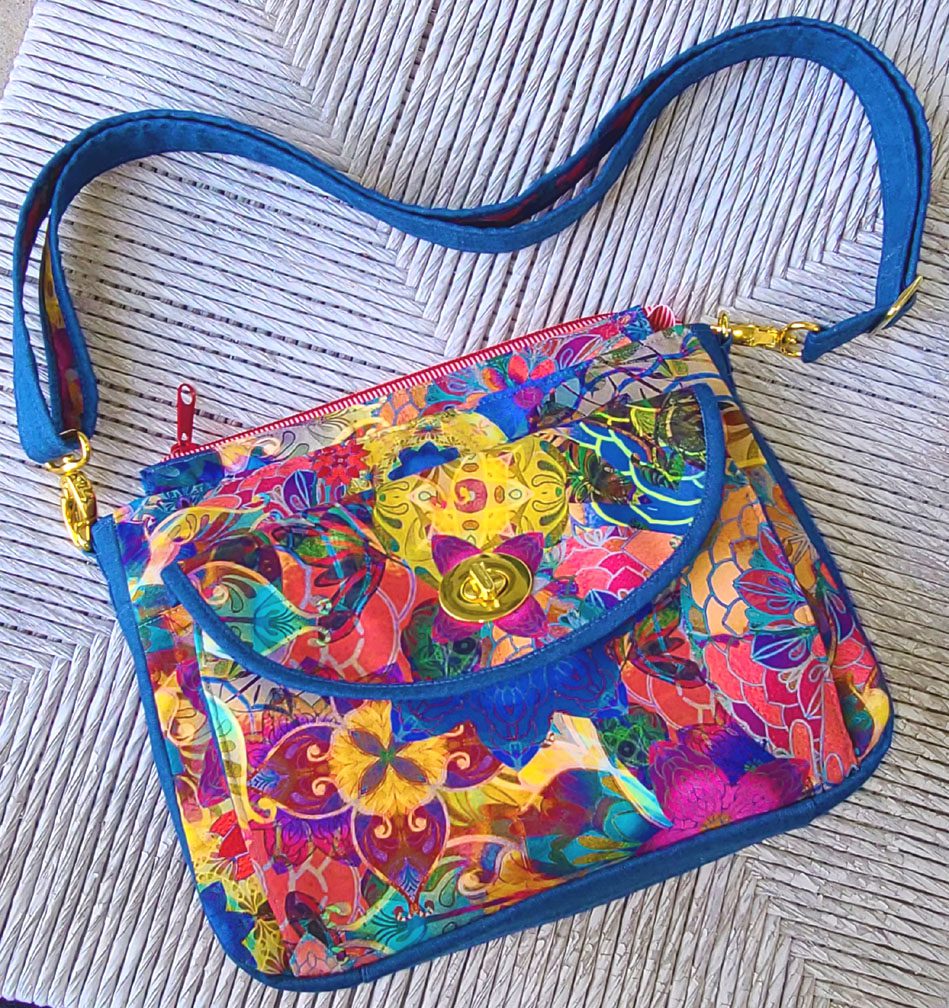
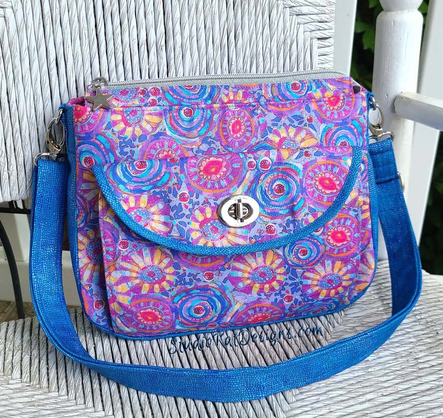
8/9/22: Take Me Back to Venice
So… having seen your options, here’s the criteria
you should consider as you make YOUR choice!
1. Consider MORE than just your personal favorite. Of course the sample you choose should be appealing to YOU, but always consider how much “universal appeal” a bag has. Would MOST people find it appealing?
2. Will it turn heads? Ideally, a cover sample should “stand out in a crowd”! By definition it’s a show bag. It’s not meant to be neutral, fade into the background or look good with virtually ANY outfit we might wear!
3. Do the fabrics used draw attention to the design’s key features? Some prints are so “busy” that the bag features seem to disappear because all you can see is the PRINT! I strive for interesting fabric, that’s for sure, but I also want the design elements to shine thru unimpeded regardless of the fabric I’ve chosen.
4. Does the sample include ALL the design features promised in the verbiage on the cover? Because here’s the thing… the model that is chosen for the cover is the model that will MOST be associated with this design… it’ll be the “spokesmodel” so to speak. But if it’s missing an expected exterior pocket for example, then every single person who pick up that pattern at stores or shows will want to know why it doesn’t, or worse still, they’ll think they’ve actually been misled about what features are included in the pattern!.
5. Is it photogenic? Sometimes, for reasons that I’ll never understand, (probably because of MY photography skills, or more accurately the lack thereof), certain samples just don’t photograph well. No matter the lighting…. no matter the background….no matter… what… I…. DO! But here’s the deal, no matter how pretty and ideal it is in person, if it doesn’t photograph well, or if I cannot seem to get a decent photograph of it, then it’s just NOT a good candidate for our cover! It can still be a fantastic “show bag”, but not the best “cover model”.
6. Does it actually LOOK like “our brand”? Our goal is for our customers to be able to identify a pattern as belonging to our line without even seeing the title or our logo on the front cover of the pattern. We would be doing ourselves no favors for example, if we suddenly departed from a “formula” that’s worked for us for 19+ years and placed a model on the cover that just doesn’t look like something we would put forward!
7. Is it created with a special pieced exterior? As most of you know, I LOVE piecing my way to a unique exterior, but I’ve learned from bitter experience and quite a few scoldings from irritated customers (reference the Lollapalooza) that placing a model with such an exterior on our pattern cover is generally just NOT a good idea. BUT– if there are actual pattern pieces for this special exterior, and those pieces can be included in the pattern package itself (reference the Uptown Saddlebag or the HipBag Hybrid, then it CAN in fact be placed on the front cover.
So…there you have it! Are you ready to have a little FUN?
Because now it’s time for YOU to put on YOUR “designer hat”! … after reconsidering all six of these samples with the above criteria in mind, I’d love to know which one YOU would choose to grace the cover of our new Katalina pattern.
But don’t forget—I would also enjoy hearing the reasoning behind your choice. 🙂 And do stay tuned for the next post in this edition of Purse Pattern Chronicles to see how closely your choice mirrored ours when I reveal which model really will be on the cover of the new pattern. I’m SO looking forward to seeing your comments! You probably don’t know this, but this is one of my very favorite posts of the whole year!
And guess what? We have a private FaceBook Group page just for StudioKat Designs customers? It’s the perfect place for you to post pictures, comments or questions about our patterns! How cool is that, right? And don’t forget to check out the best sewing pins with me on Pinterest, get your daily sewing fix and behind the scenes scoops on Instagram, and be the 1st to know about new patterns, discount codes and sample sales by signing up for “Kat Bytes”, our monthly newsletter.
17 Comments
Join Our Mailing List!
Click button below to get 15% off your 1st pattern!


My preference is Church Windows because it most clearly showcases the compartments of this lovely purse..
My 2nd choice would be Gustav Revisited, for the same reason. Love it’s diagonal binding.
The others have beautiful fabric, are very busy & are more of a challenge to see the defining features of the bag.
Serious Whimsey seems to stand out as far as seeing the purse and not just the fabric.
)over them all.
My first choice is Gustov Revisited. Live the color and striped trim. Very elegant bag!
It’s between Knock me Over and Gustav Revisited. They both show off the front pocket flap with the binding and showcase your gold hardware. Knock me over shows off the gold zipper. However, the one I would by is the Australian one. I love that fabric.
Church Windows or Serious Whimsey, I think. They’re not quite as busy as some of the others, and I think the bindings of both accentuate the design.
I love the “red” zipper and bright colors of “Take me Back to Venice” with the flower centered under the clasp. In giving that opinion, I find the “Church Window” very appealing! The “Australia Bound” and “Folklorico” have the fun fabric focus!! I’m no help! Oh the choices!
I like Church Windows because it seems to highlight the different levels of the bag the best. Of all the choices, this one seems to be the most photogenic! However, in later bags you changed the sides to be all one fabric instead of two. So, if that change would keep you from choosing Church Windows, then I’d have to go with Gustov Revisited.
Personally, I love Folklorico. I am always a sucker for creative pattern mixing! This bag is definitely an eye-catcher.
„Take Me Back to Venice“ is definitely my favorite! I do love almost all of the samples but this one really popped out to me. The blue edge is just beautiful. What more can I say, I love bright crazy colors and when I make this bag it will most likely be in bright crazy colors. You are truly amazing Kat!
Knock Me Over With a Feather by far catches the eye over the others. It makes the gold adornments look rich in a way not seen on the others. That trim…yummy, and the fabric that is not peacock goes perfectly showing the great shoulder band.
Take Me Back to Venice pops nicely….
Serious Whimsey is my least favorite. Looks like all one bag, vs the wonderful sections.
Just the opinion of a lay person who was gifted a bag from your patterns… love it.
Gustav Revisited then Church windows.
I think Church Windows shows off the bag features the best. I like them all, of course, but that particular one has fantastic definition!
My choice is Australia Bound……just a tad bias being an Australian born & bred….also loving the aboriginal prints being created and what better way of showcasing them but on a cover of a new bag pattern…..can’t wait to buy the pattern.
Aug 15. – Take me back to Venice is my favorite. Eye catching, fun. It all not fade into the background of a show.
Gustav and Knock me – both have such pizazz. Of course anything Kauffman or Hoffman resonates with me. I gotta have sparkles.
My pick would be folklorico with the carefully cut Bird above the turn lock for the wallet—clearly highlights the pocket. I personally will make my (planned) Katalina in a more subtle print, but for the Show Bag, this is the one I “see” first and all the features of the pattern are clearly discernible.
Church Windows It has a sharp , clean look to it; and clearly shows the design of the bag. Love the fabric!