But here’s the thing… before I make this decision,
I REALLY love hearing which bag YOU would choose to be on the cover if you were ME. Do you think it might be because pattern designing is such a solitary business and I like need the interaction… who knows? At any rate, I get a kick out of learning which would be YOUR choice and hearing the reasoning behind your choice.
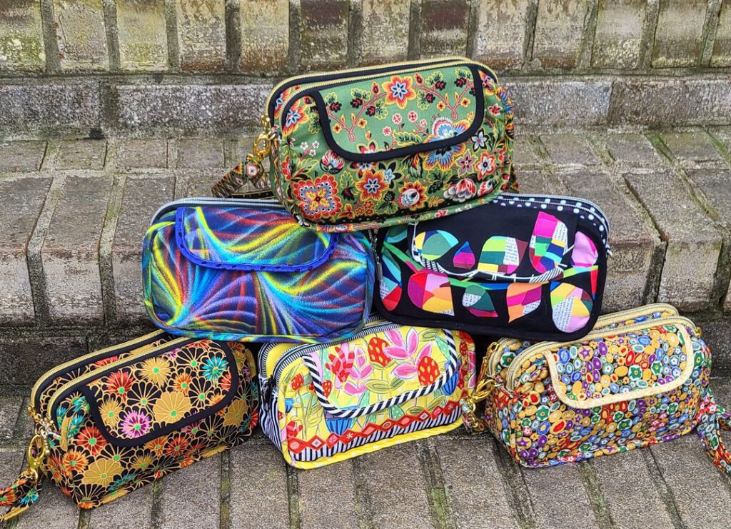
So with that, here’s the choices to consider for the Double Take pattern.
Wave at me: 12/7/22

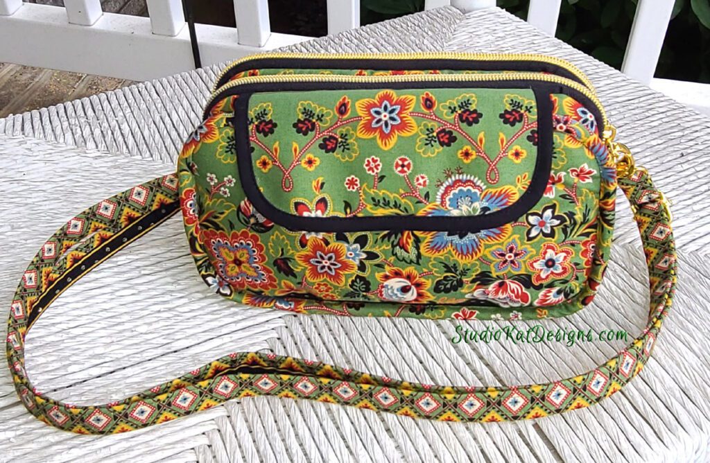
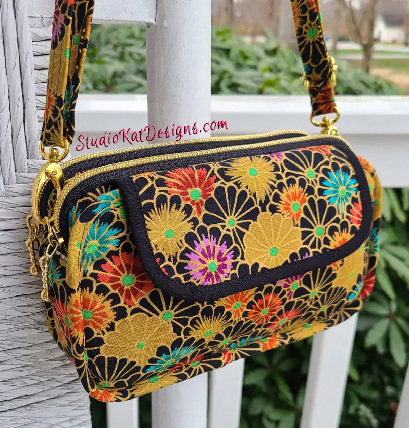
Gustav in Gold: 12/12/22
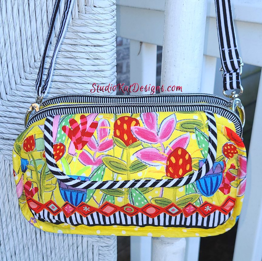
Don’t Worry, Be Happy: 12/28/22

Color Talk: 1/13/23
A French Connection: 2/8/23
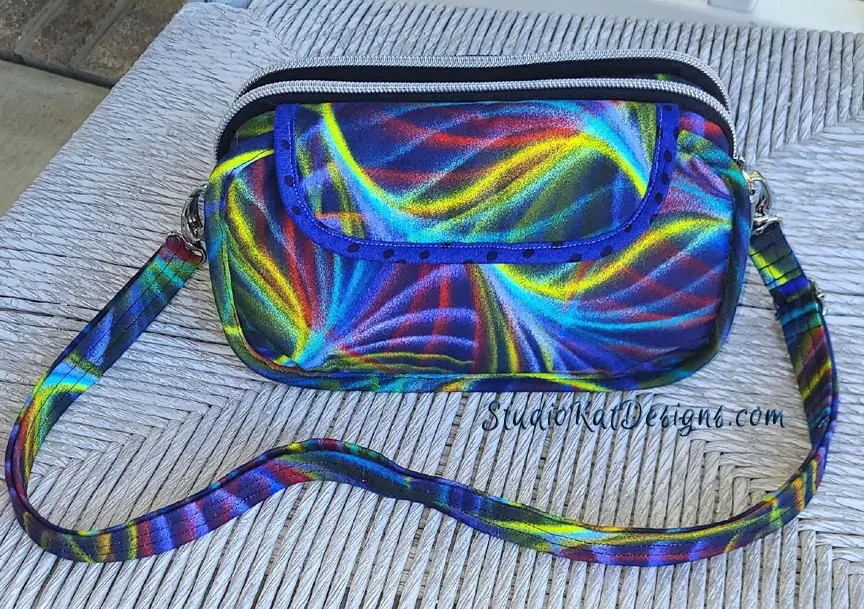
I’m On the Kaffe Train: 2/20/23
So… having seen your options, here’s the criteria
you should consider as you make YOUR choice!
1. Consider MORE than just your personal favorite. Of course the sample you choose should be appealing to YOU, but always consider how much “universal appeal” a bag has. Would MOST people find it appealing?
2. Will it turn heads? Ideally, a cover sample should “stand out in a crowd”! By definition it’s a show bag. It’s not meant to be neutral, fade into the background or look good with virtually ANY outfit we might wear!
3. Do the fabrics used draw attention to the design’s key features? Some prints are so “busy” that the bag features seem to disappear because all you can see is the PRINT! I strive for interesting fabric, that’s for sure, but I also want the design elements to shine thru unimpeded regardless of the fabric I’ve chosen.
4. Does the sample include ALL the design features promised in the verbiage on the cover? Because here’s the thing… the model that is chosen for the cover is the model that will MOST be associated with this design… it’ll be the “spokesmodel” so to speak. But if it’s missing an expected exterior pocket for example, then every single person who pick up that pattern at stores or shows will want to know why it doesn’t, or worse still, they’ll think they’ve actually been misled about what features are included in the pattern!.
5. Is it photogenic? Sometimes, for reasons that I’ll never understand, (probably because of MY photography skills, or more accurately the lack thereof), certain samples just don’t photograph well. No matter the lighting…. no matter the background….no matter… what… I…. DO! But here’s the deal, no matter how pretty and ideal it is in person, if it doesn’t photograph well, or if I cannot seem to get a decent photograph of it, then it’s just NOT a good candidate for our cover! It can still be a fantastic “show bag”, but not the best “cover model”.
6. Does it actually LOOK like “our brand”? Our goal is for our customers to be able to identify a pattern as belonging to our line without even seeing the title or our logo on the front cover of the pattern. We would be doing ourselves no favors for example, if we suddenly departed from a “formula” that’s worked for us for 19+ years and placed a model on the cover that just doesn’t look like something we would put forward!
7. Is it created with a special pieced exterior? As most of you know, I LOVE piecing my way to a unique exterior, but I’ve learned from bitter experience and quite a few scoldings from irritated customers (reference the Lollapalooza) that placing a model with such an exterior on our pattern cover is generally just NOT a good idea. BUT– if there are actual pattern pieces for this special exterior, and those pieces can be included in the pattern package itself (reference the Uptown Saddlebag or the HipBag Hybrid, then it CAN in fact be placed on the front cover.
So…there you have it! Are you ready to have a little FUN?
Because now it’s time for YOU to put on YOUR “designer hat”! … after reconsidering all six of these samples with the above criteria in mind, I’d love to know which one YOU would choose to grace the cover of our new Double Take pattern.
But don’t forget—I would also enjoy hearing the reasoning behind your choice. 🙂 And do stay tuned for the next post in this edition of Purse Pattern Chronicles to see how closely your choice mirrored ours when I reveal which model really will be on the cover of the new pattern. I’m SO looking forward to seeing your comments! You probably don’t know this, but this is one of my very favorite posts of the whole year!
And guess what? We have a private FaceBook Group page just for StudioKat Designs customers? It’s the perfect place for you to post pictures, comments or questions about our patterns! How cool is that, right? And don’t forget to check out the best sewing pins with me on Pinterest, get your daily sewing fix and behind the scenes scoops on Instagram, and be the 1st to know about new patterns, discount codes and sample sales by signing up for “Bag Making is Fun”, our bi-monthly newsletter.
18 Comments
Join Our Mailing List!
Click button below to get 15% off your 1st pattern!


In my humble opinion, the Kaffe Train most closely meets your requirements. However, when I saw Color Talk, I fell in love !
Color Talk draws me to the pattern. I have some fabric and now I will wait for the pattern to come out. My fabric is not like color talk but I do like the sample.
I love the “I’m on the Kaffe Train”
It caught my attention right away.
I like the Don’t Worry, Be Happy. It defines the outer flap because of the secondary print and also you can see clearly the double zippers at the top. Also the choice of fabrics highlights the bag’s features.
Don’t Worry, Be Happy. You can more clearly visualize the features of the bag and it shows how you can use a border fabric to create interest.
I vote for Color Talk. As a cover model it is striking and eye catching. The polka dot zippers accent the double features of the bag. I also like the light contrast of the lining. I always use light fabric linings so I can find things! This also shows the unique features of the bag.
The others are pretty but this is the best.
I would have to say that Kaffe Train best meets your criteria–although, because of my penchant for brighter colors, it was very difficult for me not to select Color Talk or Don’t Worry, Be Happy. As usual, all look great!
To my eye, “I’m On the Kaffe Train” is the version that photographs the best. It has the best color pop and shows the design details at a glance.
Color Talk really shows off the design to its advantage. Kaffe Train shows off the material and the design is lost. Sorry Kaffe fans. My opinion anyway.
Why not a grouping? Pick the best 3 and use them. They all show different aspect of the bag. I luv the blue one.
Believe it or not. That’s actually what I’m considering this time
🙂
I believe Color Talk is the most appealing. The bright colors on black catches the eye. And the polka dots at the top are just plain fun!
It’s a pity the pics are not all taken at the same angle, because the best angle to show the features is Kaffe Train, but personally I prefer the French Connection,
It’s a hard choice, but Wave at me, and Gustav in gold are the beauties said I would choose. They take my breath away!
Color Talk is the bag I would pick out to purchase, but I think that after reading your caveats that Don Worry, Be Happy seems most like “you”. I believe it is the B&W contrasts.
Wave at me is the one. Love it
Don’t Worry Be Happy appeals to me in a sweet cutesy way. It says Spring is here. On the other hand Wave at Me really catches my eye and shows off the lines of the bag.
I prefer Wave at Me. The bag features seem to get lost in some of the other busy fabrics. I’m surprised there isn’t one with a contrasting flap if showing the features is important.