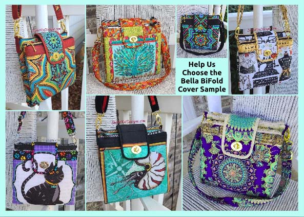
So…
with yet another pattern almost in the books, it’s time to choose the ONE bag sample that will truly represent our new design for the pattern cover! In order to do this, I like thinking about which of our samples would most appeal to our customers… which one would gather the most attention at shows… and especially, and perhaps more importantly, which sample would be the one most likely to compel a customer to pick up that pattern and give it a long… second… look!
But here’s the thing… before I make this decision,
I REALLY love hearing which bag YOU would choose to be on the cover if you were ME. Maybe its because pattern designing is such a solitary business and I like the interactions… who knows? At any rate, I get a kick out of learning which would be your choice and hearing your reasoning.
So with that, here’s the choices to consider for the Bella BiFold pattern.


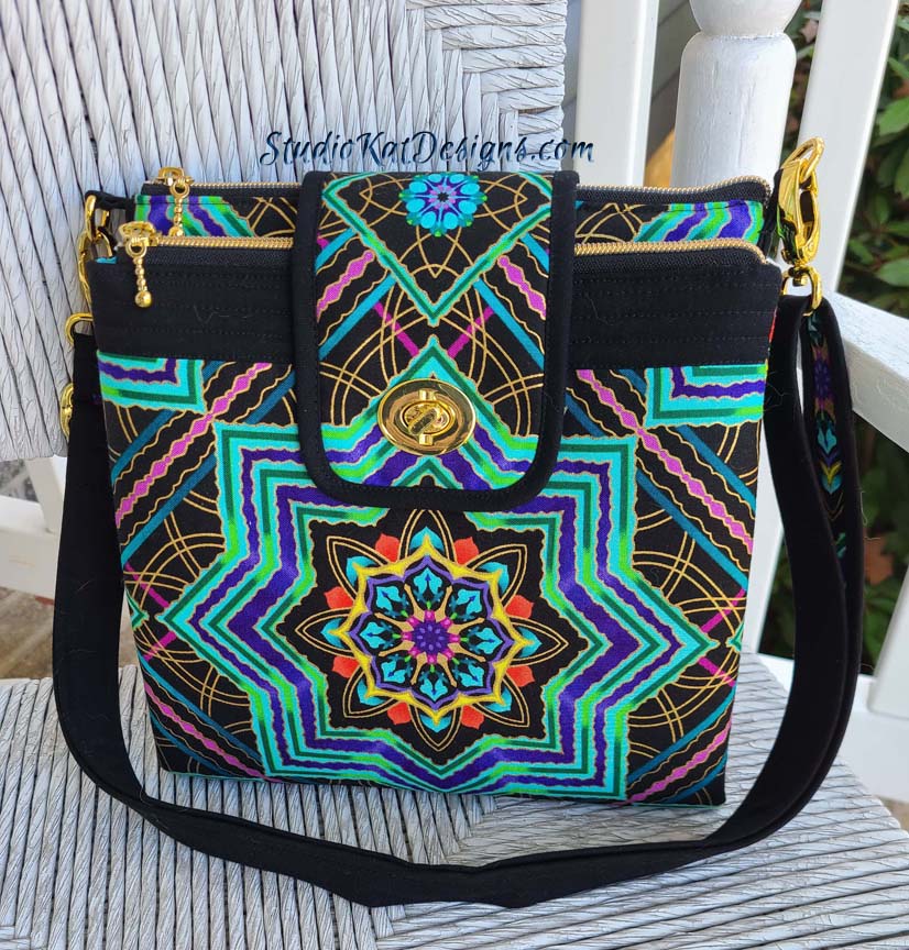
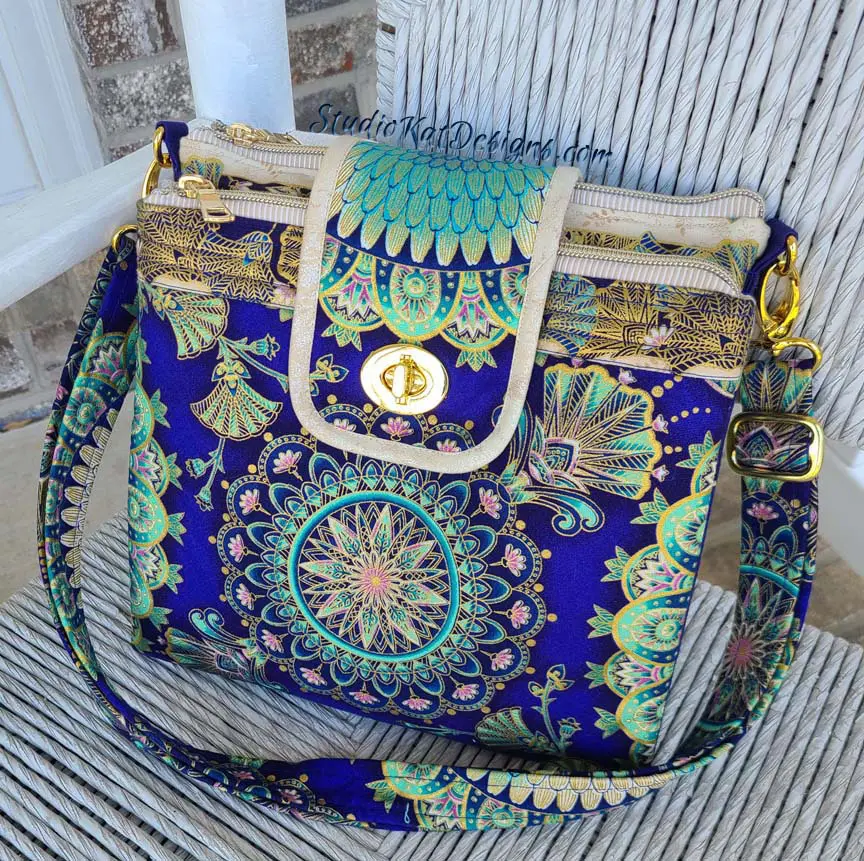
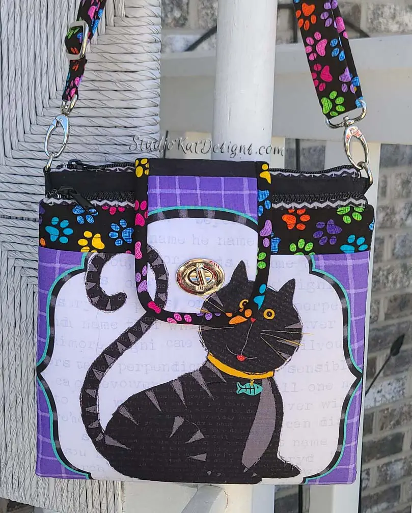

So… having seen your options, here’s the criteria to consider as you make YOUR choice!
1. Consider MORE than just your personal favorite. Of course the sample you choose should be appealing to you, but always consider how much “universal appeal” a bag has. Would it appeal to MOST people?
2. Will it turn heads? Ideally, a cover sample should “stand out in a crowd”! By definition it’s a show bag. It’s not meant to be neutral, fade into the background or look good with our entire wardrobe although it might!
3. Do the fabrics used draw attention to the design’s key features? Some prints are so “busy” that the bag features seem to disappear because all you can see is the PRINT! I want interesting fabric, that’s for sure, but I want the design to shine unimpeded THRU the print.
4. Does the sample include ALL the design features promised in the verbiage on the cover. Because here’s the thing… the model that is chosen for the cover is the model that will MOST be associated with this design… it’ll be the “spokesmodel” so to speak. But if it’s missing a promised exterior pocket for example, then every single person who picks up that bag at the shows we travel to, will want to know why it doesn’t, or worse still, they’ll think that the design DOESN’T include an exterior pocket at all.
5. Is it photogenic? Sometimes, for reasons that I’ll never understand, (probably because of MY photography skills), certain samples just don’t photograph well. No matter the lighting…. no matter the background….no matter… what… I…. DO! But here’s the deal, no matter how pretty and ideal it is in person, if it doesn’t photograph well, or if I cannot seem to get a decent photograph of it, then it’s just NOT a good candidate for our cover model! It can still be a fantastic “show bag”, but not the best “cover model”.
6. Does it actually LOOK like “our brand”? Our goal is for our customers to be able to identify a pattern as belonging to our line without even seeing the title or our logo on the front cover of the pattern. We would be doing ourselves no favors for example, if we suddenly departed from a “formula” that’s worked for us for 18+ years and placed a model on the cover that just doesn’t look like something we would put forward!
7. Is it created with a special pieced exterior? As most of you know, I LOVE piecing my way to a unique exterior, but I’ve learned from bitter experience and quite a few customer scoldings (reference the Lollapalooza) that placing a model with such an exterior on our pattern cover is generally just NOT a good idea. BUT– if there are actual pattern pieces for this special exterior, and those pieces can be included in the pattern package itself (reference the Uptown Saddlebag or the Triple Play, then it CAN in fact be placed on the front cover.
So…there you have it! Are you ready to have a little FUN?
Because now it’s time for YOU to put on YOUR “designer hat”! … after reconsidering all six of these samples with the above criteria in mind, I’d love to know which one YOU would choose to grace the cover of our new pattern.
But don’t forget—I would also enjoy hearing the reasoning behind your choice. 🙂 And do stay tuned for the next post in this edition of Purse Pattern Chronicles to see how closely your choice mirrored ours when I reveal which model really will be on the cover of the new pattern. I’m SO looking forward to seeing your comments! You probably don’t know this, but this is one of my very favorite posts of the whole year!
And guess what? We have a private FaceBook Group page just for StudioKat Designs customers? It’s the perfect place for you to post pictures, comments or questions about our patterns! How cool is that, right? And don’t forget to check out the best sewing pins with me on Pinterest, get your daily sewing fix and behind the scenes scoops on Instagram, and be the 1st to know about new patterns, discount codes and sample sales by signing up for “Kat Bytes”, our monthly newsletter.


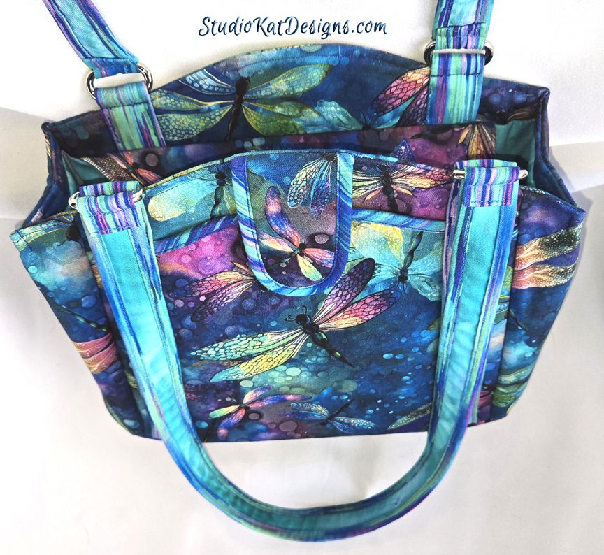

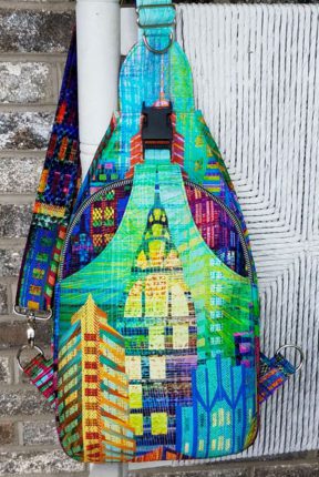
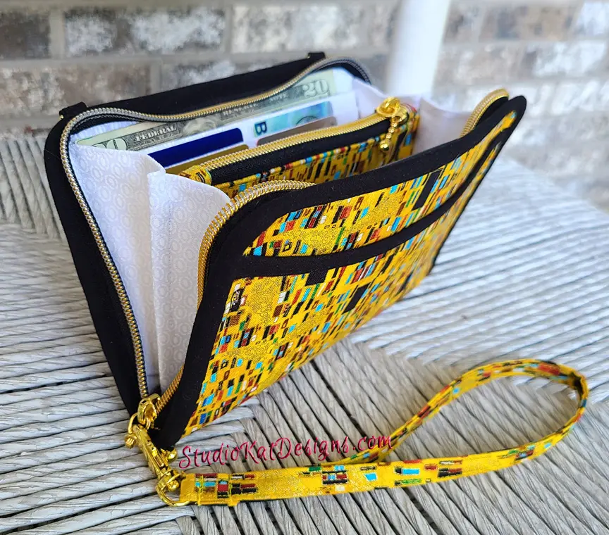

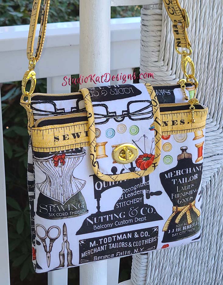
She who sews. A little way to say I did this. I’m working on a quilt with this fabric right now. Love your choices but this is my favorite. Judy
Feeline Good or Serious Whimsey is my guess.
Steampunk Fish…The fabric chosen is awesome, but it shows the design of the bag clearly. Very easy to see the design. Love it!
This is a very difficult choice–they are all so beautiful! I think my choice would be either She Who Sews or Serious Whimsey. Wonderful combination of fun fabrics!
I like The Gorilla in the Wings because it shows me what the bag will look like, with the 2 pouches and flap closure. As far as the material goes, She who sews is the material I like. But The Gorilla in the Wings is my first choice.
Mandala Effect. I think it is beautiful and very classy looking.
Any of the mandala fabrics—because you seem to lean toward that type of print which gives a strong hint as to who the designer is. Feelin’ Good, though, pulls in the Kat in Studiokat and the purple in your logo so there’s something to say about that, too!
Usually when you post photos of your bags and ask for an opinion, it is easy to say which I think would look best. This time I love every fabric choice and each would be striking on the cover photo. So I will not be any help on choosing just one!!
For me it’s the Mandala Effect I think it’s perfect for that bag
I can’t decide between 3: Steampunk Fish, Mandala Effect and Serious Whimsey. I think all three really show off the pattern.
I had a hard time picking this: a Mandala Effect fits all considerations! I personally love She Who Sews but it isn’t necessarily a design that everyone would love. I’ve made several other bags from that design line and might consider it for myself.
I really like this bag pattern and will probably purchase it when it’s released. While Alexandria Revisited and Gorilla in the Wings do a decent job of showing the bag off, they don’t scream Studio Kat to me. And while I’d love to see an independent fabric designer’s work get better publicity, Serious Whimsey just looks too busy and the effect of the print above the focal square looks too much like there might be a zipper there. Which leaves Steampunk Fish, A Mandala Effect, Feeline Good, and She Who Sews. All of these are very clear representations of the pattern, none are overpowering with too much pattern, and as much as I love She Who Sews for the fabric and Steampunk Fish for it’s fabulous boldness, I don’t think they “read” as Studio Kat designs. Those of us who follow you will immediately identify with both A Mandala Effect because of the amazing fussy cutting and the incredible attention to detail in the flap matching the panel on the front, and Feeline Good, because, duh, it’s a cat, and there’s a lot of purple around it, as Studio Kat products. So I think that either of these versions would make an excellent cover choice.
Gorilla in the Wings really catches my eye in terms of fabric and all the other reasons for choosing this one. However, I can’t remember if when you showed it to us before, you said you were going to tweak the tabs where the strap attaches. They appear a tiny bit taller than some in the other photos. It might just be the angle. But, if this one does not quite match the final design, my second choice would be A Mandala Effect. The fabric glows and your fussy cutting is superb. I love the others, but some might appeal to a more limited clientele, or they might not have the standout effect you are looking for. I never pick the same one you pick, so I’m excited to see which one makes it onto the cover!
I really like the Mandela Effect as my suggestion for the cover model. It has good contrast, the black with the brights shows off the double pocket section at the top as well as what can be done with fussy cutting.
The gorilla one. It shows off the structure and construction the most. Also, the 2 fabric combo is very prevalent. The zippers are well highlighted. The Alexandria is my 2nd. It displays the strap the best. No matter which is shown, I will be buying this one!
Serious Whimsey! I just love the colors, design, everything.
Steampunk fish is my favorite. The others are too busy. I’d like the mandelas if the tab was a solid color, I think.
The Gorilla in the Wings;
I believe the design in the fabric is nuances the folds of the pattern and the strap coming over the top. The colors really pop along with being bright and cheerful. This bag is an eye catcher and photographs very well. The color of the strap was chosen well, the dark fabric helps to brighten the color palette of the bag.
She Who Sews. As much as I love “Katz” I like my choice because I think it recognizes Kat as the designer. Love your work. Waiting for the pattern!!