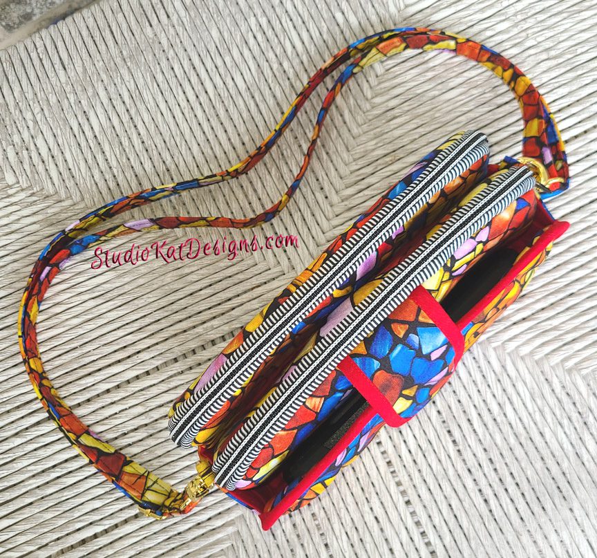
So…
In our last post I showed you the first two samples I created in the course of developing this pattern but unusually, they BOTH turned out to be “Gorilla samples”, which of course was pretty disappointing
So it goes without saying that this time I was determined that my next sample would qualify as being true to what would eventually be the final pattern parameters.
Ready for a little tour?

More about this in a bit!


So there you have it!
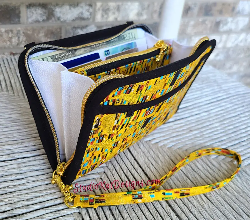
I’ll finish this post with a side view that gives you a great look at FOUR storage areasand a few words about this fun fabric which I picked up last year at the Mountain Quilt fest in Pigeon Forge, TN.
It’s by Cynthie Fisher for QT Fabrics but that’s all that’s written on the selvage of the fabric.
And finally, I have to say that the more I live with this sample (and its been hanging in my studio for over a week now), the more I dislike this look, for TWO reasons!
- First– The “Bag Front” (which is now the tabbed pocket), has an all-too-familiar look! Even though the bag is totally different than my others, there are certain angles that are totally reminiscent of several other designs and I would prefer for it to be distinctive unto itself!
- and Secondly, and perhaps more importantly– i find that this look is slightly offensive to me in that it seems to have a distinctly “homemade” look that I don’t appreciate at all.
And that means there’s a BIG change coming!
Obviously I’m disappointed in this setback, but I want this design to be the best it can be! So… do stay tuned for the next post in this series when I plan on revealing what I hope to be the FINAL incarnation of this design!!!! (That also means that this sample is in essence a THIRD gorilla sample, which is a record I hope to NOT duplicate in the future.)
And now, it’s YOUR turn!
What comments or questions would YOU like to pose this design in general or this sample in specific? Did I make the right decision on continuing to improve the look of the design? Please feel free to use the space below to let me know.
Check out the best sewing pins with me on Pinterest, join in on discussions or show off your work in our FaceBook Group, or get your daily sewing fix on our Facebook Business Page or get behind the scenes scoops on Instagram, and be the 1st to know about new patterns, discount codes and sample sales by signing up for our monthly newsletter.



Does it have an inside zippered pocket? I like this pocket for my cash since I do not like added weight of a wallet.
I think black trim would have given a more upscale look than the red. Would have probably used all solid black trim and hardware to tone down the golds/yellows.
It is amazing that you keep coming up with so many user-friendly bags so quickly!
Thanks for commenting Nina but I just dont like the front of this bag right now (which used to be the bag back). I’ll figure it out eventually, but this one has taken MUCH longer than usual. That’s for sure.
I agree with your comment that it look like other bags with the tab on the pocket. The binding on the front pocket gave it a homemade look. I don’t recall seeing binding like this before. I love your bags. Looking forward to the improved design.
Thanks Corinne- I have some ideas I’m fleshing out and I look forward to showing you the changes! 🙂
Did you ever consider putting a grommet on the sides to hold the straps?
I also like to have inside zippers and the more the merrier. I would even like one inside the center area. It just give a little place to put stuff you don’t want seen or falling out and losing it.
Sorry to say, but I’m not a fan of that stained glass fabric.
Thanks for commenting Charlene- I try to be careful about adding too many zips as some folks are totally put off by them and they do add to the total cost of the bag. I’m still working on the exterior & interior details but one thing I’ve found out for sure (from the release of the last bag… the Katalina), grommets are just not something many customers want. At least with the Katalina, the grommet was an optional feature, but if I used them as strap attachment items it could really start causing problems! 🙁
What would it be like if you replaced the tabbed pocket with another zippered compartment just like the other two? Would that make it too thick? It would be the same look on both front and back. Probably you have another plan in mind and whatever it is, I know it will be fantastic. I can’t wait to see your next post!
Thanks for the idea Beth, but in order to avoid a VERY tricky make, there’s going to need to be bias tape somewhere. I have a possibility in mind and hopefully I’ll get it together to show you next time. 🙂
Ahh, when good patterns go bad! Good luck with the rework
I thinkthe stripe zipper fights with the fabric. I agree with black bias tape. Maybe change the shape of the tab, a little wider like an envelope, but not too big. All in I like it alot.
Thanks Peggy- I’m working on the changes. Do stay tuned! 🙂
You know I’ve been loving the idea of this bag. My thought at this version? I just want to rip that front pocket section off. I liked it better without tat section. So I’m excited to see your next version!
Well… I’m afraid the sewing difficulty in finishing up the bag as you suggest would put it out of the range of most homesewers, but I think you’ll like the changes that we make.
🙂
Reading the comments I was going to say same as Beth, re zip instead of tab closure.
Also the card slots – is there enough room for 6 or 8 on that side, side by side. I like more slots as then don’t need to take a wallet. Have made a few of your patterns and really love then.
It’s going to a tight fit to place more card holders, but possible, 🙂
What about a wider, more “geometric” tab on the front?
We’ll reveal the change we’ve made to this area very soon! I can’t wait to show you! 🙂
I was thinking the same thing – a longer flap. I’m no a great fan of zippered entry into a pocket for my cell phone, but a flap of some sort works for me. And, I’ve been looking for one with more room for my sunglasses. I’ve been using the Everyday Attache and have the glasses on top of the rest of my stuff, so a separate space for them would be great. Do you have dimensions for this bag?
I really like this bag design – even the back/front pocket.
Perhaps you could change the shape of that pocket? Make it arched on both sides with a point in the middle to meet a smaller tab?
That would also help to fix where the bias tape on the pocket meets the side piece (you know the point where the bias tape goes from 90° angle at the side piece before wrapping fully around the pocket top and does that wonky shape thing it does.)
Very soon I’ll show you the changes we have made Mae! Do stay tuned? 🙂
In just want to say that you come up with amazing bags. Alot of time and attention to detail make them wonderful. I also do not like the stained glass fabric.
Thanks Linda for those kind words. 🙂
Hey Mrs. Kat,this one is a reminder of your walkabout,but smaller, but waiting on the new version enjoyed our chat at the Quilt show (the Gemini) making a new one for Birthday
GREAT! I hope you send me a picture of that Gemini when you finish it!
I do not like the look of a flat binding on a bag it definitely makes the bag have that homemade appearance. Have you considered using covered cording in place of the binding. It is so much neater and easy to apply when going around curves. I was thinking a large tab almost the size of the bag with maybe a 45degree angle to give it a more modern look rather than a plain tab.
Great idea Irene, but the way this bag has to finish would make it impossible to use covered cording. Do stay tuned for the changes we make. I’ll reveal them soon!