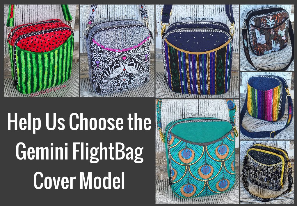
So…
with yet another pattern almost in the books, it’s time to choose the ONE bag sample that truly represents the Gemini FlightBag design for the pattern cover! In order to do this, I like thinking about which of our samples would most appeal to our customers… which one would gather the most attention at shows… and especially, and perhaps more importantly, which sample would be the one most likely to compel a customer to pick up that pattern and give it a 2nd look!
But here’s the thing… before I make this decision, I REALLY love hearing which bag YOU would choose to be on the cover if you were ME. WHY? Maybe its because pattern designing is such a solitary business and I like the interactions… who knows? At any rate, I get a kick out of learning your choice and hearing your reasoning…
So… now that you’ve seen the choices, here’s the criteria to keep in mind as you make YOUR choice!
1. Consider MORE than just your personal favorite. Of course the sample you choose should be appealing to you, but always consider how much “universal appeal” a bag has. Would it appeal to MOST people?
2. Will it turn heads? Ideally, a cover sample should “stand out in a crowd”! By definition it’s a show bag. It’s not meant to be neutral, fade into the background or look good with our entire wardrobe although it might!
3. Do the fabrics used draw attention to the design’s key features? Some prints are so “busy” that the bag features seem to disappear because all you can see is the PRINT! I want interesting fabric, that’s for sure, but I want the design to shine thru unimpeded.
4. Does the sample include ALL the design features promised in the verbiage on the cover. Because here’s the thing… the model that is chosen for the cover is the model that will MOST be associated with this design… it’ll be the “spokesmodel” so to speak. But if it’s missing a promised exterior pocket for example, then every single person who picks up that bag at the shows we travel to, will want to know why it doesn’t, or worse still, they’ll think that the design DOESN’T include an exterior pocket at all.
5. Is it photogenic? Sometimes, for reasons that I’ll never understand, (probably because of MY photography skills), certain samples just don’t photograph well. No matter the lighting…. no matter the background….no matter… what… I…. DO! But here’s the deal, no matter how pretty and ideal it is in person, if it doesn’t photograph well, or if I cannot seem to get a decent photograph of it, then it’s just NOT a good candidate for our cover model! It can still be a fantastic “show bag”, but not the best “cover model”.
6. Does it actually LOOK like “our brand”? Our goal is for our customers to be able to identify a pattern as belonging to our line without even seeing the title or our logo on the front cover of the pattern. We would be doing ourselves no favors for example, if we suddenly departed from a “formula” that’s worked for us for 17+ years and placed a model on the cover that just doesn’t look like something we would put forward!
7. Is it created with a special pieced exterior? As most of you know, I LOVE piecing my way to a unique exterior, but I’ve learned from bitter experience and quite a few customer scoldings (reference the Lollapalooza) that placing a model with such an exterior on our pattern cover is generally just NOT a good idea. BUT– if there are actual pattern pieces for this special exterior, and those pieces can be included in the pattern package itself (reference the Uptown Saddlebag or the Triple Play, then it CAN in fact be placed on the front cover.
So…there you have it! Are you ready to have a little FUN?
Because now it’s time for YOU to put on YOUR “designer hat”! … after reconsidering all six of these samples with the above criteria in mind, I’d love to know which one YOU would choose to grace the cover of our Gemini FlightBag pattern.
But don’t forget—I would also enjoy hearing the reasoning behind your choice. 🙂 And do stay tuned for the next post in this series to see how closely your choice mirrored ours when I reveal which model really will be on the cover of the Gemini FlightBag pattern. I’m SO looking forward to seeing your comments! You probably don’t know this, but this is one of my very favorite posts of the whole year!
And guess what? We have a private FaceBook Group page just for StudioKat Designs customers? It’s the perfect place for you to post pictures, comments or questions about our patterns! How cool is that, right? And don’t forget to check out the best sewing pins with me on Pinterest, get your daily sewing fix and behind the scenes scoops on Instagram, and be the 1st to know about new patterns, discount codes and sample sales by signing up for “Kat Bytes”, our monthly newsletter.
35 Comments
Join Our Mailing List!
Click button below to get 15% off your 1st pattern!


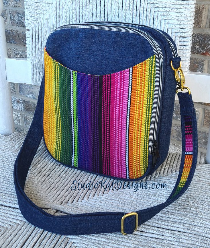
Kat – I would vote for Purple Rain.
– love the complementary colors of blue/gold, really “pops”
– the decorative zippers coordinate really well with the design elements in the vertical stripe fabric, and highlight the “zip around feature” of the bag
I would vote for Pretty In Pink. It is not too subtle, not too “loud,” not too dull, not too fancy. Just very attractive and shows off the features of the bag beautifully. I would make this bag. I would also make Welcome To Panama (I’ve been to Panama,) but I can see where it would not be for everyone. Love the style of this bag. Good luck with your new pattern launch!
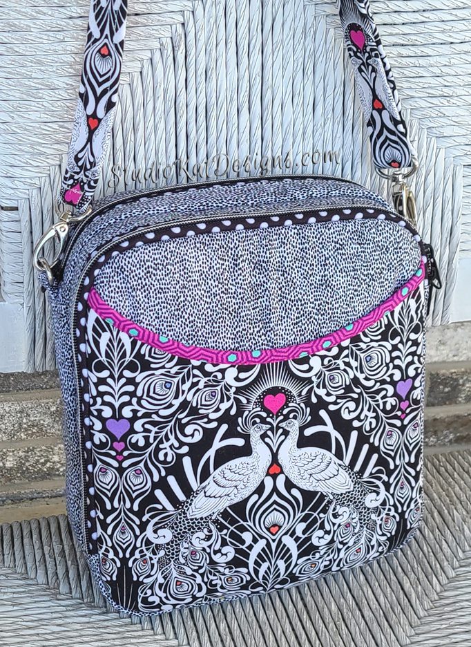
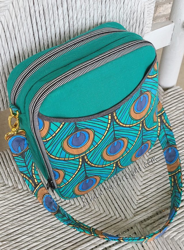
I believe the newest one, the Deco Delight, would look the best on the pattern cover. Teal is such a favorite as is the peacock feathers. I actually plan to make mine in the Tula Pink fabric but it seems to be hard to get and might be OOP for much of the pattern’s run.
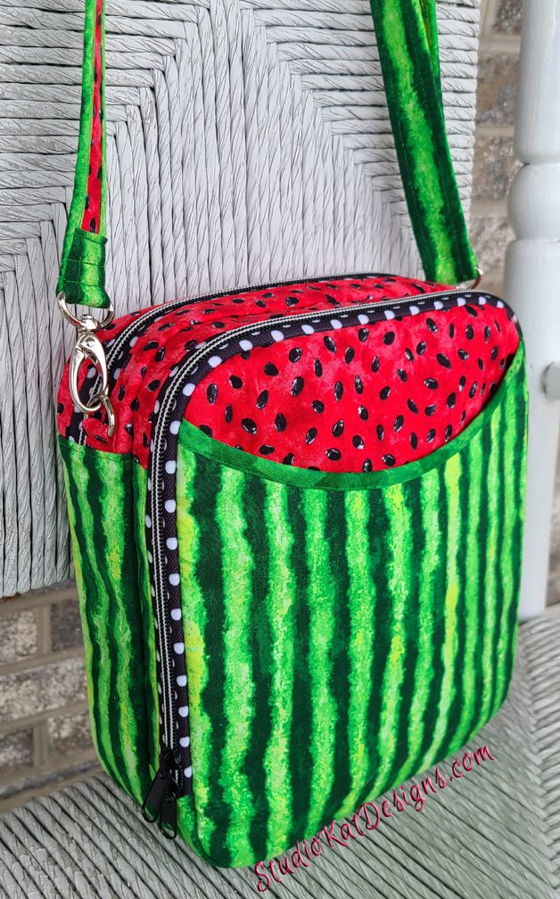
So I guess I will be the odd one. I LOVE the picnic bag. My hometown in Oklahoma has a Watermelon Fest every year . It is all about the harvest, and the school, and crafts. This would be just the thing for carrying there. I also love the shape, and extras that you can add to make it yours.
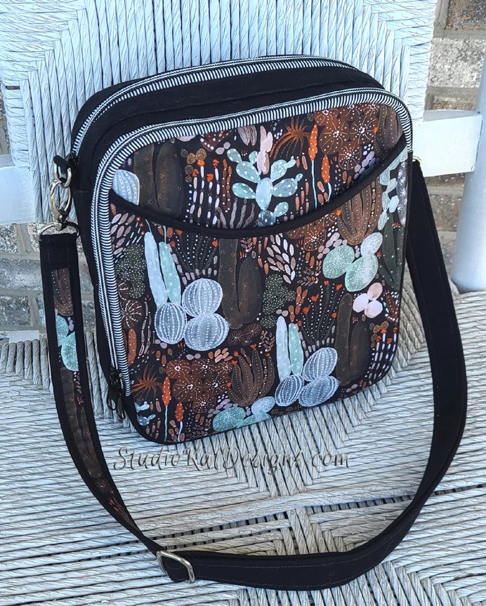
I think my first choice would be Pretty in Oink, followed by Art Design. Both show off the contrast between the body and the outer pocket.
You know I love Tula and it’s a braying bag. Just right but also the picnic is sure catching and photogenic. The picnic looks fun.
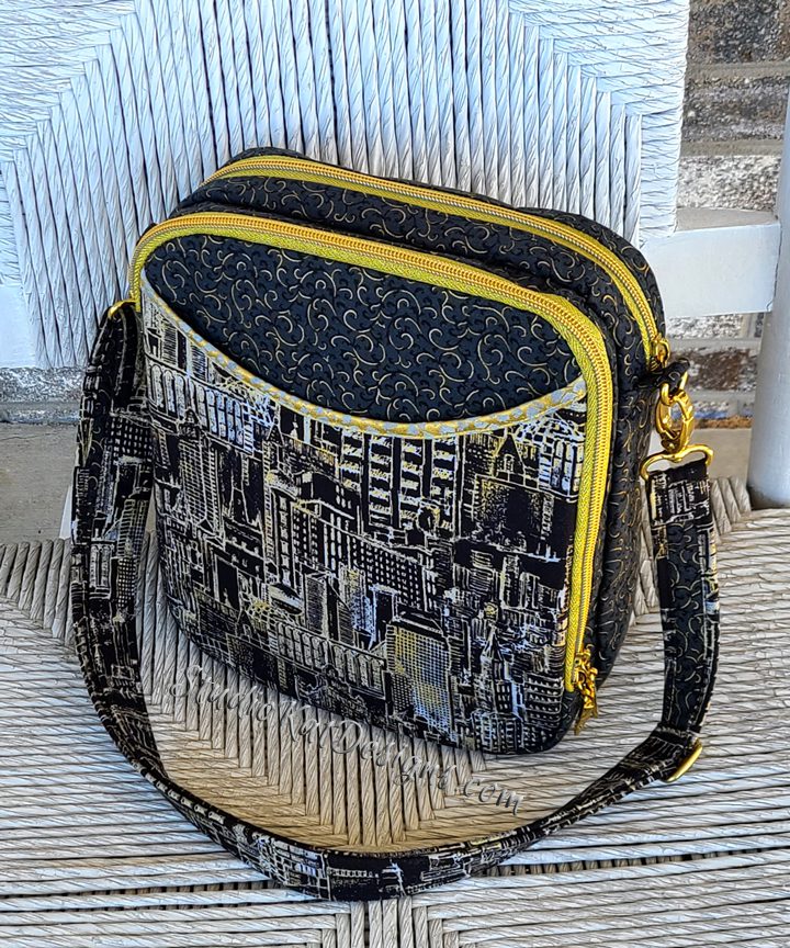
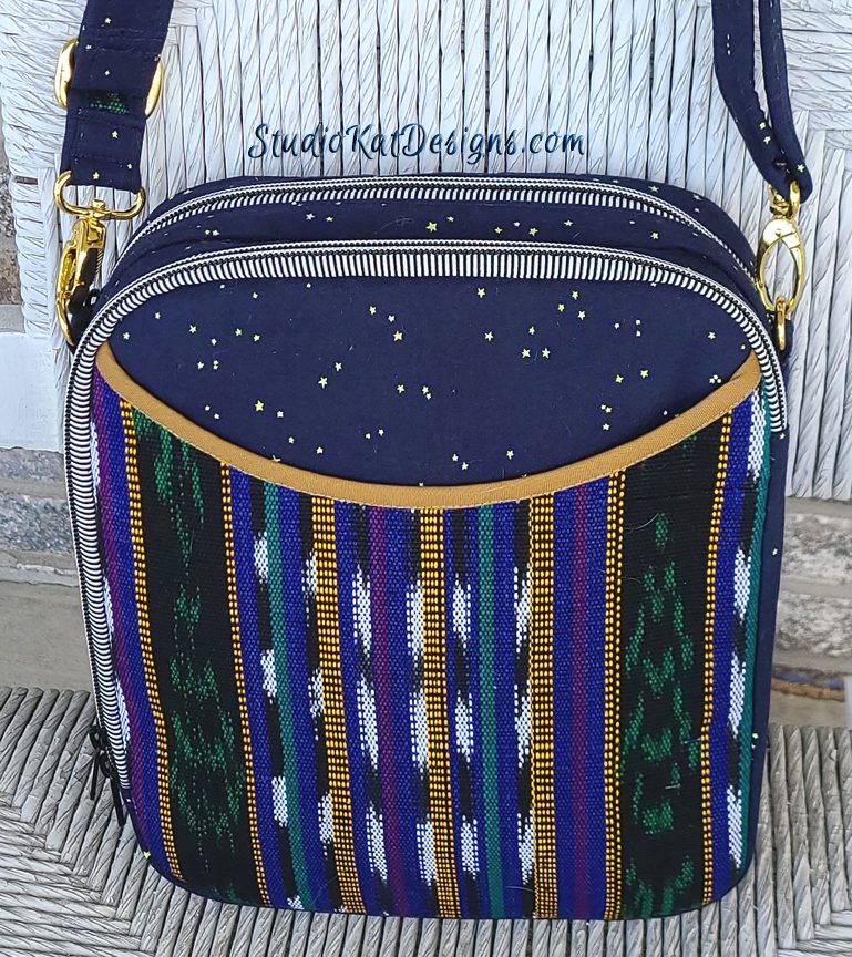
The city scenes combines all. Plus it’s classy. The gold and black gives it class. The city scenes are interesting and catches your eye. The subtle hints of gold in the fabric brings it all together. The ultimate Flight Bag is ready to go.
I think the Panama one will appeal to the most people. It isn’t garish but is colorful, shows the design features clearly and will stand out on your pattern racks as being just a bit different from most of the other patterns ( which can have quite complicated designs and sometimes overwhelm the features). I think the colorful striping will catch the eye quickly.
I’m torn between Art Delight and Pretty in Pink, the colour of Art Delight caught my eye it made me look twice but the symmetry of Pretty in Pink and the fact that it’s a bag I could use every day swings my vote so I guess it’s Pretty in Pink for me
They are all very nice, but the one that makes me stop for a second look is Pretty in Pink, just enough colour, but not flashy. Now to make one, oh yes I must wait for pattern!
I would choose the watermelon print. It stands out so much with the red and green, and the prints are so different. The ant fabric on the inside makes it more appealing!
I really like the “City Scapes” bag. The photo ş shows the bag to its best advantage, giving the viewer a clearer sense of the true dimensions. The yellow zippers give the bag a nice pop of color.
Hi I like take me to Panama followed by pretty in pink the Panama is a double take with the co!ours
The sample design I would choose would be “Take Me to Panama” as it is colorful, photographs well and shows off the design features – but mainly because this is a bag design for both men and women and the other samples have a more feminine look.
Lois
You haven’t made it easy!!
Have to say I would pick the first and the last ones! If I have to make a choice it would the first one – “Take me to Panama”. I tend to change my purse to go with the outfit. Been wearing a lot of jeans this past year. Love the colorfulness of the front panel. But I do love “Deco Delight” too. There you have it.
So …………………… when does this lovely come online? :>)
Although many appeal to me personally I vote for CIty Scapes – when traveling it would be the perfect bag to with anything and to go anywhere.
Purple Rain would have most appeal for larger picture with small insets of Watermelin Picnic Bag and Panama Bag to show more possibilities for same design!
I would choose either Purple Rain or Deco Delight. I think they both show off the front pocket the best as well as the zippers so a potential buyer can see that there are lots of layers to the bag.
I would choose Deco Delight for the pattern cover. The print is eye catching and the solid background
allows the bag’s features to show. There are others that I would choose for myself, but Deco delight
pulls me in to really look at the pattern.
Pretty in pink, followed by purple rain.
Both eye catching patterns.
Pink… the birds fit in with “flight”.
Purple… how many times does the rain spoil a flight/ holiday in pre-covid times.
All lovely but these are my two personal favourites.
purple rain definitely!!
Picnic Bag is definitely eye catching and a lot of fun and that might appeal to many. However, it looks like you’ve done something different with the sides, so that would confuse the customers who would expect the pattern to correspond. So my first choice would be Deco Delight. My reason is that it showcases the pattern beautifully in my opinion and shows off the elegant proportions of this bag. Now I have to admit that I really love this color, but I think your customers might also. To me it looks like a very cheerful color that makes me feel as if spring is coming and better times are on the horizon. It’s always fun to find out which one you pick and why.
I vote for City Scapes on the front of the pattern (a thumbnail on the back of the pattern of the Picnic Bag) The City Scapes is a professional looking bag that is neutral and so the viewer can “see” other options in their own mind. The Picnic Bag for the bag is just fun and also allows the viewer to “see” other options. The City Scapes shows the design lines better with the contrast zippers, plus the fabric is not directional.
I would choose the Purple Rainbecause to me it represents what the bag is the upper print reminds me of stars and the lower prints is just stunning but also reminds me of the colorful pins on pilots’
beautifully jackets, I could go on but I think that bag stands out, my other choice would be city scapes
My first choice is City Scapes, then Take me to Panama. City Scapes is very elegant and eye catching.
Purple Rain Love the fabric
It’s a difficult decision because what you might be drawn to if you viewed the sample in person is different than what might catch your eye as a pattern cover. For that reason, I looked for contrast. So, my choices, in no particular order … Panama, City Scapes, Picnic, and Purple Rain. Each one has its own qualities that would attract different personalities of the buyer.
The Picnic Bag is certainly an eye catcher, but I would choose Take Me To Panama. I love those bright colors, but they are not over whelming. It shows off the curve of the slip pocket (a detail I love), and the two tone strap is quite intriguing! 🙂
Okay, I made a table in Word with the criteria and came up with “Picnic Bag”, “Take Me to Panama” and “City Scapes” as the top picks.
I think “Picnic Bag” is the most “Studio Kat”ish one, but my favorite is “City Scapes”. I like the fabric, you can see the designs and when I saw “City Scapes” I thought that it looked like a bag that was going places. I’m looking forward to getting the pattern. 🙂
The Panama is colourful but not too colourful, also I think it would be attractive to younger and older customers and also to males too. I always feel there are so few choices that work for males. It also shows the pattern of the bag well. Cracking job!
Picnic is eye catching, but will it sell bags. Purple Rain shows off the design and someone can ‘imagine’ wearing/using the design. I agree with a previous comment of having the Purple Rain as the main picture then using the Picnic as a secondary. I do love the way you coordinated all the fabric to create the Picnic (the ants inside are awesome). The purple rain has the ‘bling’ of the gold binding to attract the eye to the featured pocket on the outside. Good luck choosing!
I love “Purple Rain” the colors really stand out and catch your eye!
I love Cityscapes….it is stunning. the contrasting fabric , trim and zippers make make the details of the bag “pop”.
My vote would be for “Take me to Panama”. The colors are bright and the detail of the strap, like all the other exterior details, is clearly visible for this reason.
My first choice is Deco Delight and my second choice is Purple Rain. The peacock feather are beautiful and lots of people love them but my favorite color is purple – this is why I put two choices.
It is a toss up between Take Me to Panama and Purple Rain.
Take Me to Panama draws me in with the colors, but the colors don’t overwhelm. It would be a bag I would use everyday.
Purple Rain has more muted color and seems a little more sophisticated or dressier.
I am more conservative in my apparel and accessories, so I am sure that influences my choices.