So…
I fell SO much in love with this fabric that I couldn’t decide which colorway to choose! No surprise that I finally settled on the purple /blue version, right?
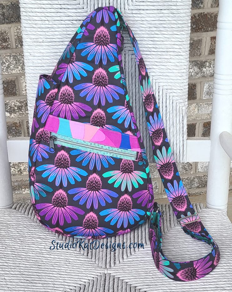
But here’s the deal, as much as I loved it, I had a really hard time coming up with complimentary/contrasting fabrics to use with it. I found a light teal from Tula Pink’s True Colors collection which worked for the interior, and I really like how a bit of it shows thru our translucent zipper in this picture! But…I was somewhat stuck on a choice for the exterior contrast. I finally went with another fabric from the same collection (“Hindsight”) by Anna Maria for Free Spirit, but I only liked one small section of it for use with this bag, so in the end I wasted over a yard of fabric just to get the small amount I actually utilized.
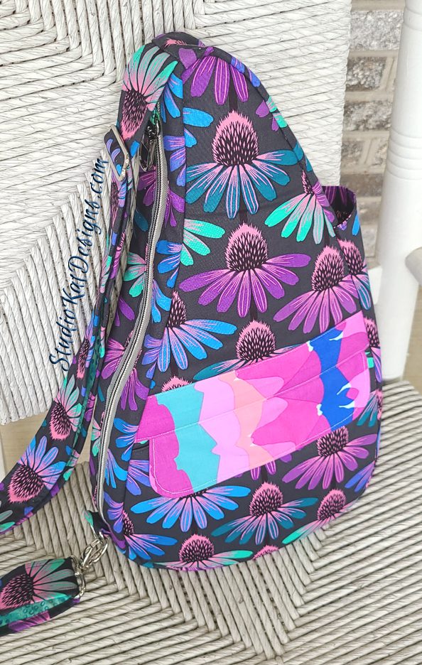
And although I liked this contrast with the Cone Flower fabric, I’m not too happy with how this Bag Front came out. To me, this section is just too elongated… to the point of distraction. I’ve actually thought seriously about ripping this section out and changing it somehow. And you know what? I may yet do that but right now I’m in a “let’s just keep moving forward mode” but do stay tuned, I may change this up before I set this design aside. I hate to have these kind of regrets about one of our samples!

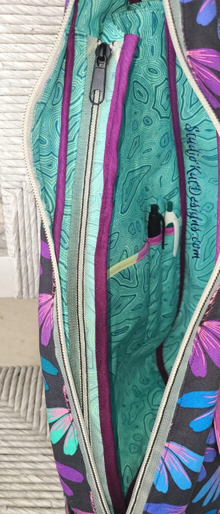

But here’s one thing I DO love about this sample… and that would be these interior shots… which so far are the best pics I’ve gotten so far of the inside features!
As you can see, I used a bit of the contrast on the inside to add some interest and to draw more attention to the interior features. From left to right– the 1st photo shows the zippered pocket w/the mag-snapped drop-in pocket situated behind it. The second picture is the best shot I’ve gotten so far of the large interior zippered storage area with pen slots. It’s perfect for a small laptop, ipad, Kindle or anything else you might like to conceal and carry. And the last photo is a good shot of my iPad Air in the zippered area.

And here’s a good shot of our brand new Bag Lock in place and “on the job”. I’ve located it on the inside portion of the Strap and works great in this location without getting in the way when it’s not in use.


Final thoughts:
I’ve made quite a few adjustments on the interior layering and I must say that this bag went together much better than the previous three! I still have one more adjustment to make on the next sample coming up! However, I completed all of my preliminary drawings and I’ve pretty much perfected the instructions in Word so I’ll be taking a bit of a break from sewing whilst I transfer the instructions into a Publisher document and redraw my pencil sketches into Corel jpgs to produce the 1st draft for my testers to use and critique!
So stay with me folks! I hope to have this pattern out for release in time for the Christmas gift-making season in mid-November, but first I guess I better get serious about thinking up a name for it, right? (if you have any ideas, I’m all ears!)
And now…. it’s YOUR turn!
And remember, we love reading your comments and answering your questions too, so please feel free to leave either or both in the space provided below.
Check out the best sewing pins with me on Pinterest, join in on discussions or show off your work in our FaceBook Group, or get your daily sewing fix on our Facebook Business Page or get behind the scenes scoops on Instagram, and be the 1st to know about new patterns, discount codes and sample sales by signing up for our monthly newsletter.
6 Comments
Join Our Mailing List!
Click button below to get 15% off your 1st pattern!


Love the colors and print for the outside, but not a fan of the outer pocket print. I’m not sure what would be better: different color? Smaller pattern? But the bag design looks great.
I really like the way the SKD translucent zippers look on this version.
I do too! I honestly dont know what i wouldve used if not the translucent zips. And I like the way a little taste of the lining shows thru to the exterior! 🙂
I love nearly everything about this bag so far and absolutely love the fabric but I hate the big “splotches” of that contrast fabric. I think either a solid or small print would look so much better. Just my opinion!
Cone flowers are one of my all time favorites, and I admire your amazing fussy cutting on the contrast!
I, too, love the coneflower fabric. I also love the interior. I’m not a fan of that contrasting fabric on the front. I would probably use a solid color or a small floral print in one of the coneflower colors. I love that bag design!