So…
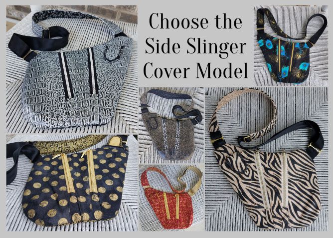
with yet another pattern almost in the books, it’s time to choose the ONE bag sample that best represents the Side Slinger design for the pattern cover! In order to do this, I like thinking about which of our samples would most appeal to our customers… which one would gather the most attention at shows… and especially, which one would be the one most likely to compel a customer to pick up our pattern to give it a 2nd look!
But here’s the thing… before I make this decision, I REALLY love hearing which bag YOU would choose to be on the cover if you were ME.
WHY? Maybe its because pattern design is such solitary business and I like the interactions… who knows? At any rate, I get a kick out of hearing your reasoning so let’s get started!
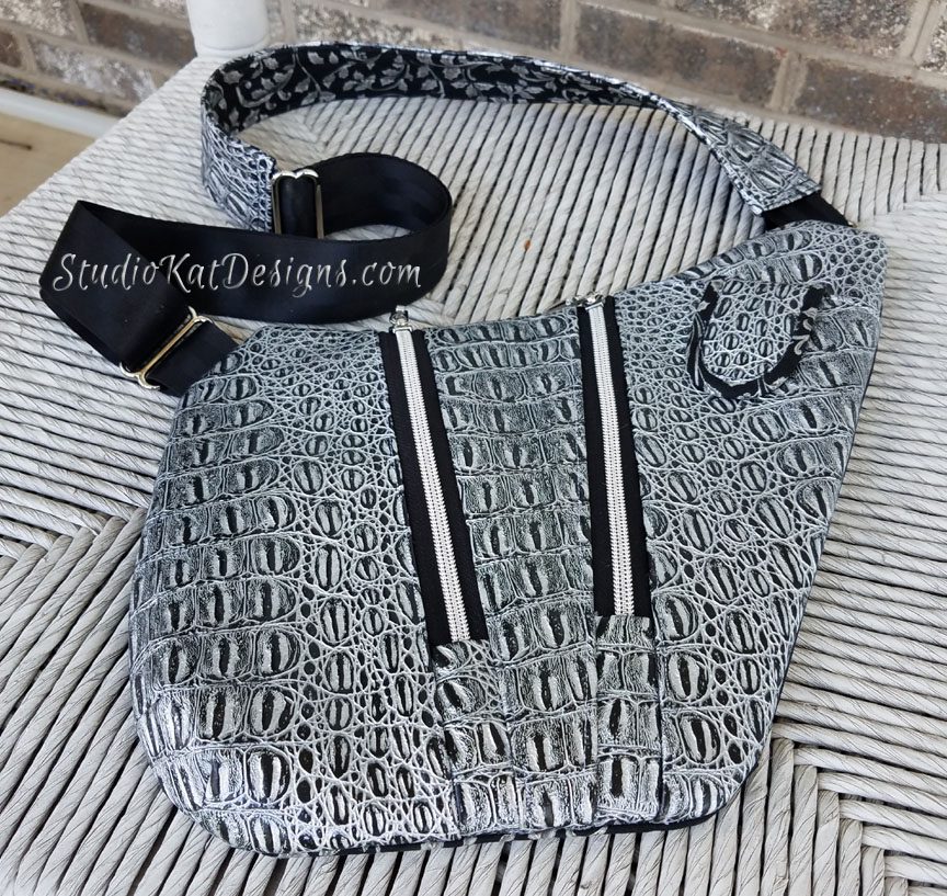
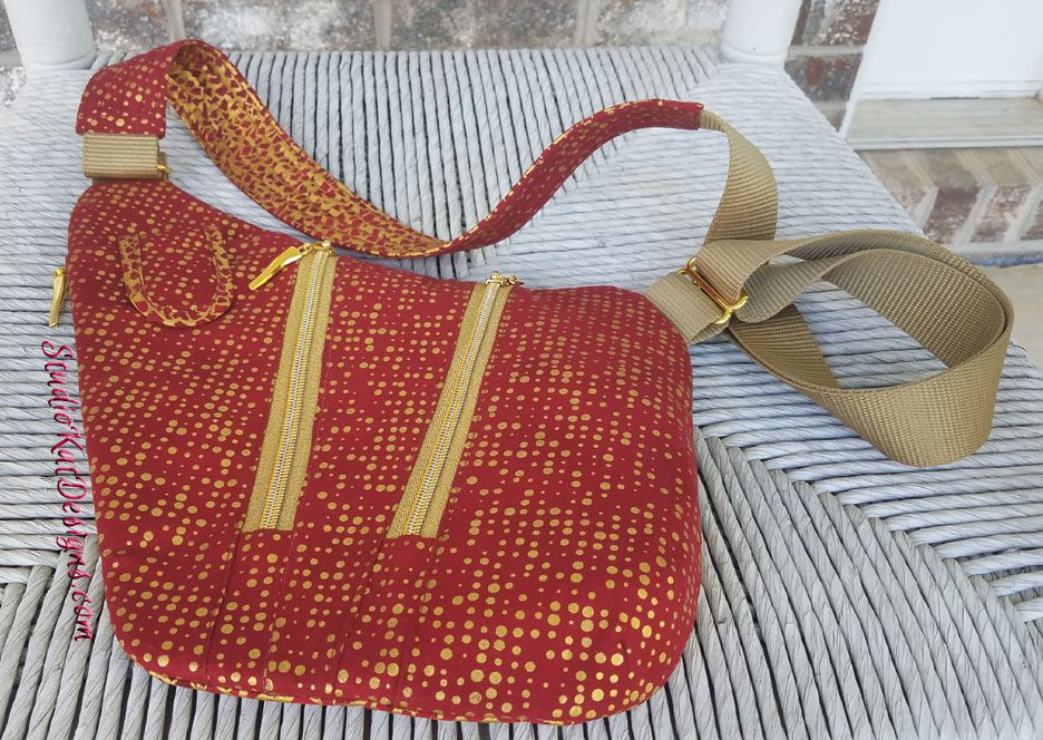
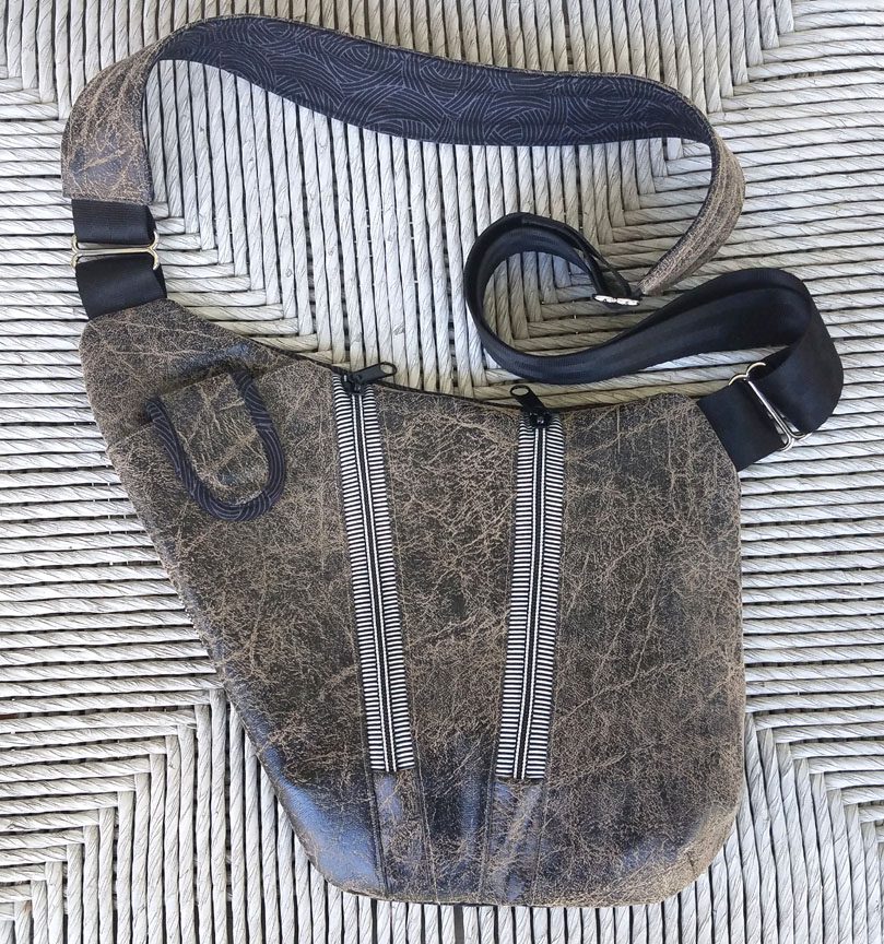
You’ll find all 6 of our Side Slinger cover candidates pictured above (and below) in the order in which they were introduced to you in this series, (just click the link under each individual picture to see the original post associated with each sample). And oh yeah… don’t forget to keep scrolling down to read up on the criteria you’ll need to consider before putting on your “designer hat” and choosing which bag YOU would place on the cover if you were ME! Because remember, the worst thing you can do is to blindly just pick the bag you LIKE the best!
So… now that you’ve seen the choices, here’s the criteria to keep in mind as you make YOUR choice!
1. Consider MORE than just your personal favorite. Of course the sample you choose should be appealing to you, but always consider how much “universal appeal” a bag has. Would it appeal to MOST people?
2. Will it turn heads? Ideally, a cover sample should “stand out in a crowd”! By definition it’s a show bag. It’s not meant to be neutral, fade into the background or look good with your entire wardrobe.
3. Do the fabrics used draw attention to the design’s key features? Some prints are so “busy” that all you can see is the print. I want interesting fabric, that’s for sure, but I want the design to shine thru unimpeded.
4. Does the sample include ALL the design features promised in the verbiage on the cover. Here’s the thing… the model that is chosen for the cover is the model that will MOST be associated with the design… it’ll be the “spokesmodel” so to speak. But if it’s missing a promised exterior pocket for example, then every single person who picks up that bag at the shows we travel to, will want to know why it doesn’t, or worse still, they’ll think that the design DOESN’T include an exterior pocket at all.
5. Is it photogenic? Sometimes, for reasons that I’ll never understand, (probably because of MY photography skills), certain samples just don’t photograph well. No matter the lighting…. no matter the background….no matter… what… I…. do! But here’s the deal, no matter how pretty and ideal it is in person, if it doesn’t photograph well, or if I cannot seem to get a decent photograph of it, then it’s just NOT a good candidate for our cover model!
6. Does it actually LOOK like “our brand”? Our goal is for our customers to be able to identify a pattern as belonging to our line without even seeing the title or our logo on the front cover of the pattern. We would be doing ourselves no favors for example, if we suddenly departed from a “formula” that’s worked for us for 16+ years and placed a model on the cover that just doesn’t look like something we would put forward!
7. Is it created with a special pieced exterior? As most of you know, I LOVE piecing my way to a unique exterior, but I’ve learned from bitter experience and quite a few scoldings (reference the Lollapalooza) that placing a model with such an exterior on our pattern cover is just NOT a good idea. BUT– if there are actual pattern pieces for this special exterior, and those pieces can be included in the pattern package itself (reference the Uptown Saddlebag or the Triple Play, then it CAN in fact be placed on the front cover.
So…Are you ready to have a little FUN?
Because now it’s time for YOU to put on YOUR “designer hat”! … after reconsidering all six of these samples with the above seven criteria in mind, I’d love to know which one YOU would choose to grace the cover of our SideSlinger pattern.
But don’t forget—I would also enjoy hearing the reasoning behind your choice. 🙂 And do stay tuned for the next post in this series to see how closely your choice mirrored ours when I reveal which model really will actually be on the cover of the Side Slinger pattern. I’m SO looking forward to seeing your comments! You probably don’t know this, but this is one of my two favorite posts of the whole year!
And guess what? We have a brand new private FaceBook Group page just for StudioKat Designs customers? It’s the perfect place for you to post pictures, comments or questions about our patterns! How cool is that, right? And don’t forget to check out the best sewing pins with me on Pinterest, get your daily sewing fix and behind the scenes scoops on Instagram, and be the 1st to know about new patterns, discount codes and sample sales by signing up for “Kat Bytes”, our monthly newsletter.
29 Comments
Join Our Mailing List!
Click button below to get 15% off your 1st pattern!


I like the 3rd one. The black and white with the black trim is light enough to see the details of the zipper and the pocket for the phone.
I would use the gator skin because it would appeal to both men and women
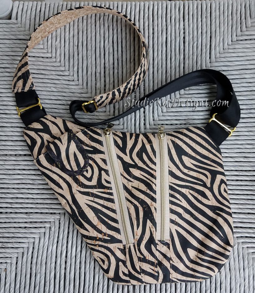
I like the faux black leather one because it appeals to both men and women. I like the cork zebra one because it reaches out and grabs the eye.
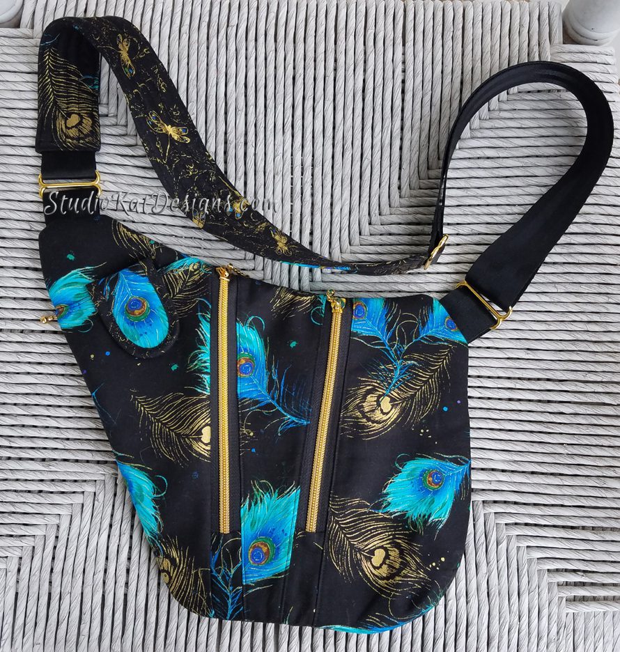
I love the heavy metal peacock. It pops with color.
1. Red, 2. Peacock,
I love the Peacock one as it makes a statement, it can be used for those dressier occasions or when you simply want to stand out in the crowd and give your outfit a bit of pizazz xx
I like the bottom one – there’s enough contrast (zippers, cell phone pocket) so that buyer can see all the elements at a glance, even though making it they might not want those elements to “pop” and use fabrics/zippers to hide the same elements that drew them to the pattern.
I like the bottom one too. What she said above me. I think it looks more classy than the other samples.
faux gator skin. It shows off the pattern features and the fabric is interesting without distracting from the pattern.
I like the fake gator best. The fabric is interesting, but the bag Features are able to shine. I think with some of the other models, the zipper Interrupts beautiful fabric without being an integrated Design Feature. It works well with the cork and the last Image too, but the gator grabs my attention with all the bag has to offer.
Both the cork and the peacock one are stunning!
The last one, that looks like fake leather. The “calm” fabric allows the features to shine (zippers, little pocket) & also looks very professional, like it was store-bought!
Faux Gator. It first caught my eye in the FB post and again here. All the elements are easily spotted.
I prefer the red and gold. The contrast of the fabric and notions allows me to instantly see the features and want to look inside!
I like the peacock, the colors appeal to me. The last one, I think would appeal to a man or woman(a little drab in color). The red turns me off completely.
I prefer the bag shown at the bottom. It is the most gender neutral. I’m not sure what size the pattern cover will be so I believe this selection would look best showing off all the features. This one looks best “from a distance”.
Gold and red is my choice
They all look great, can’t wait to make one or more! I believe the faux gator bag shows the features the best (Zipper pockets, phone pocket etc). I think I would consider having maybe a closeup photo on the side, of the phone pocket with a phone in place(a little more than just a peek of it, maybe I/3 of the way out).
I like the faux leather one (the last one shown above). I think the fabric/zipper combinations work well with each other & really show off the bag’s features. It is very classy looking, as well as being gender neutral. Every one of the above bags are beautiful though.
I vote for the Peacock bag. It looks elegant, rich. Very high end.
I cant decide between #1 & #6…I think 6 has more cross gender appeal.
Thanks SO much. I love reading these responses, and especially enjoy the reasoning behind your choices. Do stay tuned for the next post in this series when we’ll reveal the cover for our new design, the Side Slinger!
1. Faux Gator
2. Red
The faux gator made my eyes stop. I love the looks of that design. If I could find gator fabric, that’s what I would use.
We have it on our website Bobbie, but I have to say, it was tough to work with. 🙁
Faux Gator Skin. It stands out with a great design and exciting, but tasteful contrasting front. The bag is photogenic and would look great in many occasions.
I love the old leather look of the last one! (I’d wear that one) . I think that one or the faux gator should definitely be on the cover as a gender neutral example that might catch a male eye.
The Dotty or the Peacock would be my other choice for the cover, with one of the above.
OR…maybe a picture of a male with one of the neutral bags and a female with one of the other bags. That could plant the seed for making it for a different gender.
Karol
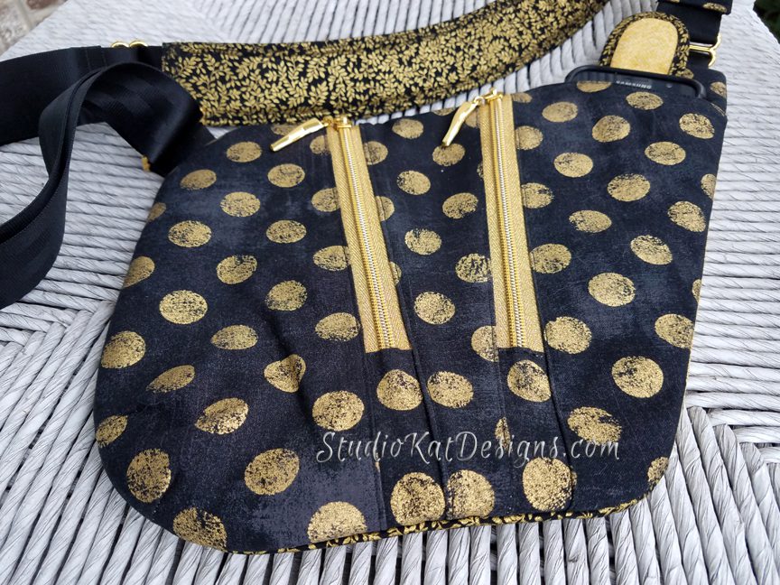
I like Driving Me Dotty. The black and gold are eye-catching and the gold zippers stand out and the gold interior of the flap on the cell phone pocket and the phone inside really brings home what the little pocket is intended for.
I have to vote for the peacock as an attention grabber for a pattern envelope.