So…. we’re almost ready to finish up another pattern! But before we can, we need to choose the ONE sample that will totally represent our new Carolinian design & become the “cover model” for the pattern! To do this, I like thinking about which of our samples would most appeal to our customers… which one would garner the most attention at those upcoming trade shows which are SO visually noisy… & especially, & perhaps more importantly, which sample would be the one most likely to compel a customer to pick it up for that all-important CLOSER look!
But here’s the thing… before I make this decision, I’d SO love to have YOUR input!
I REALLY love hearing which bag YOU would choose to be on the cover if you were ME. Do you think it might be because pattern designing is such a solitary business and therefore like need the interaction? Could be….who knows? At any rate, I get a kick out of learning which would be YOUR choice and also hearing the reasoning behind your pick!
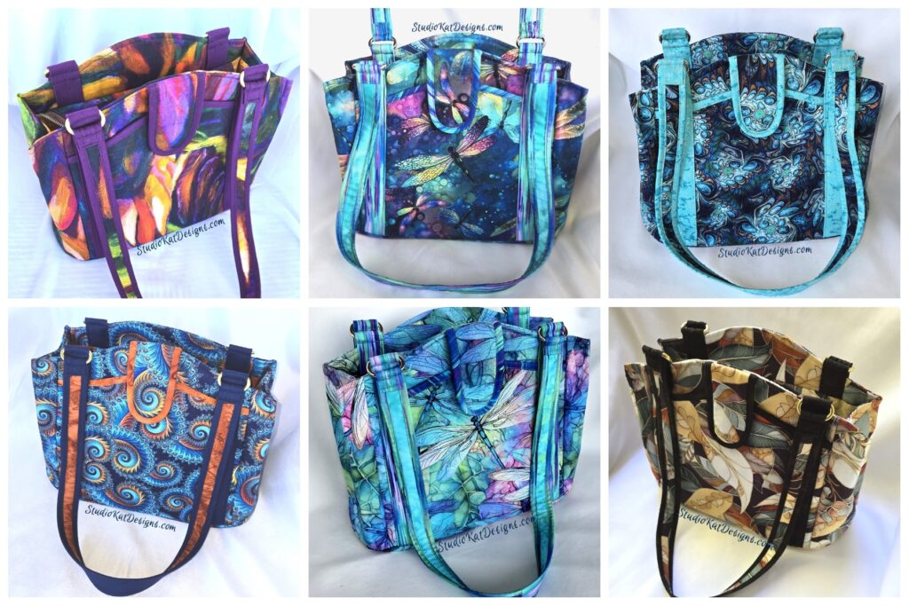
So with that, here’s the choices to consider for our
Carolinian Cover Model.

On the QT – 10/9/2
Owls in Disguise – 10/17/24

It’s Fall Y’all – 1/3/25

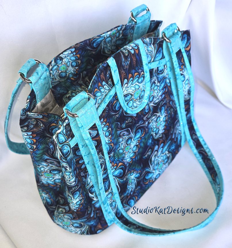
In the Wind – 1/10/25
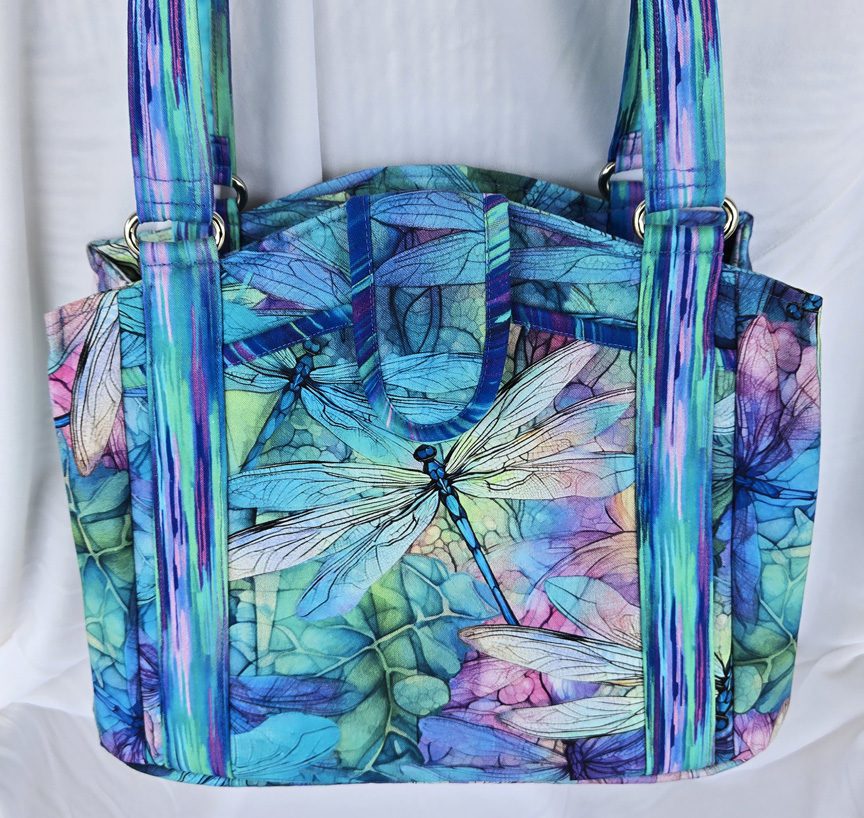
DragonFly Illusions – 1/24/25

Dragonfly Dream – 2/6/25

Frond Abstract – 2/11/25
So… having seen all Carolinian options, here’s the criteria
I would LOVE for you to consider as you make YOUR choice!
1. Consider MORE than just your personal favorite. Of course the sample you choose should be appealing to YOU, but always consider how much “universal appeal” a bag has. Would MOST people find it appealing?
2. Will it turn heads? Ideally, a cover sample should “stand out in a crowd”! By definition it’s a show bag. It’s not meant to be neutral, to fade into the background or to look good with virtually every outfit we might wear!
3. Do the fabrics used draw attention to the design’s key features? Some prints are so “busy” that the bag features seem to disappear because all you can see is the PRINT! I strive for interesting fabric, that’s for sure, but I also want the design elements to shine thru unimpeded, regardless of the fabrics I’ve chosen.
4. Does the sample include ALL the design features promised in the verbiage on the cover? Because here’s the thing… the model that’s chosen for the cover will be the model that will MOST be associated with this design… it’ll be the “spokesmodel” so to speak. But if it’s missing an expected exterior pocket (for example), then every single person who picks up that sample at stores or shows will want to know why it doesn’t, or worse still, they’ll think they’ve actually been misled about what features are included in the pattern!.
5. Is it photogenic? Sometimes, for reasons that I’ll never understand, (probably because of MY photography skills, or more accurately the lack thereof), certain samples just don’t photograph well. No matter the lighting…. no matter the background….no matter… what… I…. DO! But here’s the deal, no matter how pretty and ideal it is in person, if it doesn’t photograph well, or if I cannot seem to get a decent photograph of it, then it’s just NOT a good candidate for our cover! It can still be a fantastic “show bag”, but it just won’t be the best “cover model”.
6. Does it actually LOOK like “our brand”? Our goal is for our customers to be able to identify a pattern as belonging to our line without even seeing the title or our logo on the front of the pattern cover. We would be doing ourselves no favors for example, if we suddenly departed from the “formula” that’s worked for us for 20+ years and placed a model on the cover that just doesn’t look like something we would put forward!
7. Is it created with a special pieced exterior? As most of you know by now, I LOVE piecing my way to a unique exterior, but I’ve learned from bitter experience and quite a few scoldings from irritated customers (reference the Lollapalooza) that placing a model with such an exterior on our pattern cover is generally NOT a good idea. BUT– if there are actual pattern pieces for this special exterior, and those pieces can be included in the pattern package itself (reference the Uptown Saddlebag or the HipBag Hybrid, then it CAN in fact be placed on the front cover.
So…there you have it! Are you ready to have a little FUN because I’m so looking forward to hearing your responses!? But don’t forget—I would also enjoy hearing the reasoning behind your choice. 🙂 And do stay tuned for the next post in this cycle of Purse Pattern Chronicles to see how closely your choice mirrored ours when I reveal which model really will be on the cover of our new pattern. I’m SO looking forward to seeing your comments! (You probably don’t know this, but this is one of my two most favorite posts of the whole year!)
Check out the best sewing pins with me on Pinterest, join in on discussions or show off your work in our FaceBook Group, or get your daily sewing fix on our Facebook Business Page or the behind the scenes scoops on Instagram! And don’t forget to check out our video tips & tricks on our You Tube Channel and be the 1st to know about new patterns, discount codes and sample sales by signing up for “Bag Making is Fun”, our bi-monthly newsletter.
7 Comments
Join Our Mailing List!
Click button below to get 15% off your 1st pattern!


Dragonfly Dream
Thanks Pat! I appreciate your taking part! 🙂
They are all beautiful but I love Fall Y All and then Dragonfly Illusions
I love several, but It’s Fall Y’all seems to jump out the most.
I like that Bag a lot as well, it’ll be a hard choice! 🙂
Dragonfly Illusions – love the colors.
I choose It’s Fall Y’all because it is different and quite attractive, Actually, they are all very appealing and I like them all. Any one of them would be a great cover design.