So…
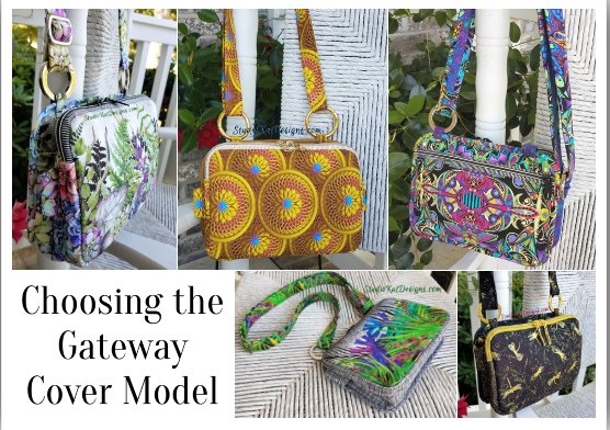
with yet another pattern almost in the books, it’s time to choose the ONE bag sample that best represents the GateWay design for the pattern cover! In order to do this, I like thinking about which of our samples would most appeal to our customers… which one would gather the most attention at shows… and especially, which one would be the one most likely to compel a customer to pick up our pattern to give it a 2nd look!
But here’s the thing… before I make this decision, I REALLY love hearing which bag YOU would choose to be on the cover if you were ME. WHY? Maybe its because pattern design is such solitary business and I like the interactions… who knows? At any rate, I get a kick out of hearing your reasoning so let’s get started!
You’ll find all 5 of our GateWay cover candidates pictured above (and below) in the order in which they were introduced to you in this series, (just click the link under each individual picture to see the original post associated with each sample). And oh yeah… and don’t forget to keep scrolling down to read up on the criteria you’ll need to consider before putting on your “designer hat” and choosing which bag YOU would place on the cover if you were ME! Because after all, it’s not really about which bag you LIKE the best!
So let’s get started!

So… now that you’ve seen the choices, here’s the criteria to keep in mind as you make YOUR choice!
1. Consider MORE than just your personal favorite. Of course the sample you choose should be appealing to you, but always consider how much “universal appeal” a bag has. Would it appeal to MOST people?
2. Will it turn heads? Ideally, a cover sample should “stand out in a crowd”! By definition it’s a show bag. It’s not meant to fade into the background or look good with your entire wardrobe.
3. Do the fabrics used draw attention to the design’s key features? Some prints are so “busy” that all you can see is the print. I want interesting fabric, that’s for sure, but I want the design to shine thru unimpeded, because after all, I’m not selling fabric!
4. Does the sample include ALL the design features promised in the verbiage on the cover. Here’s the thing… the model that is chosen for the cover is the model that will MOST be associated with the design… it’ll be the “spokesmodel” so to speak. But if it’s missing a promised exterior pocket for example, then every single person who picks up that bag at the shows we travel to, will want to know why it doesn’t, or worse still, they’ll think that the design DOESN’T include an exterior pocket at all.
5. Is it photogenic? Sometimes, for reasons that I’ll never understand, (probably because of MY photography skills), certain samples just don’t photograph well. No matter the lighting…. no matter the background….no matter… what… I…. do! But here’s the deal, no matter how pretty and ideal it is in person, if it doesn’t photograph well, or if I cannot seem to get a decent photograph of it, then it’s just NOT a good candidate for our cover model!
6. Does it actually LOOK like “our brand”? Our goal is for our customers to be able to identify a pattern as belonging to our line without even seeing the title or our logo on the front cover of the pattern. We would be doing ourselves no favors for example, if we suddenly departed from a “formula” that’s worked for us for 15+ years and placed a model on the cover that just doesn’t look like something we would put forward!
7. Is it created with a special pieced exterior? As most of you know, I LOVE piecing my way to a unique exterior, but I’ve learned from bitter experience and quite a few scoldings (reference the Lollapalooza) that placing a model with such an exterior on our pattern cover is just NOT a good idea. BUT– if there are actual pattern pieces for this special exterior, and those pieces can be included in the pattern package itself (reference the Uptown Saddlebag or the Triple Play, then it CAN in fact be placed on the front cover.
So…Are you ready to have a little FUN?
Because now it’s time for YOU to put on YOUR “designer hat”! … after reconsidering all five of these samples with the seven criteria above in mind, I’d love to know which one YOU would choose to grace the cover of our GateWay pattern.
But don’t forget—I would also enjoy hearing the reasoning behind your choice. 🙂 And do stay tuned for the next post in this series to see how closely your choice mirrored ours when I reveal which model really will actually be on the cover of the GateWay pattern. I’m SO looking forward to seeing your comments! You probably don’t know this, but this is one of my two favorite posts of the whole year!
************************************************************************
Check out the best sewing pins with me on Pinterest, join in on discussions or show off your work in our FaceBook Group, or get your daily sewing fix on our Facebook Business Page or get behind the scenes scoops on Instagram, and be the 1st to know about new patterns, discount codes and sample sales by signing up for our monthly newsletter.
46 Comments
Join Our Mailing List!
Click button below to get 15% off your 1st pattern!


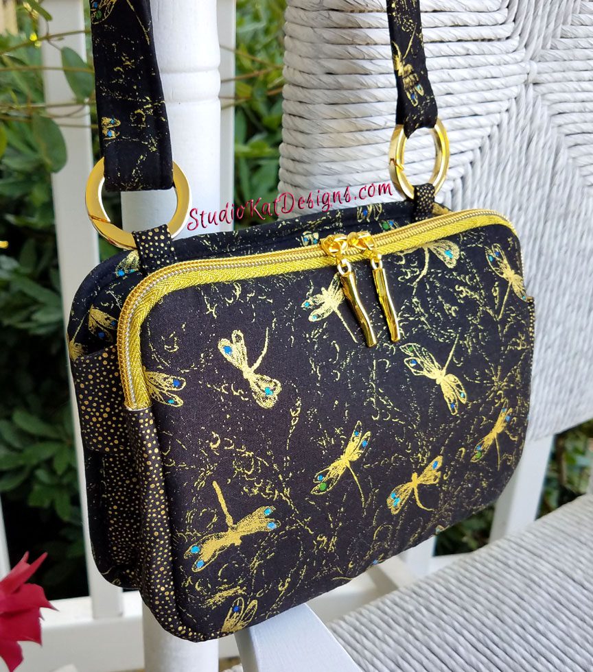
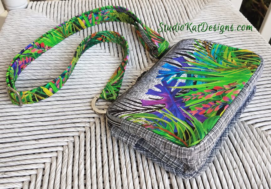
The Dragonfly or Safari would be my pick. You have two that are too busy and one that’s too light and would show the soil too easily though beautiful.
The two preferred show the contrast of the sides and bottom and the features well. Hopefully the interior isn’t too dark so one can find what’s inside.
The ornamental rosettes. Yellow catches the eye. There is so much depth and dimension in the photo, I want to pick it up and look closer. It has photographed neat and crisp. I like the neatness of the finished project. The hardware shows beautifully.
I like the more is more, although it is a busy print, I think it’s very eye-catching. It definitely delivers when it comes to color.
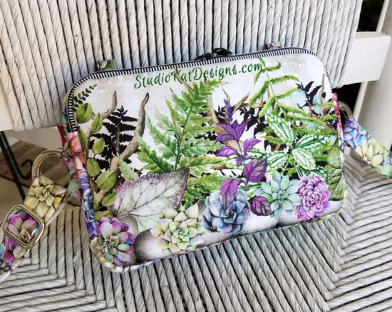
Terrarium I think meets the criteria best. It has a universal theme. The colors attract attention without overwhelming softer taste. It will always photograph well mostly because if the theme and colors.
I would choose the Dragonfly with Safari a close second. It seems Safari shows off the shape and features best. Also, these two have the side tabs in the correct spot. The earlier samples had it in a lower position that you didn’t deem as “balanced” which is definitely needed when carrying a purse. The gold zipper really adds a touch of class.
P.S. Really like the new website design!
Oops, I meant DRAGONFLY shows off ….. Hmmm, maybe subconsciously I really like the Safari better? 🙂
Dragon flies fabrics best show off the details of the design/pattern. The bags all have lovely fabrics, but dragonflies is the fabric that I keep going back to in order to see details of design.
Dragon Fly–it is simple and shows the features
Dragonfly not overwhelming shows features. Most universally appealing.
Dragonflies is my favorite of the five, but the very best example of this bag in my opinion, is the bag made from the cork. It is the one example so far that has stopped me in my tracks and made me consider making the bag.
I also really like the cork bag!
YES! I thought cork too when I saw it.
I would pick More Is More because it is eye catching and also reveals the opposite side of the bag with another zipper pocket that the other photos do not!
Ornamental rosettes is an eye catcher. I love the dimensional look. The gold rings , zipper and pattern make this bag a stunner!
I think the Dragonfly bag best showcases the wonderful details you have incorporated in your design.
I like the contrast of Dragonflies, but love the Safari fabric (itself). I think the Ornamental roses is too many gold rings and the clasps kind of get lost. More is More seems too busy and detracts from aspects of the purse (the zipper pocket seems more of a design detail than an actual pocket! Can’t wait for the pattern to come out.
Safari With Me is my choice as you can see most of the design details in that photo.
Can’t wait for this pattern to release! My daughter’s Grandmother-in-love asked me to make her a purse/bag almost exactly like this. She likes the idea of a crossbody bag similar to the way they are wearing the “fanny” packs now, hands free but still accessible since she uses a cane for walking when she is out shopping.
I’m not a particularly floral person, but this time my vote goes to Terrarium. I like the fact that it was a revision on a previous one, and that it used the 1 1/4 ” Gateway clasp. (Still have to find some in the UK).
I’ve heard that ochre/mustard is the big color for this fall (through a mutual friend who is currently traveling in Italy) so I’d pick Rosettes for that reason. And, though not on this list…the cork one is my favorite.
I like the Dragon fly.
Dragonflies definitely! I can see the details of the bag better, it is not as bright as the others but that’s a plus. When the fabric overwhelms the design, I can’t see the details like I want to. When I am buying a pattern, I want to know as much about the design and features as I can before spending my money! (I am not cheap, just practical.). And if I spend the money for a pattern, I want to make sure that after I buy it, I will actually use it!
Love the name by the way. (It was part of the suggestion I gave you from the newsletter last month!)
My favorites are Terrarium or Safari because of the fabric. Whichever one is selected, I think it’s important that the photo be of the purse standing and at an angle so you can see the front and the side. Every one has color preferences, so for me the most important aspect would be to see the design of the bag, side and front.
While Rosettes gets you with a Wow!, I think Dragonfly or Safari are the two top contenders. Both are eye catching and show off the pattern details the best. If I had to pick one of those 2, I’d go with Dragonfly. They are all gorgeous!
I think the black dragonflies print best shows the design. My personal favorite is the lightest one with the leaves, but I feel the dragonflies print showcases the golden rings & the zippers nicely.
I would choose Safari is me. It would grab my attention. If I am going to spend time making a bag I want it to make a statement. Showing a photo of a stunning but not overly busy bag would attract attention. We see the details of the bag clearly. Good job!
Dragon fly! The gold makes it pop! The terrarium looks like there is a crease on the front… pocket, something. The rosette is kind of plain. The safari, you can’t see the bag. The more is more, is just ugly!
Although they are all pretty in their own way the one that catches my eye the most is the Ornamental Rosettes. Normally anything with blue in it catches my fancy but I was drawn to this the first time you posted it. Even tagged my daughter in law so she didn’t miss it. My second choice would be the Terrarium bag. I love plants although I have a black thumb and kill more than I grow. The colors in the bag are also pleasing to my eye. Can’t wait to see what your selection is!
I really think the Ornamental Rosette is the most eye-catching purse. The material catches your attention and then you look at the details.
Dragonflies & Safari with Me are my favorites. I would like to see at least two different fabrics, like on clothing patterns, so you can get an idea of more than just one fabric.
More is more caught my eye right away!
More is more
I like the Terrarium … but where is the cork…that one was gorgeous !
The Ornamental Rosettes fabric fascinates me and catches my eye because it has a 3-D effect (at least on my monitor). However, it looks like its side attachments are lower than in the final placement. Likewise, the Terrarium side rings seem smaller than in the final design although it is gorgeous. I like Safari but for some reason I can’t articulate, I don’t think it is your cover bag. That leaves the Dragonflies and More is More. Honestly I’m kind of flip flopping on those two. The Dragonflies might be a little dark, but More is More is a little busy in terms of viewing the side details. Both are stunning in their own ways. It’s fun to try to pick one, but honestly, I’m not sure how you end up picking. Even considering all the criteria, it’s not easy. I can’t wait to see which one it will be! And I agree with the others who mentioned the cork bag. It is stunning! I’m sure it would be show catcher, but I’m not sure what it would look like on the pattern cover as I don’t have it in front of me to analyze.
The Dragonfly photo shows off the features of the bag best, the rings, the zipper and the compartments seen from the side. More is more looks more like one of your bags,, but the photo view is not the best.
I really like safari, but I think dragonflies shows off the pattern best.
I think that Dragonfly is interesting enough to draw attention but not so bold as to repel people who don’t like “in your face ” prints. Rosettes is beautiful too but my first thought is, “Do I have to do embroidery?” It has so much visual dimension. Details on Dragonfly are easily distinguished.
#1 pick is Ornamental Rosettes: fabric shows the space you have to show off other motifs. Zippers & ring connections show well. #2 pick is Dragonfly: shows off the design of the bag better, but is not as much of an eye catcher as the gold of the rosettes. Other fabrics are pretty, but lose the bag design as a immediate eye draw. Personally I would be more drawn to the Rosettes at a show/stand.
The Ornamental Roses catches the eye, although it’s my least favorite. I prefer the Safari and the Terrarium, but their fabric designs are busy and your details don’t stand out. Also they might fade into the background among other purses. My second choice is the Safari. Although the fabric is busy, you’ve got the non-busy contrast that will show off details nicely.
The dragonfly would be my choice. I can’t seem to find the cork one so I will have to say dragonfly. It’s eye catching but not too busy. It also shows of the design nicely.
Ornamental Rosettes would not be my favorite as I am not a fan of yellow. But the pattern stands out in a crowd and also highlights the new gateway rings. Attachment placement is immaterial (excuse the pun) as it probably would not be noticed on the cover page.
Ornamental roses caught my eye immediately. But after reading through consider these: I would choose the dragonflies. It has a serene character and would appeal to most . To me it represents the style of SKdesigns that I have come to expect.
I love green as it is my favorite color. I would make in green for me, but Still would put Dragonflies on cover. Then put others on reverse to show that other choices are possible.
Can not wait for this one.
Pegeth
Not personally fond of the Rosette material one yet it is the one that shows the details the best. The Dragon Fly is nice material and appeals to many but is not as eye catching as the Rosette. The more is more is out as it is way too busy, and the Terrarium Style is nice material that I personally would choose but for showing the bag it hides much of the detail. The Safari With Me is very pretty but I remember you saying that the companion fabric was from your stash so right there that would eliminate it as a cover photo . People always want to use the material that the sample was done in.
More is More, ‘tho a trifle busy pattern, is the only photo that shows that are 2 zipper compartments and that there are alternate ways to attach the straps.
More is more! Dragonflies might show the features more clearly, but I love More is More!
When I first saw all of the pictures I chose the green one with black and white on the sides. Then today when you sent out all the pictures in a group that one just faded away and the gold one stood out and said see me, look at me!
So if you want one that says look at me the gold one is it.
My choice is Terrarium.. it’s very attractive and would look great with any outfit. It is a theme that catches the eye, The colors come across and show the simplicity of the design very well. Actually, the first time I saw this, I wanted to make the bag!