PPC34: Help Us Choose the Expand-o-Matic Cover Model
So…. we’re almost ready to publish another pattern! But before we can do that, we need to choose the ONE sample that will best represent our new Expand-o-Matic design & become the “cover model” for the pattern! To do this, I like thinking about which of our samples would most appeal to our customers… which one would cause folks to stop mid-scroll to give this design a 2nd look!

But here’s the thing… before I decide, I’d LOVE to have YOUR input!
I REALLY love hearing which bag YOU would choose to be on the cover if you were ME. Do you think it might be because pattern designing is such a solitary business and therefore I like need the interaction? Could be….who knows? At any rate, I get a kick out of learning which would be YOUR choice and also hearing the reasons you feel that way!
So with that, here’s the EIGHT choices to consider for our Expand-o-matic Cover Model.
(to see more pictures of each sample, just click on the link provided.)


September 12, 2025 - Steampunking it!

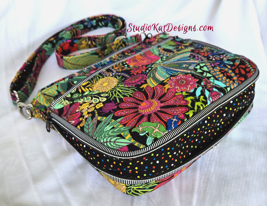
September 17, 2025 - Twilight Dance


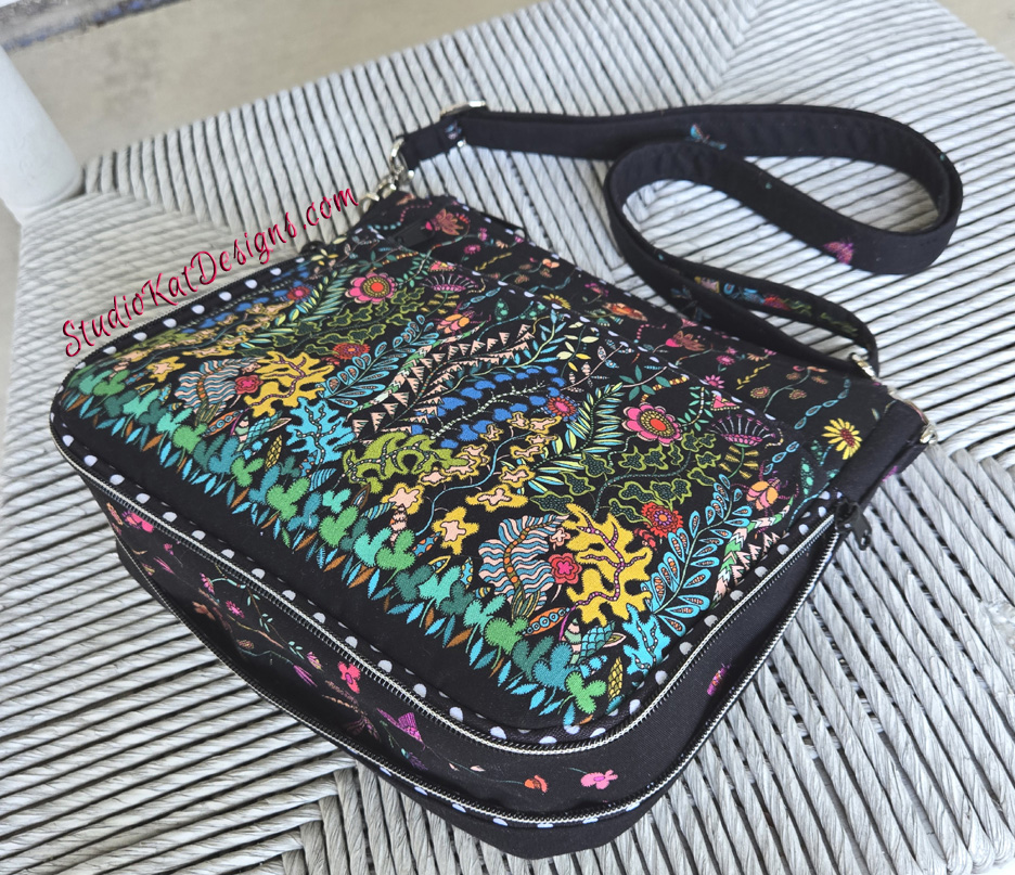
November 12, 2025 - Dancin' in the Moonlight

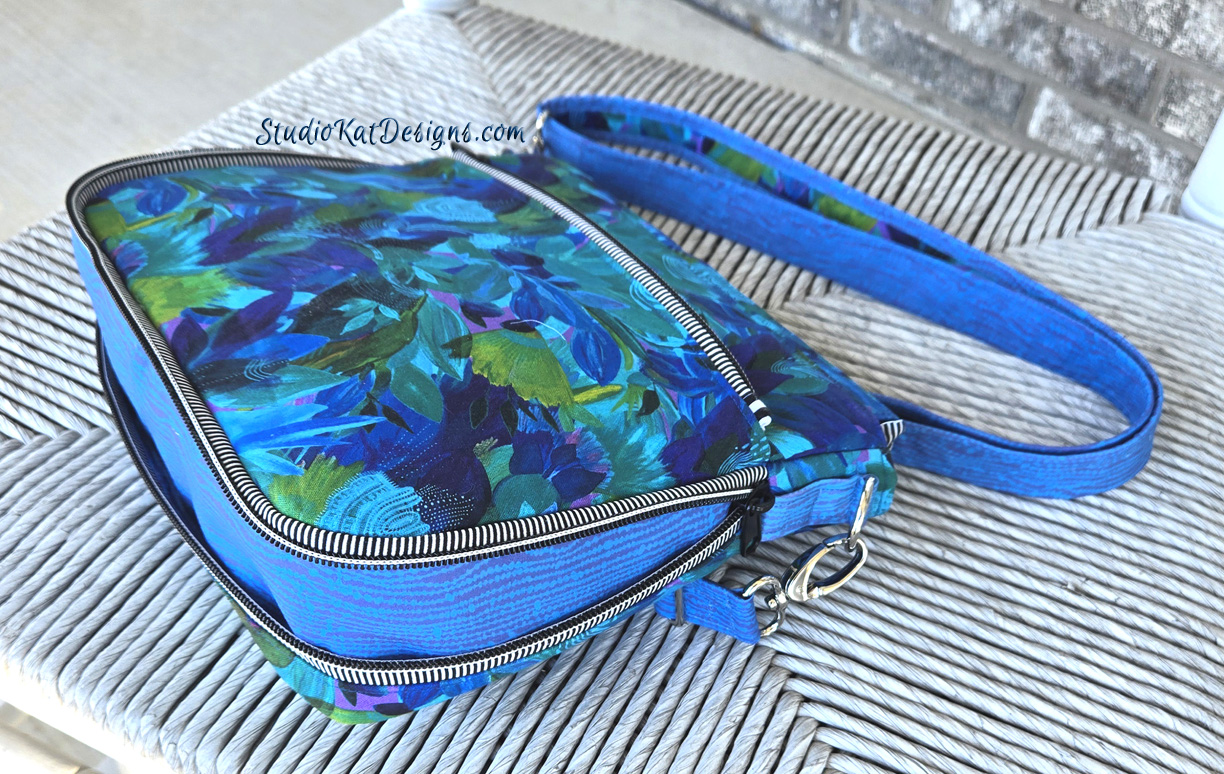
December 9, 2025 - Butterfly Wings

December 9, 2025 - Cactus Flower

January 5, 2026 - Affinity
So... Having seen all Expand-o-Matic options, here’s the criteria I would LOVE for you to consider as you make YOUR choice!
1. Consider MORE than just your personal favorite. Of course the sample you choose should be appealing to YOU, but always consider how much “universal appeal” a bag has. Would MOST people find it appealing?
2. Will it turn heads? Ideally, a cover sample should “stand out in a crowd”! By definition it’s a show bag. It’s not meant to be neutral, to fade into the background or to look good with virtually every outfit we might wear!
3. Do the fabrics used draw attention to the design’s key features? Some prints are so “busy” that the bag features seem to disappear because all you can see is the PRINT! I strive for interesting fabric, that’s for sure, but I also want the design elements to shine thru unimpeded, regardless of the fabrics I’ve chosen. Sometimes contrast fabrics or unique zippers can aid in this. 🙂
4. Does the sample include ALL the design features promised in the verbiage on the cover? Because here’s the thing… the model that’s chosen for the cover will be the model that will MOST be associated with this design… it’ll be the “spokesmodel” so to speak. But if it’s missing an expected exterior pocket (for example), then every single person who picks up that sample at stores or shows will want to know why it doesn’t, or worse still, they’ll think they’ve actually been misled about what features are included in the pattern!.
5. Is it photogenic? Sometimes, for reasons that I’ll never understand, (probably because of MY photography skills, or more accurately the lack thereof), certain samples just don’t photograph well. No matter the lighting…. no matter the background….no matter… what… I…. DO! But here’s the deal, no matter how pretty and ideal it is in person, if it doesn’t photograph well, or if I cannot seem to get a decent photograph of it, then it’s just NOT a good candidate for our cover! It can still be a fantastic “show bag”, but it just won’t be the best “cover model”.
6. Does it actually LOOK like “our brand”? Our goal is for our customers to be able to identify a pattern as belonging to our line without even seeing the title or our logo on the front of the pattern cover. We would be doing ourselves no favors for example, if we suddenly departed from the “formula” that’s worked for us for 20+ years and placed a model on the cover that just doesn’t look like something we would put forward!
7. Is it created with a special pieced exterior? As most of you know by now, I LOVE piecing my way to a unique exterior, but I’ve learned from bitter experience and quite a few scoldings from irritated customers (reference the Lollapalooza) that placing a model with such an exterior on our pattern cover is generally NOT a good idea. BUT– if there are actual pattern pieces for this special exterior, and those pieces can be included in the pattern package itself (reference the Uptown Saddlebag or the HipBag Hybrid, then it CAN in fact be placed on the front cover.
So…there you have it! Are you ready to have a little FUN because I’m so looking forward to hearing your responses!? But don’t forget—I would also enjoy hearing the reasoning behind your choice. 
Check out the best sewing pins with me on Pinterest, join in on discussions or show off your work in our FaceBook Group, or get your daily sewing fix on our Facebook Business Page or the behind the scenes scoops on Instagram! And don’t forget to check out our video tips & tricks on our You Tube Channel and be the 1st to know about new patterns, discount codes and sample sales by signing up for “Bag Making is Fun”, our bi-monthly newsletter.

I’m torn between Dancing in the Moonlight and Butterfly Wings. Both meet all the requirements, as far as I can tell. They’re all beautiful.
I agree that they are both beautiful. I really couldnt go wrong with any of them this time! 🙂
I love the butterfly wings, Blue is such a well-liked color, and my own customers are always asking for butterflies and dragonflies. Also, it shows off the expansion zipper perfectly~
Thanks Margaret! That fabric is amazing, no doubt about it! 🙂
I like both Sketches and Affinity. Sketches shows that there is a pocket on one side and a zipper pocket on the other; although you have to look closely to determine this. Affinity shows off the expanding feature at the bottom. All of the samples are really beautiful, however, some of the contrasting fabric used takes away from showing off the pattern.
Thanks for your input Sharon! I cant wait to release this pattern! 🙂
I like the “Twilight Dance” fabric, I think it pops and really looks good on this bag.
I love that fabric too! I really couldnt go wrong choosing ANY of these bags! Its a good position to be in! 🙂
I choose the “Butterfly Wings”. It definitely catches the eye and shows features, while nit being in your face.
The Butterfly wings fabric is by Chong A-Hwang, one of my designing favorites! 🙂
I like Sketches and Cactus Flower. But I’m thinking Cactus Flower would be the better choice because it has all the final design changes.
I loved the Cactus Flower fabric from the moment I saw it! Thanks for commenting Karen! 🙂
I’m voting for Twilight Dance because it screams “Studio Kat” to me. However Affinity is my second choice because it showcases the featured expanded bottom in contrast the best.
Well… I gotta love ANYTHING that screams “StudioKat! ” right? Thanks so much
I like Antique Machines and Dancing in the Moonlight. They both have enough contrast to see the expandable option.
Thanks Caryn. I cant wait to show you our finalcover!
I like Dancin in the moonlight. It has variety in colors that will go with anything.
I love that fabric too Marci! 🙂
Affinity is my choice. It’s beautiful , striking, and checks all of the boxes in my opinion.
The saturation of color in the Affinity fabric is striking! 🙂
I like the Affinity! Right away, it caught my eye. I think it meets all the qualifications. Love the color!
I do too! Thanks for commenting Delores!
Dancing in the Moonlight.
Definitely this one
All have eye appeal. I love how the gusset contrasts, yet compliments the focus fabric.
The two that would show off the design features are Cactus Flower and Affinity.
Cactus Flower has a look that would coordinate with most wardrobes, and is very appealing. The insert is clearly part of the design . And the two fabrics are clearly seen in the strap.
In a monochromatic presentation, Affinity will also show the design features. Using unique and contrasting zippers and hardware pulls it together. Good in. The photo.
My personal favorite is Moonflower because the print is evenly distributed and the gusset is subtle. More my style.
Thanks Alma Lou! I love hearing your thoughts behind the choices! 🙂
I’m voting for sketches. Love the fabric. They are all beautiful. for the addition to the cover I like the Hip bag Hybrid.
Thanks for commenting Eileen. I always hearing these pints of view! 🙂
They are all lovely but I keep going back to Affinity. Not only is the fabric eye appealing but the simple contrast fabric highlights the expand-o-matic feature.
That’s true. Its been hard making this choice! 🙂
Twilight Dance speaks the loudest to me because of the coordination of the zippers with the fabric.
Thanks so much Barbara! 🙂
1. Steampunk – because steampunk is still a favorite with people and because the bottom and exterior are so contrasting. And the exterior fabric is so rich looking that it immediately drew my eye to it. It’s the most elegant version shown.
2. Dancing In The Moonlight – because the flowers are vibrant enough to draw the eye but “generic” enough to interest many types of people. The way you’ve made it, the bottom fabric appears to be a horizontal print as opposed to the exterior fabric’s vertical lineup which also draws the eye (as opposed to polka-dots which don’t stand out quite as much).
Love hearing your reasoning. Thanks for the comments Mea!
They are all gorgeous, but I really like the Cactus Flower. I lived in Arizona for 29 years. My friends there would love this fabric.
It’s a new fabric and should be available locally now. 🙂 Thanks for commenting Karen.
I haven’t really watched the process on this since I’ve been off the blog, but I am not sure that any of the versions are really perfect. Each has their plusses, but they also have major detractors. I think that your first sample, Sketches, shows the features of the bag the best, but it doesn’t scream your brand. Most of the bags, because they are lying down, don’t really show the features other than the expandable bottom. From that viewpoint it’s difficult to see the front zippers, and none show the back pocket. They do a better job of identifying the bag as a Studio Kat design, but if I don’t see the zipper or pocket clearly, I’m not likely to purchase the pattern. I think for me the best at all the criteria is the Antique Sewing Machines. It’s a slightly different look for you, but the bones of your “brand” are there in the notions, specifically the bold gold and black zippers and hardware, which make the design features pop. My second choice would be Twilight Dance, as most all features are very visible, but the fabric isn’t say Studio Kat to me as much as the Sewing Machines.
I liked reading your logic Vreni! Thanks for the comments.
🙂
Dancing in the Moonlight was my initial first choice. The use of that fabric panel created a beautiful bag. But then I read some comments about people who liked Butterfly Wings so I went back and looked closer at that. Butterfly Wings is my first choice. The gold hardware against the fabric is stunning. As far as appealing to a wide audience, the combination of purple and blue is always a winner. The fabric choice is spot on.
Great comments Laura. We’ll reveal our choice soon! 🙂
Sketches is my favorite