Help Us Choose the Cignet Phone Pal Cover Model
So…. we’re almost ready to finish up another pattern! But before we can, we need to choose the ONE sample that will totally represent our new Cignet Phone Pal design & become the “cover model” for the pattern! To do this, I like thinking about which of our samples would most appeal to our customers… which one would garner the most attention at those upcoming trade shows which are SO visually noisy… & especially, & perhaps more importantly, which sample would be the one most likely to compel a customer to pick it up for that all-important CLOSER look!

But here’s the thing… before I decide, I’d LOVE to have YOUR input!
I REALLY love hearing which bag YOU would choose to be on the cover if you were ME. Do you think it might be because pattern designing is such a solitary business and therefore like need the interaction? Could be….who knows? At any rate, I get a kick out of learning which would be YOUR choice and also hearing the reasoning behind your pick!
So with that, here’s the SEVEN choices for us to consider for our
Cignet Phone Pal Cover Model.

the Prototype - 04/29/25


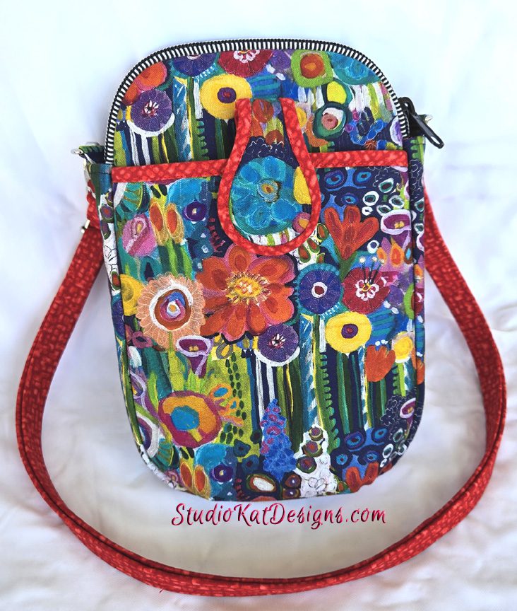
Fantasy Garden - 05/23/25

Denim Fantasy - 06/02/25

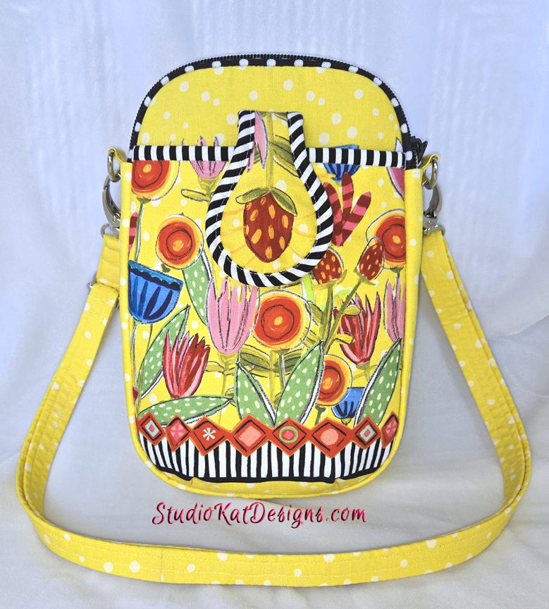
Happy-Go-Lucky - 6/6/25

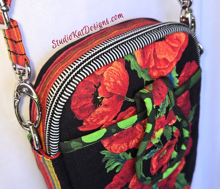
Poppies - 7/1/25

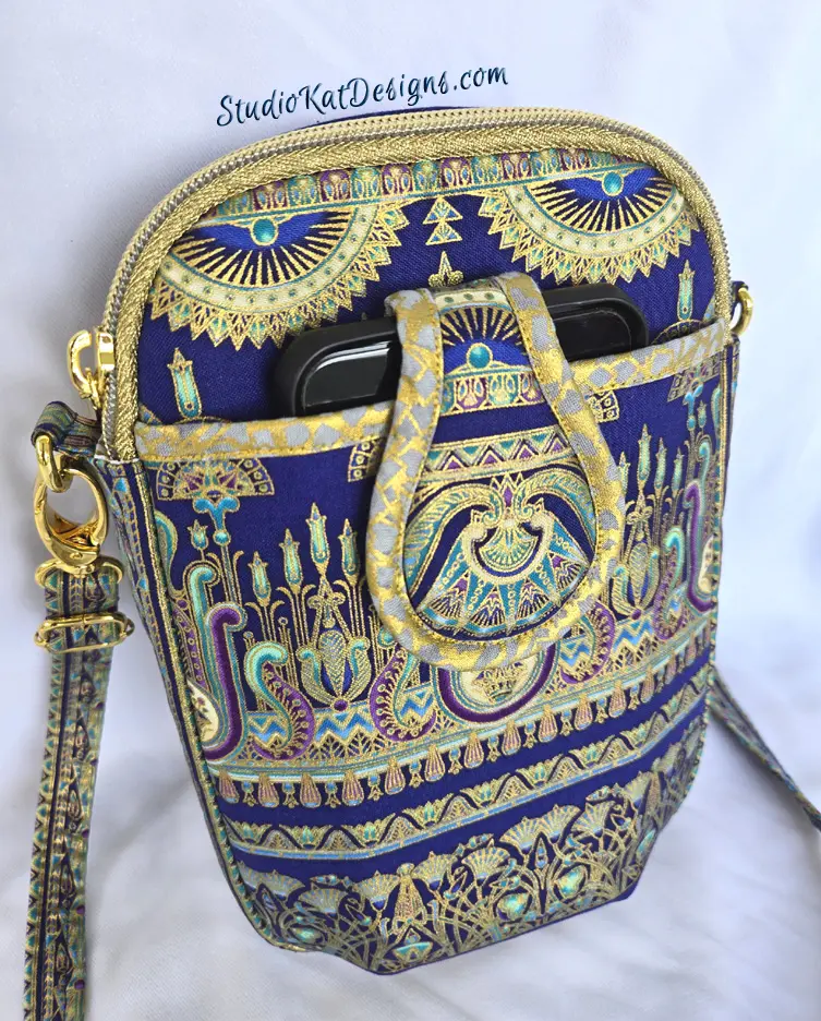
Palatial - 7/3/25
So… having seen all Cignet Phone Pal options, here’s the criteria
I would LOVE for you to consider as you make YOUR choice!
1. Consider MORE than just your personal favorite. Of course the sample you choose should be appealing to YOU, but always consider how much “universal appeal” a bag has. Would MOST people find it appealing?
2. Will it turn heads? Ideally, a cover sample should “stand out in a crowd”! By definition it’s a show bag. It’s not meant to be neutral, to fade into the background or to look good with virtually every outfit we might wear!
3. Do the fabrics used draw attention to the design’s key features? Some prints are so “busy” that the bag features seem to disappear because all you can see is the PRINT! I strive for interesting fabric, that’s for sure, but I also want the design elements to shine thru unimpeded, regardless of the fabrics I’ve chosen.
4. Does the sample include ALL the design features promised in the verbiage on the cover? Because here’s the thing… the model that’s chosen for the cover will be the model that will MOST be associated with this design… it’ll be the “spokesmodel” so to speak. But if it’s missing an expected exterior pocket (for example), then every single person who picks up that sample at stores or shows will want to know why it doesn’t, or worse still, they’ll think they’ve actually been misled about what features are included in the pattern!.
5. Is it photogenic? Sometimes, for reasons that I’ll never understand, (probably because of MY photography skills, or more accurately the lack thereof), certain samples just don’t photograph well. No matter the lighting…. no matter the background….no matter… what… I…. DO! But here’s the deal, no matter how pretty and ideal it is in person, if it doesn’t photograph well, or if I cannot seem to get a decent photograph of it, then it’s just NOT a good candidate for our cover! It can still be a fantastic “show bag”, but it just won’t be the best “cover model”.
6. Does it actually LOOK like “our brand”? Our goal is for our customers to be able to identify a pattern as belonging to our line without even seeing the title or our logo on the front of the pattern cover. We would be doing ourselves no favors for example, if we suddenly departed from the “formula” that’s worked for us for 20+ years and placed a model on the cover that just doesn’t look like something we would put forward!
7. Is it created with a special pieced exterior? As most of you know by now, I LOVE piecing my way to a unique exterior, but I’ve learned from bitter experience and quite a few scoldings from irritated customers (reference the Lollapalooza) that placing a model with such an exterior on our pattern cover is generally NOT a good idea. BUT– if there are actual pattern pieces for this special exterior, and those pieces can be included in the pattern package itself (reference the Uptown Saddlebag or the HipBag Hybrid, then it CAN in fact be placed on the front cover.
So…there you have it! Are you ready to have a little FUN because I’m so looking forward to hearing your responses!? But don’t forget—I would also enjoy hearing the reasoning behind your choice. 🙂 And do stay tuned for the next post in this cycle of Purse Pattern Chronicles to see how closely your choice mirrored ours when I reveal which model really will be on the cover of our new pattern. I’m SO looking forward to seeing your comments! (You probably don’t know this, but this is one of my two most favorite posts of the whole year!)
Check out the best sewing pins with me on Pinterest, join in on discussions or show off your work in our FaceBook Group, or get your daily sewing fix on our Facebook Business Page or the behind the scenes scoops on Instagram! And don’t forget to check out our video tips & tricks on our You Tube Channel and be the 1st to know about new patterns, discount codes and sample sales by signing up for “Bag Making is Fun”, our bi-monthly newsletter.

Hello, I love this bag and can’t wait to make one!!
As far as my favorite presentation I would go for the Palatial. Not so much for the fabric choice but for the angle of the photo. It shows the features plainly. The zipper, the closure, and the depth of the front pocket. Its not just a slit, it actually has room.
I love the floral choices but the details get lost in the photo.
Thanks for all you do!! Love yhe kitties as well.
Thanks Mary! It’s always such a hard choice! 🙂
I actually like “The Prototype” because it really shows off the bag features. I can already see that this is a bag that I’m going to make because I need something to carry my phone and other small things (eye drops, small container of advil, a pen and a small pad of paper) when I go on quick errands.
That being said… I adore the “Denim Fantasy” one because that pieced design on the front pocket is very eye catching. Denim upcycling seems to be gaining popularity. Do you think that marketing for that purpose would help it sell??? I think the denim photo is the one that would make me stop and pick up the pattern to look at.
I do agree that I would appreciate having the pattern to make the pieced outer layer in a pattern that showed it on the outside. But I wouldn’t be angry if it wasn’t included, I would just figure it out on my own. I’m sorry that people have given you problems in the past.
Thanks for voting Cathy! I probably won’t include the pattern piece for the pieced pouch in the pattern, but would probably include them as a FREE download on the website instead. 🙂 Hope this helps.
My vote — Palatial
Thanks for voting Janice! I love that one too! But its so hard to choose!
Shangri-La gets my vote.
Thanks Karen! That’s one of my favorites as well! 🙂
I think Happy-Go-Lucky for the cover. Gives happy look and looks easier than some of others.
My personal favorite is Denim Fantasy with the “aliens” in the fussy cut design. Also see her on the Fantasy Garden. The yellow-green face with blue & orange eyes. Looks like her tongue sticking out . Upside down still an alien,
maybe sister of other one. Fun fabrics!
Interesting ideas! Thanks so much for your comments Nina! 🙂
Denim Fantasy. The fabric allows the details to be clearly shown. It gives us a piecing idea if we are also quilters ( like me).
I have many of your patterns.
Thanks for your input Karen! 🙂 Such a hard choice
My personal favorite is the Poppies. However, I think the Prototype would be a more universal model.
Thanks for your assistance Ellen. I sure appreciate the help! 🙂
Happy go Lucky
Modern, eye catching, stylish, happy and fun to look at
I really like this sample too, I wonder about the universal appeal though. 🙂
Choices! I can boil it down to two! Palatial is elegant with a beautiful pattern of print that attracts the eye. It clearly shows the design elements. I love the print, and the color is one that can be worn and be very classy! Shangrila is so appealing. The focal point as a flower also shows the features of the pattern. It is fun, but elegant! The choice is yours!
Thanks a bunch Alma Lou! What to do? I have to make up mind pretty soon though! 😀
To me, the poppies are the most visually compelling. They are different enough from your usual style to make this pattern pop and show the beauty of fussy cutting.
Thanks for commenting SUe! I loved the Poppies version as well, but using that fabric for this design presented some special considerations in the fussy cutting so regrettably it was out. 🙂