So…. we’re almost ready to finish up another pattern! But before we can, we need to choose the ONE sample that will totally represent our new High Seas Convertible design & become the “cover model” for the pattern! To do this, I like thinking about which of our samples would most appeal to our customers… which one would garner the most attention at those upcoming trade shows which are SO visually noisy… & especially, & perhaps more importantly, which sample would be the one most likely to compel a customer to pick it up for that all-important CLOSER look!
But here’s the thing… before I make this decision, I’d SO love to have YOUR input!
I REALLY love hearing which bag YOU would choose to be on the cover if you were ME. Do you think it might be because pattern designing is such a solitary business and therefore like need the interaction? Could be….who knows? At any rate, I get a kick out of learning which would be YOUR choice and also hearing the reasoning behind your pick!
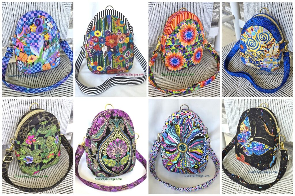
So with that, here’s the choices to consider for our
High Seas Convertible cover model.
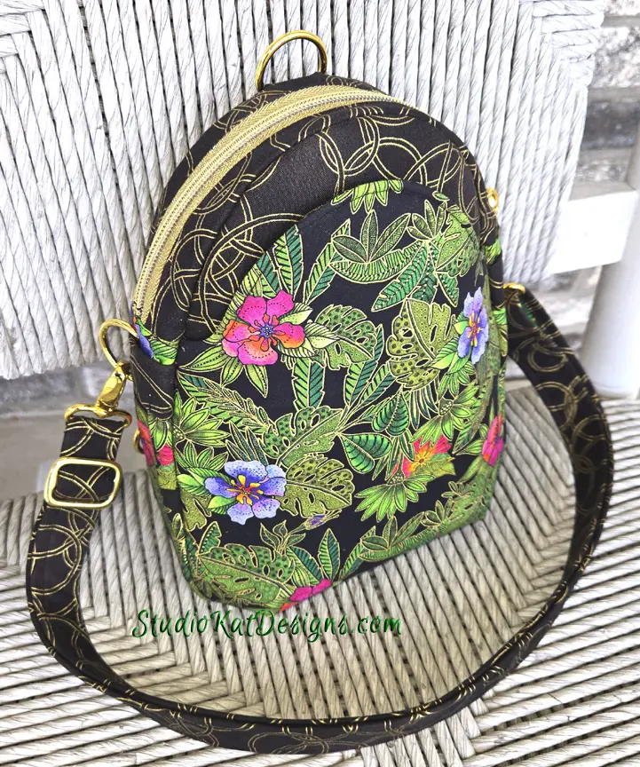
Laurel Burch Forever – 4/16/24
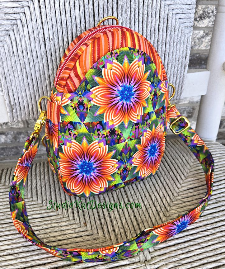
Fractal Flowers – 5/3/24

Butterflies are Free – 6/13/24
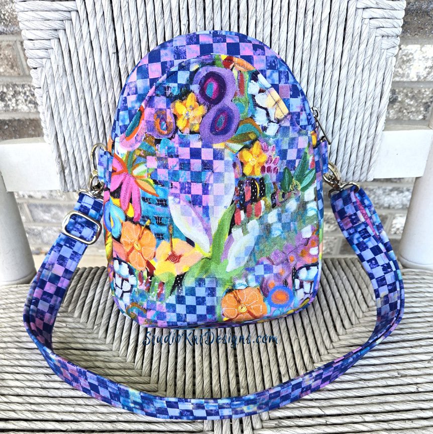
Checks & Balances – 6/18/24
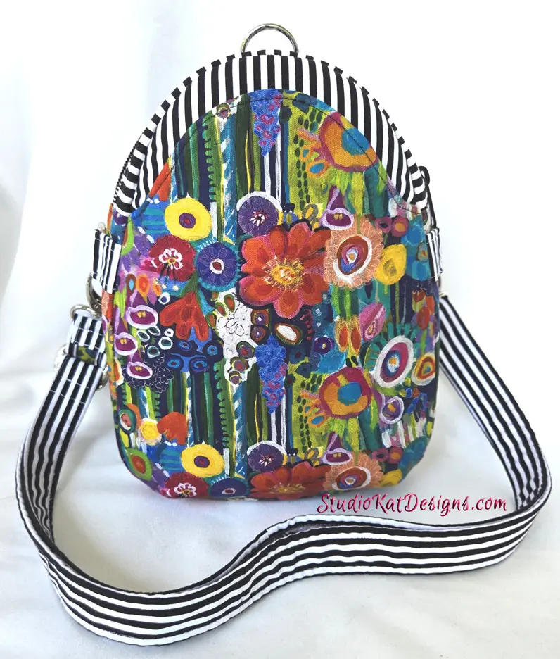
Flowering Stripes– 7/1/24

Purple Paisley – 7/12/24

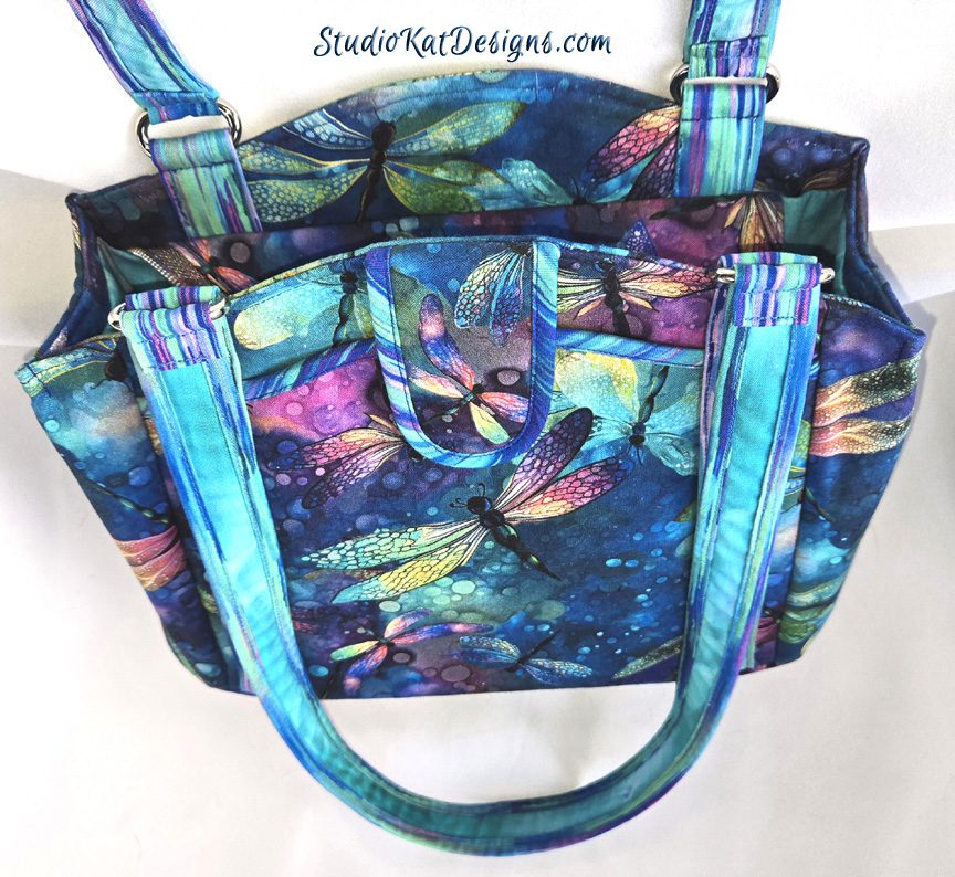
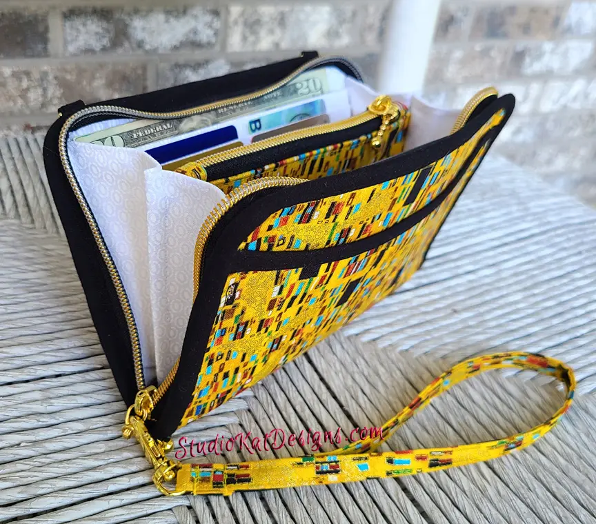
Wings of Gold – 7/16/24
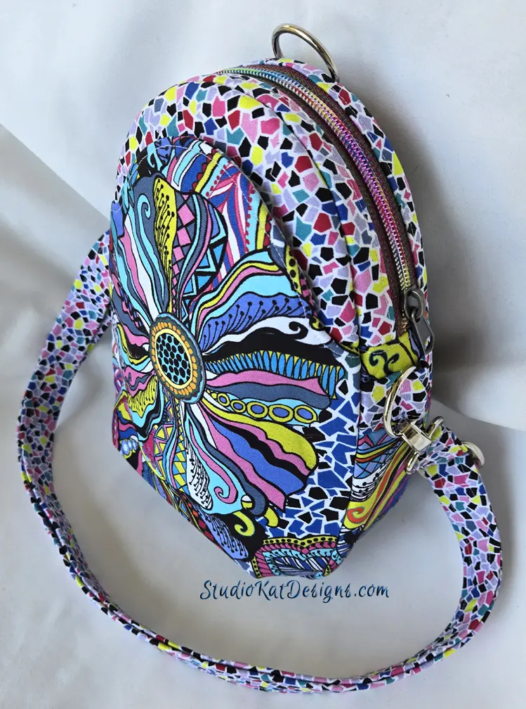
Color & Light – 7/19/24
So… having seen all EIGHT options, here’s the criteria
I would LOVE for you to consider as you make YOUR choice!
1. Consider MORE than just your personal favorite. Of course the sample you choose should be appealing to YOU, but always consider how much “universal appeal” a bag has. Would MOST people find it appealing?
2. Will it turn heads? Ideally, a cover sample should “stand out in a crowd”! By definition it’s a show bag. It’s not meant to be neutral, to fade into the background or to look good with virtually every outfit we might wear!
3. Do the fabrics used draw attention to the design’s key features? Some prints are so “busy” that the bag features seem to disappear because all you can see is the PRINT! I strive for interesting fabric, that’s for sure, but I also want the design elements to shine thru unimpeded, regardless of the fabrics I’ve chosen.
4. Does the sample include ALL the design features promised in the verbiage on the cover? Because here’s the thing… the model that’s chosen for the cover will be the model that will MOST be associated with this design… it’ll be the “spokesmodel” so to speak. But if it’s missing an expected exterior pocket (for example), then every single person who picks up that sample at stores or shows will want to know why it doesn’t, or worse still, they’ll think they’ve actually been misled about what features are included in the pattern!.
5. Is it photogenic? Sometimes, for reasons that I’ll never understand, (probably because of MY photography skills, or more accurately the lack thereof), certain samples just don’t photograph well. No matter the lighting…. no matter the background….no matter… what… I…. DO! But here’s the deal, no matter how pretty and ideal it is in person, if it doesn’t photograph well, or if I cannot seem to get a decent photograph of it, then it’s just NOT a good candidate for our cover! It can still be a fantastic “show bag”, but it just won’t be the best “cover model”.
6. Does it actually LOOK like “our brand”? Our goal is for our customers to be able to identify a pattern as belonging to our line without even seeing the title or our logo on the front of the pattern cover. We would be doing ourselves no favors for example, if we suddenly departed from the “formula” that’s worked for us for 20+ years and placed a model on the cover that just doesn’t look like something we would put forward!
7. Is it created with a special pieced exterior? As most of you know by now, I LOVE piecing my way to a unique exterior, but I’ve learned from bitter experience and quite a few scoldings from irritated customers (reference the Lollapalooza) that placing a model with such an exterior on our pattern cover is generally NOT a good idea. BUT– if there are actual pattern pieces for this special exterior, and those pieces can be included in the pattern package itself (reference the Uptown Saddlebag or the HipBag Hybrid, then it CAN in fact be placed on the front cover.
So…there you have it! Are you ready to have a little FUN because I’m so looking forward to hearing your responses!? But don’t forget—I would also enjoy hearing the reasoning behind your choice. 🙂 And do stay tuned for the next post in this cycle of Purse Pattern Chronicles to see how closely your choice mirrored ours when I reveal which model really will be on the cover of our new pattern. I’m SO looking forward to seeing your comments! (You probably don’t know this, but this is one of my two most favorite posts of the whole year!)
Check out the best sewing pins with me on Pinterest, join in on discussions or show off your work in our FaceBook Group, or get your daily sewing fix on our Facebook Business Page or the behind the scenes scoops on Instagram! And don’t forget to check out our video tips & tricks on our You Tube Channel and be the 1st to know about new patterns, discount codes and sample sales by signing up for “Bag Making is Fun”, our bi-monthly newsletter.




Flowering Stripes
Wings of Gold. Striking, shows elements at a glance. Classic Kat.
I figured you’d like that one Don! 🙂
Laurel Birch forever is my choice doesn’t have to be a fussy cut but could stands out but not to pop your eyes out I love them all but that would be my cover choice. I could see my fabric on it.
Flowers and stripes shows pictures for Checks and flowers.
I wanted to see back shots for Flowers Stripes before a vote.
Hi Nina- Thanks for commenting… and if you click over to the post (link provided) you will see links to each one of these samples as we made them with multiple shots of each, including the back
🙂
I love Laural Birch and butterflies and the colour orange but my choice is Purple Paisley. It shows off the wonderful shape of the bag, it’s eye catching and I do believe your talent with fussy cutting is part of your ” brand” and this demonstrates that the best of all the bags.
Thanks for commenting Lorna. It’s such a hard choice! 🙂
Fractal Flowers fill the criteria. The bright contrast of the orange with the blue is an eye catcher. The fabric highlights the design features of the pattern. Though I liked the Butterflies are free fabric, it doesn’t show off the design features. A great cover model
Thanks Alma! I really appreciate your input!
🙂
Butterflies are Free
Thanks Jo Lacy 🙂
For my personal use, I’d pick Butterflies are Free, but to show off the features, I think Fractal Flowers catches your eye and shows off the front shapes.
Thanks for your help Barbara! 🙂
For me it was a toss up between 3 bags until I went to the page for each individual bag. Flowering Stripes gets my vote. It will appeal to so many different people. Thank you for including photos from all sides and of the bag in use,
Thanks so much for your comments. I really love hearing the reasoning behind your shoices! 🙂
I choose Wings of Gold. It is lovely fabric and a beautiful bag. but, my main reason, above those is because I can actually easily. see the design of the bag itself. I love the wild bright colors of your bags and fabrics, but to be honest they are often so visually busy, I cant see the details of the bag and its construction and features. My thought is.. if you are selling the pattern… you need to be able to see the details. I know you also sell fabrics, and I love seeing it made in different fabrics, but it needs to be a clean uncluttered image to sell the pattern to me.
Thanks so much Candice. I very much appreciate your comments! 🙂
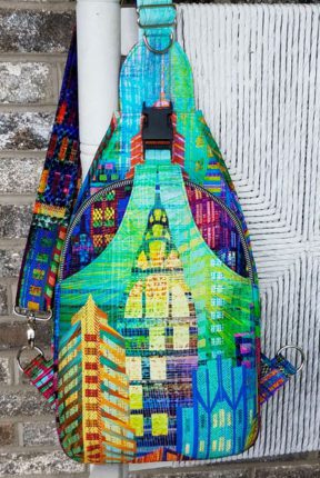
This is a very difficult choice because they are all fabulous! Wings of Gold & Color& Light are my personal favorites because I can’t pass up a creative mix of patterns & colors .
Checks and Balances…I just love those colors.
Thanks Charlene! Will we see you in Houston?
🙂
I think that Fractal Flowers, Flowering Stripes, and Wings of Gold are the ones which most highlight the cool curved front pocket. My final choice for a cover bag would be Flowering Stripes because the black and white is very eye catching and yet it complements and sets off the flowered fabric perfectly. Fractal Flowers is a close second because of its vibrant color. Wings of Gold is very elegant, but it ranks third in my choices because the gorgeous blue recedes more than the colors of the other two samples. Therefore, it might not stand out quite so much at first glance. That being said, I’d be proud to carry any one of the sample bags as I think they are all beautiful.
Thank you for this very thoughtful comment Beth! I really love hearing the logic behind the choice! In this particular case, I really could have gone a variety of ways. I was fortunate to have so many beautiful fabrics to use this time! 🙂
I like both Laurel Burch Forever and Butteflies are Free. To me they are elegant without being busy.
Thanks Carol. It’s such a hard choice!
Color and light shows the unique lines while still wowing the eye with color. I also love flowering stripes. It stands out for being bold and different, but I wonder if it’s prescriptive? Buyers might not see past the stripes to imagine their own vision.
Thanks for commenting Sue. I guess time will tell!