So…
As Quilt Shows slowly start coming back on line after the LONG pandemic shutdown, it’s worth noting that when the closing bell rang at the conclusion of the 2022 AQS Paducah show, we signified that we have completed a decade & a half of trade shows.
WOW!
It’s hard to believe we’ve been doing this for 15 full years! It doesn’t seem that long ago that we were nervously planning for our first Quilt Market in 2008, but in that length of time we’ve traveled and vended at 17 Markets and 29 separate retails shows. Our travels have taken us to the various corners of the US and many places in between… Pittsburgh PA, the Los Angeles area, Daytona Beach FL, Portland OR, Minneapolis MN, Lancaster PA, Hampton VA, Paducah KY, Kansas City MO, Salt Lake City UT, and of course Houston, TX.
So as 15 years of trade shows comes to a close, I thought it might be fun and about time to do another Booth Evolution post! Let’s look in our rear view mirror & see how our booth layout has evolved since the Spring of 2008 when we traveled to Portland, Oregon for our very first Quilt Market. (Then we’ll look forward to how our booth “look” might change as we head to Houston at the end of this month!)

And as bare bones as this booth display was, we basically stayed with this configuration for two more Markets (in Houston ’08 & Pittsburgh ’09), when we reluctantly admitted that we simply needed more room!
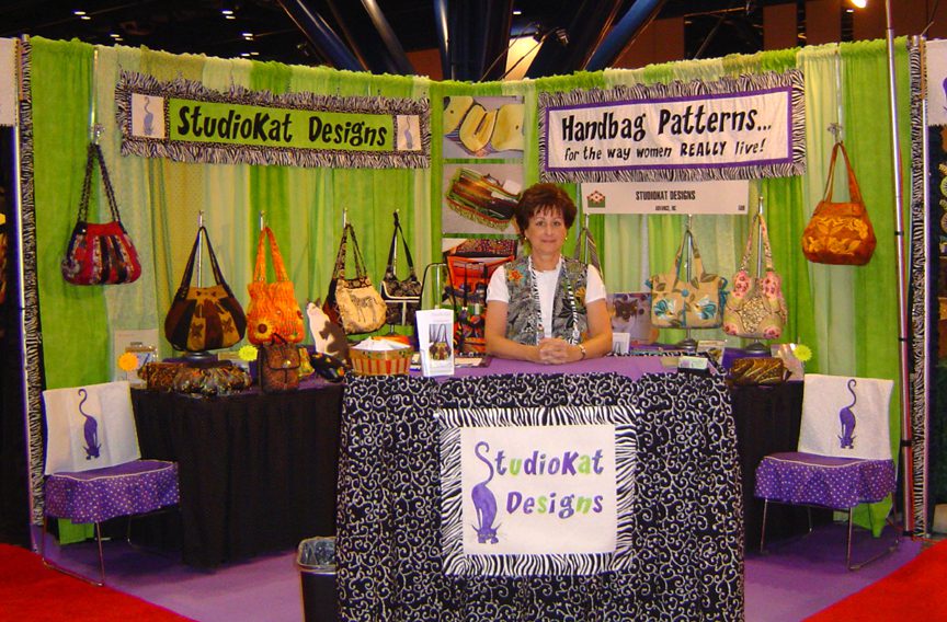

The only thing is, I wasn’t crazy about how the tall table hid a substantial part of the low tier of sample bags, so even though we kept this basic configuration, I fooled around with various small changes in Kansas City ’12 & Portland ’13, but here’s the deal, we knew we had to make some BIG changes in our display before returning to Houston in the Fall since we were seriously considering staying on for the Quilt Festival, the weekend after Market. YIKES!

Additionally, we were starting to question whether our revolving carousels were the best way to display our ever-growing zipper & hardware line. The carousels seem crowded and since at any given time, half of our products are facing AWAY from our customers, so we’ll try to come up with a better option!

Houston, Fall 2015– As you can see, not only did we expand to a THREE-tier bag display, but this time we left our revolving carousels home, opting to upgrade to a 6′ by 6′ gridwall for our zippers & hardware AND patterns. It also provided us with some nifty signage opportunities.
This proved to be a VERY effective layout for us (plus we had the added bonus of lots of behind-the-counter space), so we stayed with this configuration with only minor modifications well into 2017. When we suffered the theft of one of our Walkabout Wallet samples at the 2016 AQS Paducah show, we started researching ways in which we could keep our valuable samples secure, but still allow our customers to be able to handle them.

Which brings us to the AQS Daytona show in March ’17… If you look closely at the bag display area (above), you’ll see that we added 5 grid boxes to which we proceeded to secure our bags with spring cords. This seemed like a perfect solution for us because it kept our samples secure yet still totally accessible for our customers to handle and inspect.
And here’s the deal… I enjoyed using the grid boxes SO much that that made me wonder… What if I stacked these boxes TALLER so we could display our bags on TOP of them and in FRONT of them as we did in the picture above, but with room in between these two areas for our patterns to be displayed WITH the bags and who knows… maybe even with some notions?
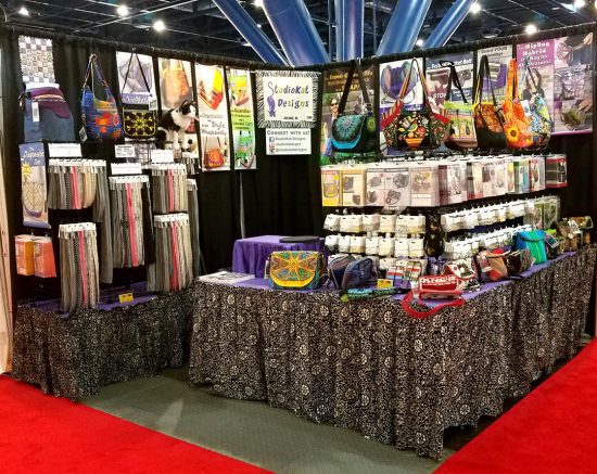
Additionally ,the other BIG change we made for this show was that we ditched the tall, white grid iron walls for our zippers and notions in favor of even MORE grid boxes (3 boxes wide by 3 boxes tall). I like this look better than the tall, white grid walls. It’s a FAR more cohesive look than anything we’ve accomplished so far, BUT… I wasnt particularly crazy about how part of the zipper area was technically within the confines of our booth interior for a LOT of reasons.
The down side? All these grid boxes (and there was THIRTY of them) took forever to put together and take down!)
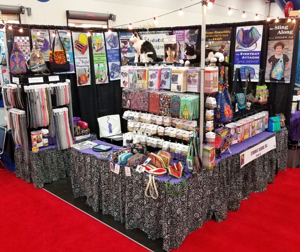
And I wrapped some of the zippers around the corner to the front of the display which was definitely less “deep” into our booth interior, which was good but there always seemed to be so many people shopping there that it kept me from gettig out from behind the counter to straighten up or restock critical items. On the positive side though, there were fewer gird boxes (only 24) to assemble which pleased the hubby.
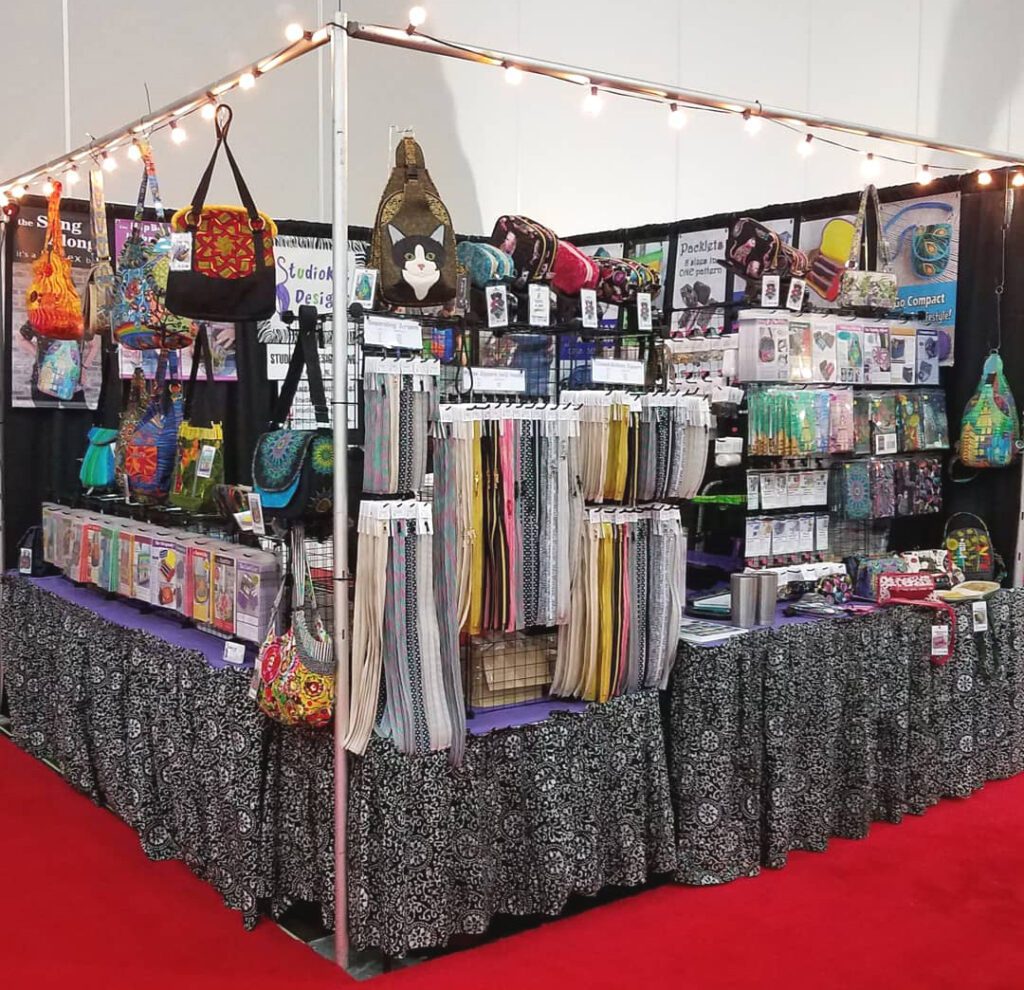
The advantage? It greatly speeds up the checkout process for our customers since we no longer have to help them find all the hardware items they need for each pattern, AND… we’re able to discount the hardware kits, which our customers appreciate! You might also notice that we starting experimenting a bit with hanging some of our bag samples from the overhead cross bars!

We still set up a few grid boxes (only 5) for the side area and for the very first time we made FULL use of the overhead cross bars which allowed us to showcase even more of our samples which gives our customers the benefit of seeing our designs in more than one colorway.

So… will this be the last incarnation of our booth.? That answer would almost certainly be NO! I’m constantly changing and tweeking our set up. We’ll probably stick with this arrangement for another show or two, but don’t be surprised if we make another significant change by the time we get to Houston this Fall and our first Quilt Market since the Fall of 2019! Will we see YOU there?
And now its YOUR turn….
I hope you’ve enjoyed our little trip down memory lane! Do you have a particular booth display that you liked better than any other? Or do you have any suggestions as to how we can improve upon our display? If so, please feel free to leave your questions and/or comments in the space provided below!
Check out the best sewing pins with me on Pinterest, join in on discussions or show off your work in our FaceBook Group, or get your daily sewing fix on our Facebook Business Page or get behind the scenes scoops on Instagram, and be the 1st to know about new patterns, discount codes and sample sales by signing up for our monthly newsletter.




I think solid black tablecloths would make your items show off better. Tableclothsfactory.com has good deals on them.
Have you tried the “Z” set up? I’m in a vendor group that this is very popular since gives more display / access space.
I hate those wire cubes also! Even using zip ties still awful to put together.
Thanks for commenting Nina, and I understand what youre saying, but solid colors usually require a good deal of ironing and I cant abide that. The batik tends to conceal and normal wrinkling that takes place in storage and shipment. And I’m not sure what the “Z” set up is…..