So…
with yet another pattern almost in the books, it’s time to choose the ONE bag sample that best represents the OutBreaker design for the pattern cover! In order to do this, I like thinking about which of our samples would most appeal to our customers… which one would gather the most attention at shows… and especially, and perhaps more importantly, which sample would be the one most likely to compel a customer to pick up that pattern and give it a 2nd look!
But here’s the thing… before I make this decision, I REALLY love hearing which bag YOU would choose to be on the cover if you were ME.
WHY? Maybe its because pattern designing is such a solitary business and I like the interactions… who knows? At any rate, I get a kick out of learning your choice and hearing your reasoning…

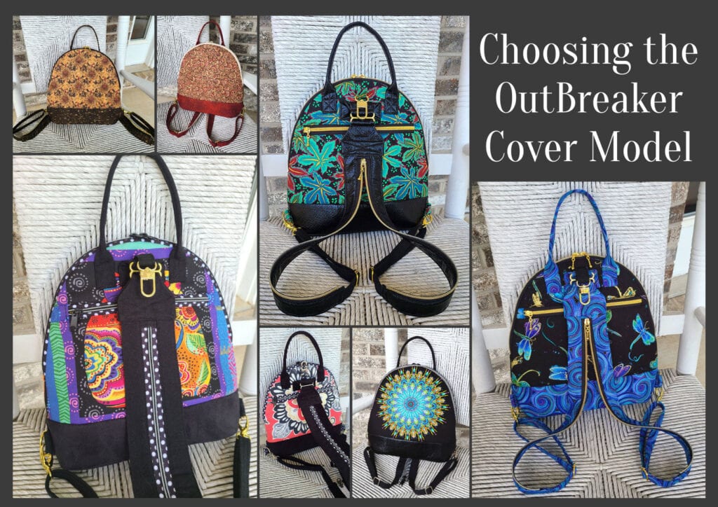
I have presented all SEVEN of our OutBreaker cover candidates in the order in which they were introduced to you in this series, (just click the link under each individual picture to see the original post associated with each sample). And oh yeah… don’t forget to keep scrolling down to read up on the criteria you’ll need to consider before putting on your “designer hat” and choosing which bag YOU would place on the cover if you were ME! Because remember, the worst thing you can do is to blindly choose the bag you LIKE the best!
So… now that you’ve seen the choices, here’s the criteria to keep in mind as you make YOUR choice!
1. Consider MORE than just your personal favorite. Of course the sample you choose should be appealing to you, but always consider how much “universal appeal” a bag has. Would it appeal to MOST people?
2. Will it turn heads? Ideally, a cover sample should “stand out in a crowd”! By definition it’s a show bag. It’s not meant to be neutral, fade into the background or look good with our entire wardrobe.
3. Do the fabrics used draw attention to the design’s key features? Some prints are so “busy” that the bag features seem to disappear because all you can see is the PRINT! I want interesting fabric, that’s for sure, but I want the design to shine thru unimpeded.
4. Does the sample include ALL the design features promised in the verbiage on the cover. Because here’s the thing… the model that is chosen for the cover is the model that will MOST be associated with this design… it’ll be the “spokesmodel” so to speak. But if it’s missing a promised exterior pocket for example, then every single person who picks up that bag at the shows we travel to, will want to know why it doesn’t, or worse still, they’ll think that the design DOESN’T include an exterior pocket at all.
5. Is it photogenic? Sometimes, for reasons that I’ll never understand, (probably because of MY photography skills), certain samples just don’t photograph well. No matter the lighting…. no matter the background….no matter… what… I…. do! But here’s the deal, no matter how pretty and ideal it is in person, if it doesn’t photograph well, or if I cannot seem to get a decent photograph of it, then it’s just NOT a good candidate for our cover model!
6. Does it actually LOOK like “our brand”? Our goal is for our customers to be able to identify a pattern as belonging to our line without even seeing the title or our logo on the front cover of the pattern. We would be doing ourselves no favors for example, if we suddenly departed from a “formula” that’s worked for us for 17+ years and placed a model on the cover that just doesn’t look like something we would put forward!
7. Is it created with a special pieced exterior? As most of you know, I LOVE piecing my way to a unique exterior, but I’ve learned from bitter experience and quite a few scoldings (reference the Lollapalooza) that placing a model with such an exterior on our pattern cover is just NOT a good idea. BUT– if there are actual pattern pieces for this special exterior, and those pieces can be included in the pattern package itself (reference the Uptown Saddlebag or the Triple Play, then it CAN in fact be placed on the front cover.
So…there you have it! Are you ready to have a little FUN?
Because now it’s time for YOU to put on YOUR “designer hat”! … after reconsidering all seven of these samples with the above criteria in mind, I’d love to know which one YOU would choose to grace the cover of our OutBreaker pattern.
But don’t forget—I would also enjoy hearing the reasoning behind your choice. 🙂 And do stay tuned for the next post in this series to see how closely your choice mirrored ours when I reveal which model really will actually be on the cover of the OutBreaker pattern. I’m SO looking forward to seeing your comments! You probably don’t know this, but this is one of my very favorite posts of the whole year!
And guess what? We have a private FaceBook Group page just for StudioKat Designs customers? It’s the perfect place for you to post pictures, comments or questions about our patterns! How cool is that, right? And don’t forget to check out the best sewing pins with me on Pinterest, get your daily sewing fix and behind the scenes scoops on Instagram, and be the 1st to know about new patterns, discount codes and sample sales by signing up for “Kat Bytes”, our monthly newsletter.
14 Comments
Join Our Mailing List!
Click button below to get 15% off your 1st pattern!


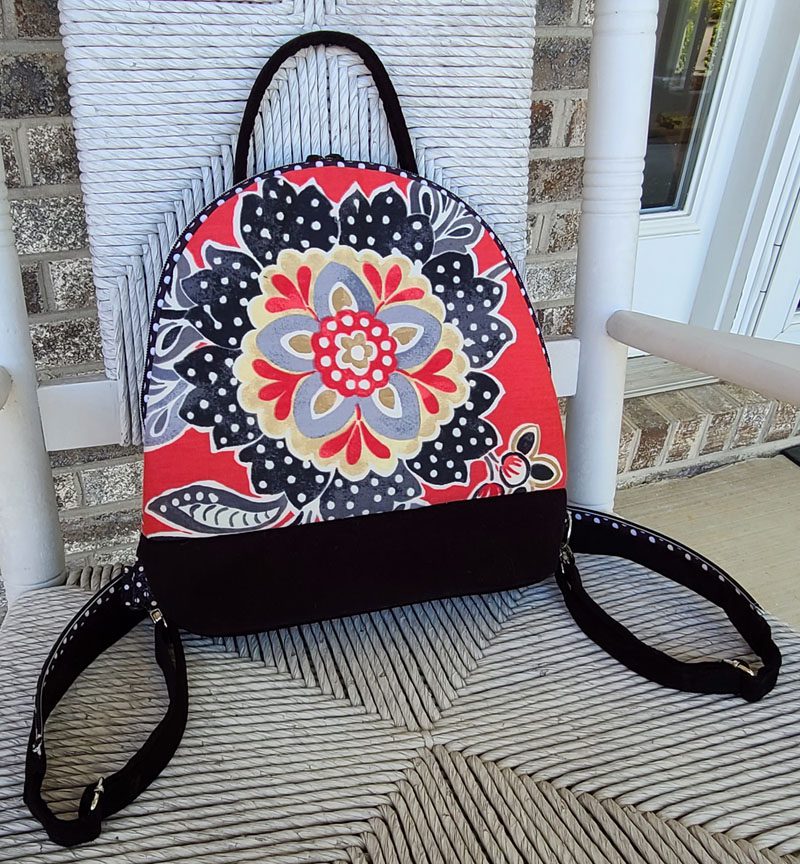
Wow! I worry when being the 1st to respond. So here are my top 3 and my reasons. 1. Kaleidoscopic Fun-that front image just jumps out at you. It’s the combination of the circular patter and the color. 2. Color By Kaffee–Again, the color makes the pattern jump out, and it’s not a small pattern. 3. Denim Sunrise–Like my #1, the design attracts you, but the colors don’t jump out quite as much as Kaleidoscopic Fun.
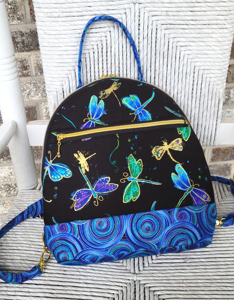
I did try to read your comments about each bag, but the last three didn’t link to anything. I like this bag design and the adaptable strap to take it to a back pack style. My visual fav is the Kaffe fabric. Glad you are being so creative! It is interesting to see these bags in the different fabrics! The Dragonflies are my number 2 fav.
My first choice is Color by Kaffe, followed by the Dragonflies. Kaleidoscopic Fun is definitely your style, but one of the others would be a good change up. Can’t wait to get the pattern!
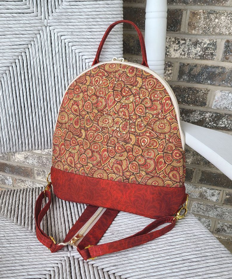
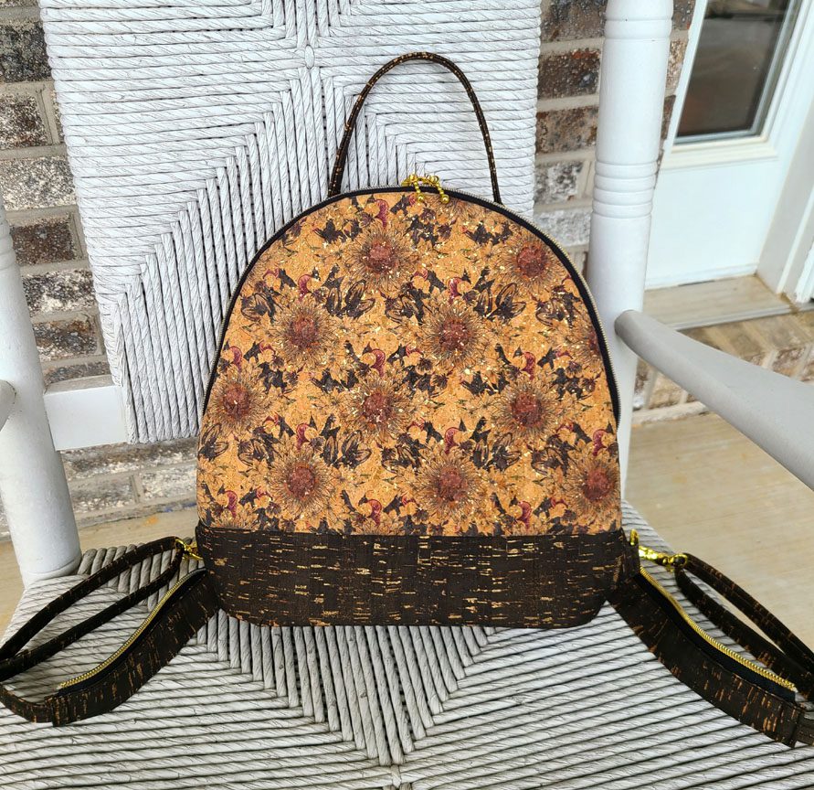
1st choice is Kaffe print, and 2nd choice is Butterflies. I like the vibrant colors of both and the zip open strap design “a really neat feature by the way” shows really well. Lots of contrast. My 3rd choice is Laurel Burch design as she has been a favorite of mine for since the 70’s. But HOLD THE PRESS, the Cork and Flowers is a great showcase for another masterful bag design. Thanks for letting me add my two-cents worth. Love to your Kitties, my actual favorites
Ok, using your criteria, I came up with “Color by Kaffe” as my first choice because it scored better based my interpretation of your criteria. My second choice is “Cat’s Meow” which was close on scoring, and third is “Dragonflies at Night” which I would give an extra point just because I like the theme and colors.
1st choice would be kaleidescopic fun, 2nd dragonflies, 3rd is cat’s meow. reasons: kaleidescopic fun good colors, it is a little less busy them cat’s meow and dragonflies, so the details may stand out more…. 2nd–a gut choice–simple, I like that shade of blue, and cat’s meow–I like cats and laural burch designs, but for me, it is a little bit busy, and the details seem to disappear into the print. 4th choice for me would be cork and flowers, but that may be a bit bland. there is a happy medium for the color and pizazz, I guess.
Given all the parameters for selection, I would say either Denim Sunrise or The Cat’s Meow. I like the vibrant colors of The Cat’s Meow and I also like that it’s a cat theme and it’s a fabric you sell. On the other hand, as far as seeing each design element, perhaps the back zipper is a “smidge” easier to see on the Denim Sunrise sample. I like all the colorful ones! I’ll be interested to see which one you choose.
Dragon Flies at Night. The fabrics are distinctive and eye catching. The bag design comes forward. It looks crisp and clean. All the details stand out.
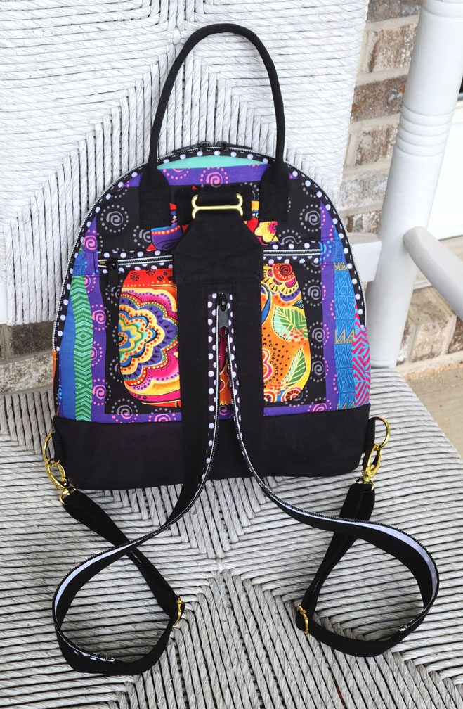
Using your criteria, The Cat’s Meow or the Dragonflies by Night. My REAL favorite of ALL samples, including gorilla samples, is Hay Diddle, Diddle. Just seems the perfect Hansel and Gretel type fabric that screams backpack.
My choice would be Dragonflies at Night. It’s bright colors catch your eye but don’t overwhelm you with too much pattern. The swirls go beautifully with the dragonflies. You can easily see all elements of the bag, unlike some of the other bags that seem to blend the elements into the background. Nice work! Would love to make this exact bag!
Although my personal favorite is the Color by Kaffe, I believe that the Cat’s Meow best fits the criteria for choosing a cover model. It definitely makes me think of your brand, it shows all the features well, is VERY photogenic and will definitely turn heads. The More Kaleidoscope Fun is a close 2nd though as I believe it fits all the criteria as well. I only put the Cat’s Meow 1st because of the cat design. I am very much looking forward to this pattern and trying out the new lock!! Thank you!
Color by Kaffe is my first choice. I think it is colorful and attention getting without being busy. The pattern details show up beautifully. In my opinion Red Abstract Cork and Cork and Flowers while both beautiful tend to be more bland in order to go with everything in our wardrobes. This is a positive for everyday use, but maybe not for a show bag. Dragonflies at Night has quite a lot of black, and The Cat’s Meow tends to show the pattern details less than the others (even though I’d personally love to have this bag!) More Kaleidoscopic Fun might deter persons who might worry that they couldn’t find a fabric that would fit the size of that bag as well as your fabric does. Denim Sunrise while probably my second favorite pick for a cover might not appeal to as many persons color-wise as does the fabric in Color by Kaffe. This is also one of my favorite of your posts because it’s fun to pick even though I’ve never picked the one you end up picking!
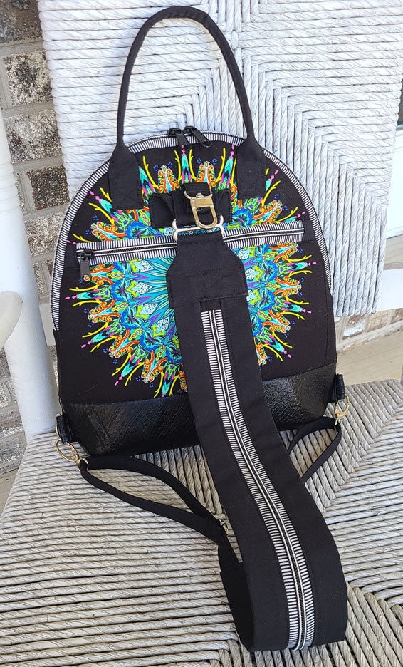
I would use the Kaleidoscopic Fun – the bag profile is overall black, but the striped zipper in the back showcases the pocket and the center motif blue just pops! The striping in the zipper doesn’t detract from the kaleidoscope, and overall, because you’ve used Paula Nadelstern fabric before, it is a familiar bag to Studio Kat customers.
The KAffe Fassett and the Denim Sunrise are also good picks, but neither fabric screams Studio Kat, and the colors are more muted. The same is true of the two cork bags. They are beautiful in themselves, but not outstanding.
Laurel Burch will be everyone’s favorite, but I agree with other posters that the pattern is too busy and the features of the bag disappear in it.
The dragonfly bag also pops, but there’s just something about it that doesn’t work for me. I think it’s the quilting cotton bag bottom – all the other bags have more solid, substantial bottoms and this one looks like it might not wear well.
All the bags are beautiful & the fabrics are wonderful, but my choice would have to be the Color by Kaffe bag. In this bag, all the elements seem to work together perfectly. And I really like that it is a little different from the typical StudioKat look.