So…
As we gear up for the 2017-18 show season, it’s worth noting that when the closing bell rings at the conclusion of this Fall’s Quilt Market in Houston, we will have completed a full decade of trade shows. It’s hard to believe we’ve been doing this for 10 full years! It doesn’t seem that long ago that we were nervously planning for our first Market in 2008, but in that length of time we’ve traveled and vended at 15 Markets and 15 separate retails shows. Our travels have taken us to the various corners of the US and many places in between… Pittsburgh, the Los Angeles area, Daytona Beach, Portland, Minneapolis, Kansas City, Salt Lake City, and of course Houston, TX.
So as our 1st ten years of trade shows comes to a close, I thought it might be fun and about time to do another Booth Evolution post! Let’s look in our rear view mirror & see how our booth layout has evolved since the Spring of 2008 when we traveled to Portland, Oregon for our very first Quilt Market.

Portland- Spring Market 2008 (above)– We arrived in Portland wide-eyed and naive. It’s almost impossible to believe but at this point but we actually packed everything we needed to set up our half-booth display in just 2 suitcases and carried it back and forth on the airplane with us! However, now that I look at this picture a little closer, maybe I can see why! 🙂
And as bare bones as this booth display was, we basically stayed with this configuration for two more Markets (in Houston ’08 & Pittsburgh ’09), when we reluctantly admitted that we simply needed more room!
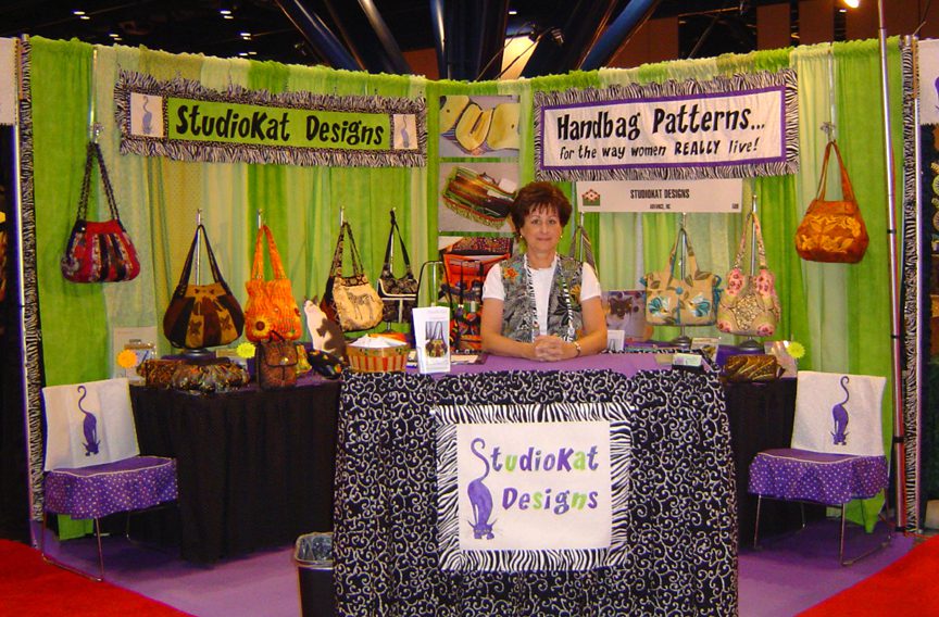
Houston- Fall Market 2009 (above) For the first time we…. arranged for a full-sized corner booth and shipped all of our supplies (in individual boxes via UPS) to the advance warehouse which made for a much more enjoyable flight, and also for the first time, we started using wreath holders to display our bags for a much more professional look, no?
We stuck with this basic set up for 3 more Markets, adding electricity in Minneapolis ’10, shelving in Houston ’10 & Salt Lake City ’11 for more display area )

Houston, Fall 2011 (above)– For this Market we added a few posters to our display as well as two counter-height tables and placed one each corner of our display. This added quite a big of extra surface area which was a good thing, because we never would have had room to debut our new Notions Line if we hadn’t. The only thing is, I wasn’t crazy about how the tall table hid a substantial part of the low tier of sample bags, so even though we kept this basic configuration, I fooled around with various small changes in Kansas City ’12 & Portland ’13, but here’s the deal, we knew we had to make some BIG changes in our display before returning to Houston in the Fall since we were seriously considering staying on for the Quilt Festival, the weekend after Market. YIKES!

Houston, Fall 2011 (above)– For this Market we added a few posters to our display as well as two counter-height tables and placed one each corner of our display. This added quite a big of extra surface area which was a good thing, because we never would have had room to debut our new Notions Line if we hadn’t. The only thing is, I wasn’t crazy about how the tall table hid a substantial part of the low tier of sample bags, so even though we kept this basic configuration, I fooled around with various small changes in Kansas City ’12 & Portland ’13, but here’s the deal, we knew we had to make some BIG changes in our display before returning to Houston in the Fall since we were seriously considering staying on for the Quilt Festival, the weekend after Market. YIKES!

Houston, Fall 2014 (above)– First, we added some colorful posters, along with more notions stands to handle our ever-growing zipper & hardware selection plus… we changed the floorplan again. The post show verdict?— This layout worked very well, BUT…. we had VERY little room to function behind the counter. As a matter of fact, after living in such tight quarters for 8 showdays, it was a wonder we were still speaking to each other when we flew home.
Additionally, we were starting to question whether our revolving carousels were the best way to display our ever-growing zipper & hardware line. The carousels seem crowded and since at any given time, half of our products are facing AWAY from our customers, we’ll try to come up with a better option!

Houston, Fall 2015– As you can see, not only did we expand to a THREE-tier bag display, but this time we left our revolving carousels home, opting to upgrade to a 6′ by 6′ gridwall for our zippers & hardware AND patterns. It also provided us with some nifty signage opportunities.
This proved to be a VERY effective layout for us (plus we had the added bonus of lots of behind-the-counter space), so we stayed with this configuration with only minor modifications until well into 2017. When we suffered the theft of one of our Walkabout Wallet samples at the 2016 AQS Paducah show, we started researching ways in which we could keep our valuable samples secure, but still allow our customers to be able to handle them.
Which brings us to the AQS Daytona show in March ’17…

If you look closely at the bag display area (above), you’ll see that we added 5 gridboxes to which we proceeded to secure our bags with spring cords. This seemed like a perfect solution for us because it kept our samples secure yet still totally accessible for our customers to handle and inspect.
And here’s the deal… I enjoyed using the grid boxes SO much that I started thinking of how I might use them to answer the question that has plagued us ever since we started vending, and that would be…
“Are you selling the finished bags or the patterns?
And that made me wonder… What if I stacked these boxes TALLER so we could display our bags on them and in front of them as we did in the picture above, but with room in between these two areas for our patterns to be displayed WITH the bags and who knows… maybe even with some notions?
And just so you know…
I’ve been playing around with this idea off and on ever since I got home from Paducah, with some very encouraging results, so stay tuned for our next post in this Booth Evolution series to see what could be the biggest change we’ve made in our booth display since we graduated from a single to a double booth back in the Fall of 2009!
And I hope you’ve enjoyed our little trip down memory lane! Do you have a particular booth display that you liked better than any other? Or do you have any suggestions as to how we can improve upon our display? If so, please feel free to leave your questions and/or comments in the space provided below!
Check out the best sewing pins with me on Pinterest, join in on discussions or show off your work in our FaceBook Group, or get your daily sewing fix on our Facebook Business Page or get behind the scenes scoops on Instagram, and be the 1st to know about new patterns, discount codes and sample sales by signing up for our monthly newsletter.
