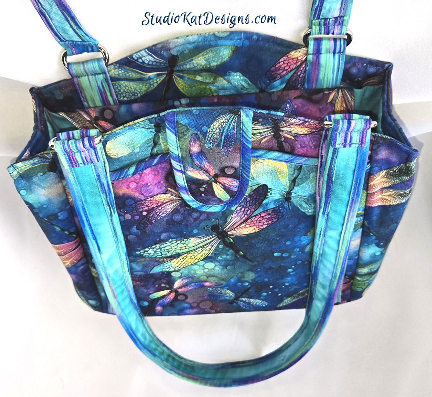
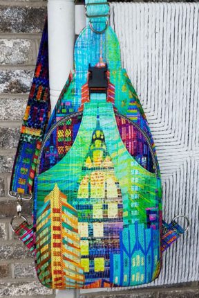
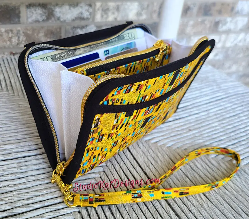
So…
in our last post we had a little fun letting YOU be the designer and choosing which of our bag samples YOU would choose to grace the pattern cover for our 1st new design for 2018, the Go-Go Compact. Thanks to everyone who participated! I always enjoy hearing about which bag my customers would choose and I especially enjoy reading about why you chose the bag that you did! We have really good reasons for the choice we made and I’ll go into details below, but now…
it’s time for the BIG reveal!
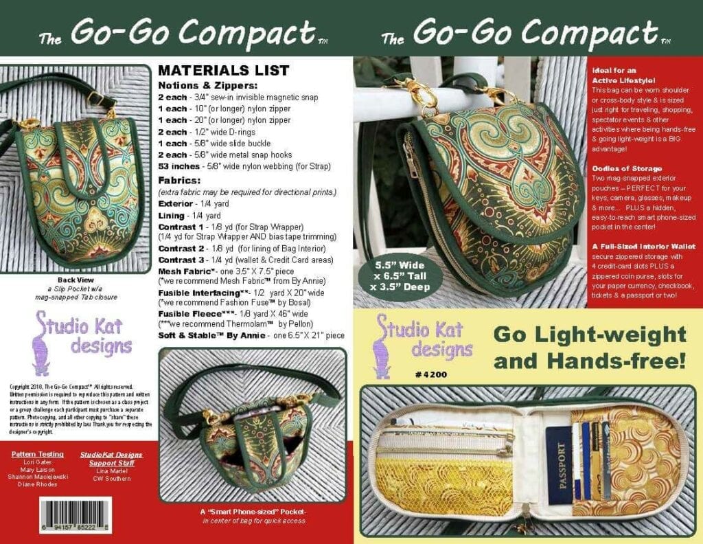
Pictured below is the actual pattern cover for the Go-Go Compact!
And now…
let me tell you why I chose THIS sample for our cover!
Ok, so this was the first sample we made which was completely “true to the design”…. that is, it included all of the promised features, inside and out.
And per usual, I used fabric from my stash for this sample because even though I was PRETTY sure we’d be making no more changes to the design or operation of this bag, I’m never completely sure until I’m well…. completely sure. And until then, I just use fabrics from my stash and you might recall that this fabric has already been featured in our HipBag Hybrid design, which automatically disqualifies it for consideration for the pattern cover even though it’s very beautiful!
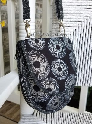
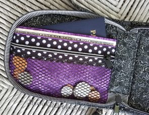
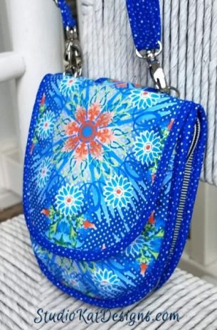
“Under the Sea” I actually REALLY loved this sample. Once it was made up it FAR exceeded my expectations. As a matter of fact, this little sample had a LOT going for it and I was very tempted to make it our cover model.But here’s the deal… I think I’ve chosen more blue-ish bags for our cover models than any other shade, so I told myself that unless there was just no other option, then I would try to stay away from blue for our pattern cover.So for that reason, this sample is out! 🙂
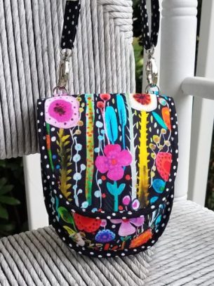
And I had high hopes for this particular sample because orginally I found this fabric to be particularly inspiring and I thought the polka-dot trim and zippers would be an excellent pairing… but it didn’t work out quite the way I thought it might.
Oh it’s a nice enough sample, but overall I find it quite busy. To me, the exterior print overwhelms the design features. In other words, if I was selling fabric, this would be a great sample, but since I’m selling the design, this fabric is taking center stage, and that is not my objective.
So even though I personally like this sample, it’s out! 🙂
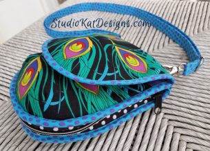
To be honest, my final decision for the pattern cover boiled down to the Medallion bag we chose and THIS bag, mainly because it photographed so beautifully.
Truth is, it’s practically perfect in every way and would have made a very striking cover, BUT, once again our color scheme would have primarily featured various shades of blue/purple. Because here’s the deal… in Houston I noticed some amazing similarities in MANY of our pattern covers, so I made a mental note to start varying the color schemes more because if a new pattern looks too similar to an older pattern, it can in fact be overlooked by customers. Don’t feel bad for this sample though, it ‘ll get PLENTY of mileage at the various shows we travel to next year!
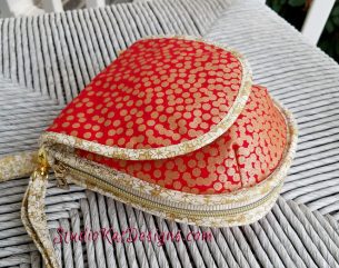
“Dot to Dots”
And even though I had GREAT hopes for this sample, (because it wouldn’t have looked at ALL like any of my previous pattern covers, right?).
But the final result was a bit of a disappointment because it just didn’t photograph well no matter the lighting or the angle. I’m thinking it’s because there’s SO much metallic shine in the fabric. But it’s quite compelling in person, so once again it should be popular on the show circuit, but for the pattern cover, it’s out!
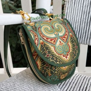
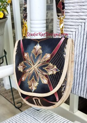
“Fussy-Cut Medallions”
So by now you know that THIS is the sample we chose to grace the cover for the Go-Go Compact pattern. The reason?
It photographed beautifully, accurately and demonstrates very graphically how stylish this little bag can be! It also demonstrates how our gold-trimmed zippers totally enhance this fabric, but over and beyond that….
- It showcases the design components and in fact draws attention to them.
- It’s compelling & will standout in crowded display or on a “loud” Market floor.
- It looks like our brand. Customers who know us would automatically know it was ours!
- Even though there were no specialty piecing techniques involved, this bag’s exterior has a lux, one-of-a-kind feel that’s reminiscent of specialty piecing.
- The color scheme is fun, bold and the colors of pine green, burgundy & gold are different than any we’ve used before!
So… in the final analysis, I felt that this bag best represented this design!
But you know what?
Call me crazy but I always love knowing if you agree with our selection or if you think we totally blew it! So please feel free to leave your comments and/or questions in the space provided below!
And please note– For this cycle, we’ll be announcing our pattern release in a SPECIAL late-month edition of our Newsletter complete with a few special discount offers exclusive to our subscribers. And if you’re not currently on our newsletter mailing list, you still have time to get in on the fun and pick up a nifty discount coupon too!) by clicking here or by joining our brand new StudioKat Designs Pattern Group on FaceBook!
Check out the best sewing pins with me on Pinterest, join our Facebook discussions, get your daily sewing fix and behind the scenes scoops on Instagram, and be the 1st to know about new patterns, discount codes and sample sales by signing up for our monthly newsletter.


