So…
It’s almost time to head for Houston and the 2015 version of the International Fall Quilt Market and since this will be our 15th Market I thought it might be fun and about time to do another Booth Evolution post (especially for our newer readers). So let’s look in our rear view mirror & see how our booth layout has evolved since the Spring of 2008 when we traveled to Portland, Oregon for our very first Quilt Market.
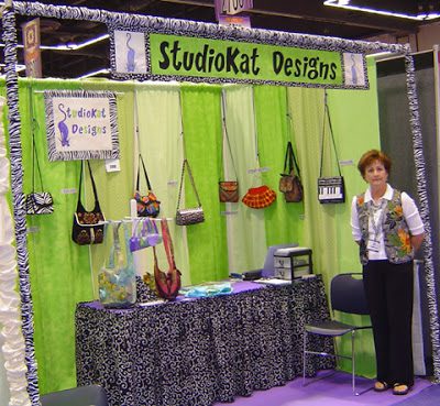
Portland- Spring 2008 (at left)- We arrived in Portland wide-eyed and naive. It’s almost impossible to believe at this point but we actually packed everything we needed to set up our half-booth display in 2 suitcases and carried it back and forth on the airplane with us! However, now that I look at this picture a little closer, maybe I can see why! 🙂
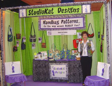
Houston- Fall 2008 (at left)- We added a new banner, an improved table display and made chair covers which gave our half-booth a homier look. Once again, we carried everything with us on the airplane, but vowed we’d never ever do that again!
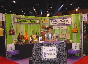
Houston- Fall 2009 (at left) For the first time we…. arranged for a full-sized corner booth and shipped all of our supplies (in individual boxes via UPS) to the advance warehouse which made for a much more enjoyable flight, and also for the first time, we started using wreath holders to display our bags, a much more professional look, no?
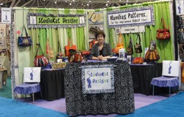
Minneapolis- Spring 2010– we rented electricity for the first time to light up our booth AND we brought actual patterns with us so that customers could take product away from Market with them!

Salt Lake City- Spring 2011– My Dad made us some portable shelving which was similar, (only taller & better) than the shelving we rented in Houston. This seemed to really open up the space, making it seem less crowded, don’t you think? BUT- even so, I knew we needed to change our set up somehow to give us a little more surface area and a better traffic flow for the Fall Market.
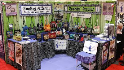
Houston, Fall 2011– For this Market we added a few posters to our display as well as two counter-height tables and placed one each corner of our display. This added quite a big of extra surface area which was a good thing, because we never would have had room to debut our new Notions Line if we hadn’t. The only thing is, I wasn’t crazy about how the tall table hid a substantial part of the low tier of sample bags, so… in our next Market….

Kansas City- Spring 2012– I lowered the height of the short table on the left side of the booth to improve the sightlines into our booth, and while this did help somewhat, I decided that I needed to think of someway to improve the traffic flow thru our booth, which at times seemed bottled-necked. I also played around a little with some of our big posters, hanging them from the curtain rods behind our display, just to give a slightly different look.
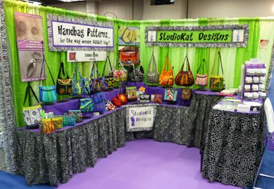
Portland, OR- Spring 2013– The next big display change we made was in the Spring of 2013 when we returned to Portland, OR, the site of our very first Quilt Market. As you can see, we removed shorter of the two end tables in favor of a 2nd counter-height table on the right side of our display in order to make room for a 2nd notions display carousel. Even though this change did “open-up” our display some, we knew we had to make some BIG changes in our display before returning to Houston in the Fall since we were seriously considering staying on for the Quilt Festival, the weekend after Market.
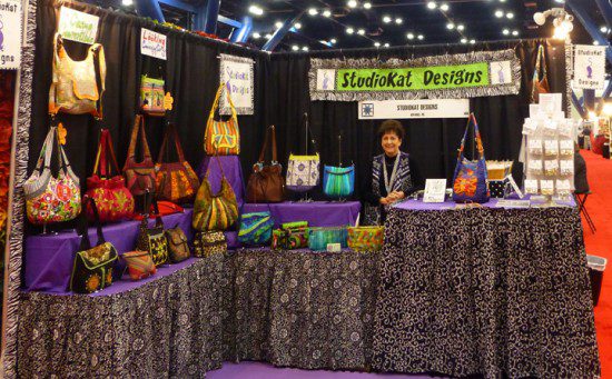
Houston, Fall 2013– We were pretty nervous as we arrived in Houston in the Fall of 2013, because we knew we were staying on after Market for our very first Quilt Festival, the biggest retail show of its type in the US. We knew we’d have to ship a LOT more product for this show so contracted with a shipper and loaded everything on a pallet (850 lbs to be exact). We also arranged our display so for the first time we could sell from BEHIND the counter providing security for our cash transactions. AND… did you notice that we totally changed up our “look” by using a black curtained backdrop this time. The post show verdict? — this floorplan worked OK but we knew we could & should improve on it.
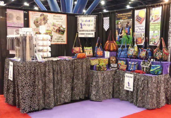
Houston, Fall 2014 (at left)– So… did you notice that we skipped right over the Spring Quilt Market this year? That’s right, we actually chose to skip it this year because of family obligations but you might notice that we made some pretty big changes.
First, we added some colorful posters, along with more notions stands to handle our ever-growing zipper & hardware selection, plus changed the floorplan again. The post show verdict?— This layout worked very well, BUT…. we had VERY little room to function behind the counter. As a matter of fact, after living in such tight quarters for 8 showdays, it was a wonder we were still speaking to each other when we flew home, so we knew we had to make a big change again!
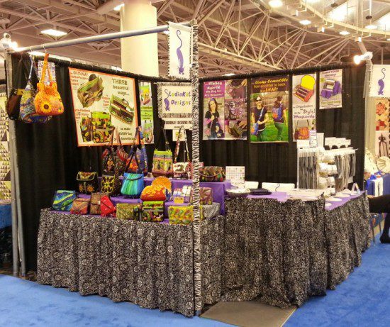
Minneapolis, Spring 2015– Since we knew we couldn’t expand our linear display any further without opting for a larger booth, we decided to expand our display UPWARD instead, and as you can see at left, this bag display now includes THREE shelves of bags.
This layout worked well but the best part by FAR was all the extra space we picked up behind the counter! The hubster literally could’ve taken a nap under our display, but I said NO!
So what was the post-show verdict? While this floorplan was probably our most effective thus far for pattern sales, we’re starting to question whether our revolving carousels are the best way to display our zipper & hardware line. The carousels seem crowded and since 50% of the time our products are facing AWAY from our customers, we’ll try to come up with a better option for Fall Market.
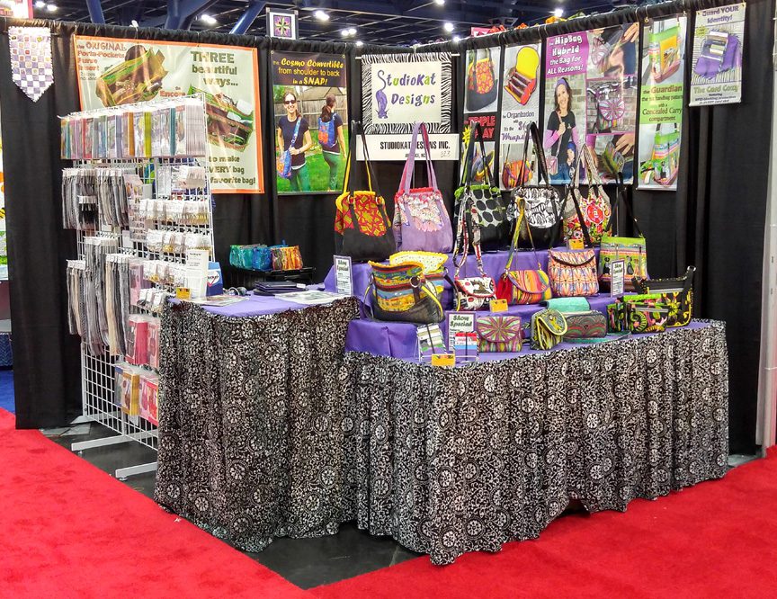
Houston, Fall 2015-Which bring us to the present, and maybe the biggest change we’ve made to our display since we expanded to a full-sized corner booth in the Fall of 2009!
As you can see, we kept out 3-tier bag display from Minneapolis, but this time we left our revolving carousels home, opting to upgrade to a 6′ by 6′ gridwall for our zippers & hardware. It also provided us with some nifty signage opportunities.
So… what’s the post-show verdict for Fall Quilt Market 2015?
We’ll show you way more pictures and tell you all about it in our next post, so stay tuned for that?
**********************************************
And for now…. it’s YOUR turn!
I’d love to know what your thoughts are about our new display in general and our grid wall in particular? And remember, we love reading your comments and answering your questions too, so please feel free to leave them in the space provided below.
************************************************************************
Check out the best sewing pins with me on Pinterest, join our Facebook discussions, get your daily sewing fix and behind the scenes scoops on Instagram, and be the 1st to know about new patterns, discount codes and sample sales by signing up for our monthly newsletter.
