So…..
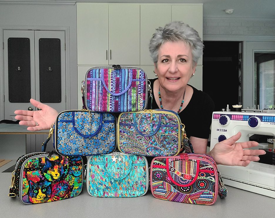
with yet another pattern almost in the books, it’s time to choose the ONE bag sample that will truly represent our new design for the pattern cover! In order to do this, I like thinking about which of our samples would most appeal to our customers… which one would gather the most attention at shows… and especially, and perhaps more importantly, which sample would be the one most likely to compel a customer to pick up that pattern and give it a long… second… look!
But here’s the thing… before I make this decision,
I REALLY love hearing which bag YOU would choose to be on the cover if you were ME.
WHY?
Maybe its because pattern designing is such a solitary business and I like the interactions… who knows? At any rate, I get a kick out of learning which would be your choice and hearing your reasoning..

So… now that you’ve seen the choices, here’s the criteria to keep in mind as you make YOUR choice!
1. Consider MORE than just your personal favorite. Of course the sample you choose should be appealing to you, but always consider how much “universal appeal” a bag has. Would it appeal to MOST people?
2. Will it turn heads? Ideally, a cover sample should “stand out in a crowd”! By definition it’s a show bag. It’s not meant to be neutral, fade into the background or look good with our entire wardrobe although it might!
3. Do the fabrics used draw attention to the design’s key features? Some prints are so “busy” that the bag features seem to disappear because all you can see is the PRINT! I want interesting fabric, that’s for sure, but I want the design to shine unimpeded THRU the print.
4. Does the sample include ALL the design features promised in the verbiage on the cover. Because here’s the thing… the model that is chosen for the cover is the model that will MOST be associated with this design… it’ll be the “spokesmodel” so to speak. But if it’s missing a promised exterior pocket for example, then every single person who picks up that bag at the shows we travel to, will want to know why it doesn’t, or worse still, they’ll think that the design DOESN’T include an exterior pocket at all.
5. Is it photogenic? Sometimes, for reasons that I’ll never understand, (probably because of MY photography skills), certain samples just don’t photograph well. No matter the lighting…. no matter the background….no matter… what… I…. DO! But here’s the deal, no matter how pretty and ideal it is in person, if it doesn’t photograph well, or if I cannot seem to get a decent photograph of it, then it’s just NOT a good candidate for our cover model! It can still be a fantastic “show bag”, but not the best “cover model”.
6. Does it actually LOOK like “our brand”? Our goal is for our customers to be able to identify a pattern as belonging to our line without even seeing the title or our logo on the front cover of the pattern. We would be doing ourselves no favors for example, if we suddenly departed from a “formula” that’s worked for us for 17+ years and placed a model on the cover that just doesn’t look like something we would put forward!
7. Is it created with a special pieced exterior? As most of you know, I LOVE piecing my way to a unique exterior, but I’ve learned from bitter experience and quite a few customer scoldings (reference the Lollapalooza) that placing a model with such an exterior on our pattern cover is generally just NOT a good idea. BUT– if there are actual pattern pieces for this special exterior, and those pieces can be included in the pattern package itself (reference the Uptown Saddlebag or the Triple Play, then it CAN in fact be placed on the front cover.
So…there you have it! Are you ready to have a little FUN?
Because now it’s time for YOU to put on YOUR “designer hat”! … after reconsidering all six of these samples with the above criteria in mind, I’d love to know which one YOU would choose to grace the cover of our new pattern.
But don’t forget—I would also enjoy hearing the reasoning behind your choice. 🙂 And do stay tuned for the next post in this edition of Purse Pattern Chronicles to see how closely your choice mirrored ours when I reveal which model really will be on the cover of the new pattern. I’m SO looking forward to seeing your comments! You probably don’t know this, but this is one of my very favorite posts of the whole year!
And guess what? We have a private FaceBook Group page just for StudioKat Designs customers? It’s the perfect place for you to post pictures, comments or questions about our patterns! How cool is that, right? And don’t forget to check out the best sewing pins with me on Pinterest, get your daily sewing fix and behind the scenes scoops on Instagram, and be the 1st to know about new patterns, discount codes and sample sales by signing up for “Kat Bytes”, our monthly newsletter.
Related Posts

37 Comments

Join Our Mailing List!
Click button below to get 15% off your 1st pattern!

Celestial magjc or Gustav in Blue. Both I think would appeal to the most people. Both seem to highlight the exterior pocket.
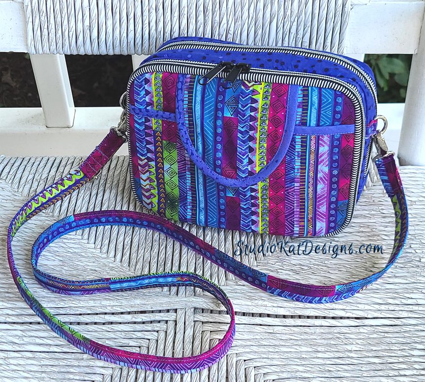
My favorite is the Celestial Magic. I like how easily you can see the trim -buut- I would also worry that the challenge of matching the stripes might discourage someone as the pattern being too hard. My choice instead because of that would be the With a Flourish bag
With a flourish is my favorite. It’s both functional and elegant with the gold zippers and trims. The front pocket is accentuated with a coordinating fabric. Overall, the fabric choices is beautiful and and not “overly busy”. Depicts that it could made to look classy!
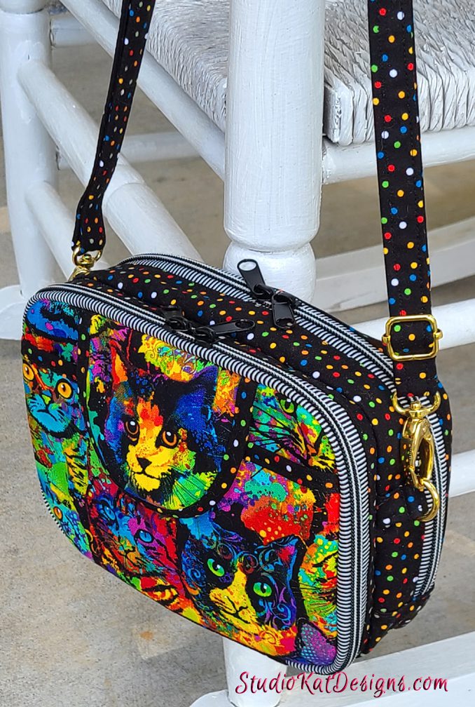
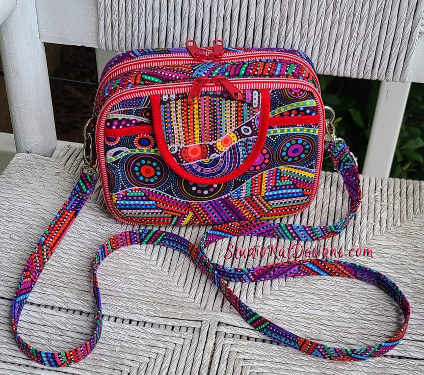
I like gustav in blue…I think the black zipper fabric acts as a piping trim and really pops in the photo…the blue bias around the placket also accentuates that front pocket without being overbearing…and the fabric is georgous without being too busy to detract from the design……but….the cat face is all you !!!! lol
Cranes revisited is my choice! Also, your natural color hair is so pretty!
Thank you- I’m getting used to it. 🙂
All of them are awesome!!! I don’t know how you are just going to pick one!!!
It’s a good problem to have, but you’re right! 😀
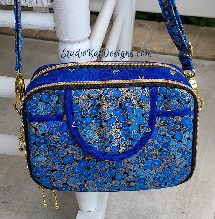
Gustav in Blue
Will it appeal to most people? Yes. Will it stand out? Yes Is it my favorite ? No draw attention to the design’s key features, include ALL the design features promised? Yes and yes. Photogenic? Looks like “Our Brand”? Again, yes and yes. I really like Cranes… and lovely as they all are, the others don’t answer ALL the questions. Gustav hits all of them.
Psycho cat caught my eye right away!
With a Flourish. Because I like it. 🙂
Beautiful colors. Timeless design and fun to look at.
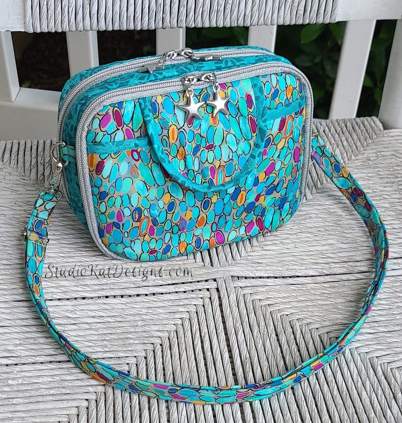
Psycho cats, cats play a large part in your life. But I also like the Gustav in Blue and the sea glass.
Psycho Cats absolutely. It grabs the eye immediately, will appeal to all cat lovers and Isn’t purple. You have too much purple in all your other ones so if you choose a purple one it will just blend in with all the others.
Celestial Blue and Gustav, both highlight bag design/flap feature. The Cats are my personal favorite….Why you ask? Because I LOVE cats. Hello to both your fur babies.
Cranes revisited. I’m not too much of a fan of red, but I think it really stands out and is appealing to a lot of people.
With a flourish. The hardware accents the fabric and bag design perfectly. Bag can be both special occasion and every day.
First choice is Gustsv in Blue. I think the blue and gold is really classic. Very striking. I also think the darker bias binding and black zipper tape really shows off the lines of the bag and sets off the gold zipper teeth. I am also very partial to blue bags, personally.
Second choice is With a Flourish. Again, the darker binding sets off the lines, but I dont like the gold zipper tape. I think it looks gaudy.
Third choice is Psycho Cats because I think the cat fabric is super fun. But it is really busy and doesn’t do the design of the bag justice. I think it obscures the lines.
Psycho cats for sure.
I think Cranes or Gustav both show off features the best, because the binding show things like the flap and pocket edge. For my personal use, I’d like Seaglass, because I love anything in the teal/turquoise families.
Sea glass is my pick.
The color is beautiful and it is easy to see the bag’s features.
Gustav in blue attracts my eye and makes me want to make this bag.
Cats Cats Cats!!!!!!
What can I say, I can’t move past the one that is MY favorite. I keep going back to it.
You can’t go wrong with rainbow cats and polka dots – IMHO!
Signed, Crazy Cat Lady in Arizona
Reading all of the previous comments – I do agree with Gustav in Blue showing off the features well. And that it’s not purple. Plus that gold hardware is really eye catching!
1: Psyco Cats – great colors/cats very eye catching. And did I say Kats! 2: with a flourish – this fabric line comes in multiple color mixes/ good for ideas. 3: Sea Glass – I love aquas, colors are more muted but blend well together & I love the silver zips/stars. 4: Cranes revisited – See fabric like this out now in stores. Red binding & zips really stand out as a feature.
Psycho Cats gets my vote! When you have them photographed all together your eye immediately goes to that one. Great layout of fabric to showcase cats and the stripy zipper and multi dots bring it all together.
Whichever you choose they are all great examples of the bag.
Can you put the cats on the back side of the pattern? There are a lot of cat lovers in the world. One of the other designs might be better for the front. Myself I like Celestial Magic. I think it is a bit more casual just like me. Having the stripes lined up is so eye catching. I’m anxious to order the pattern when it comes out.
I like the With Flourish it showcases your new hardware, the lines are easily seen, it looks great in a photo. If I were to pick one for my personal taste I would choose Gustav in blue but the total design seems to blend all together in that one. For selling it does not show as well.
I think Gustav in blue shows the pattern details the best. Second is Flourish because the zippers really stand out! Beautiful!!
Psycho Cats…..who doesn’t love cats…….the colours pop out and makes you want one and also expresses the design of the bag perfectly……another amazing pattern from your stash…..just a shame that it takes so long to be delivered down here in Australia, especially now……stay safe people
Gustav in Blue probably fits your criteria, and I do like it a lot. But, oh my, I do love Psycho Cats!
‘With a Flourish’ followed by ‘Celestial Magic’.
Here’s why:
‘With a Flourish’ is the most eye catching of them all – the fabric and gold zipper really stands out yet go so well together. The fabric has a peacock flair, and most people find peacocks fascinating.
‘Celestial Magic’ drew my eye because of the color of the stripes and the fussy cutting from the flap down into the body of the bag. It makes you do a double take because you can percieve it’s not one piece of fabric but you have to look again to see the subtle blue of the binding to know for sure there’s a flap there.
My favorite is Celestial Magic, but I think either Gustav in Blue, or With a Flourish highlight the pocket the best because of the contrast of the binding. Choosing between those two, I would pick With a Flourish, because it also shows the all around zipper off better.
BTW, I agree with Patti F., your hair is beautiful! Lucky you!
With a Flourish and Cranes Revisited both catch my attention each time I look at the group picture. On both you can see the outline and extra pocket outlines clearly.
Glad I don’t have to make the choice, though!
Gustav in Blue shows off the bags features best, altho Psycho Cats is eye-catching! But not everyone is a cat person. And love your hair! May sound crazy but it makes you look younger!
Lois
Gustav in Blue! It just seems to pop off the page. Shows the piping as well as the zipper.
I love the color of Seaglass, however it does not fulfill your criteria. So what does.. I like the cranes revisited. It looks like Studio Kats designed the bag, it shows off the features nicely, and being a form of red it stands out. My close second choice is psycho cats. That really stands out. But what if a dog lover sees it and is turned off by the cats? That’s the only reason it came in second.
Good luck!
Gustav in Blue
The zippers compliment the fabric and define the design features. Inside, the white lining clearly shows the function of each pocket.