So…
in our last post we had a little fun letting YOU be the designer and choosing which of our bag samples YOU would choose to grace the pattern cover for our third design for 2020, the ErgoMatic. Thanks SO much to everyone who participated! Pattern design can be rather solitary work and I always enjoy hearing the logic behind which bag my customers would choose. But as much as I enjoy these interactions, (and I do), this really isn’t a democratic process and in my estimation I have good reasons for having chosen the bag I have for our pattern cover. Sometimes I agree with the majority of you, and sometimes (and this is evidently one of those times), I don’t. Only time will tell if I made a good choice but…
Here’s the pattern cover for our new pattern,
the ErgoMatic

Now let’s talk a bit about WHY we made this choice!
First of all, let me say that I really think I could hardly go wrong in my selection this time! Many of you added that all of the bags seemed worthy of being on the cover and I would heartily agree… with the exception of one bag (which we’ll discuss in a bit).
This particular sample was the 1st one I made for the ErgoMatic design and was constructed almost entirely (except the bottom pocket area) from one border print. I love this look and likely would have considered it more seriously for the cover, except that the areas for which I’m designating the use of contrasting fabric has changed since making this sample, and I was afraid it might confuse some folks when cutting out their own pattern pieces.
So for that reason, it was OUT!
And if you clicked thru and read the post about this bag then you know that while I adore this fabric and ONE side of this bag… I do NOT like this side… the “flapped side” of this bag. It was early in the process and I learned that the flap and the flap band should NOT be of the same contrasting fabric.
I really didnt realize how much I disliked this look until the bag was virtually finished and I thought very seriously about ripping it out and making an adjustment of some type. And while ripping the flap out would have been easy, stitching it back would have been an iffey thing, especially if I wanted the bag to still be of “SHOW” quality!
So for that reason, it was OUT!
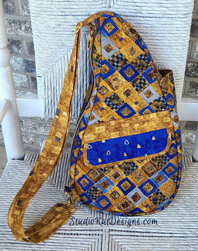
When I first saw this fabric I was totally inspired! It was completely different that anything we had used before in both color palette and print and by the time I was finished sewing, I honestly thought this bag might in fact be THE bag that would be on the cover of our pattern!
AND I actually had my graphic design gal fix up a cover sample featuring this bag, but you know what? There was something I just didnt like about it… it was too brassy?… too yellow?… too something that I didnt like…
So for that reason, it was OUT!
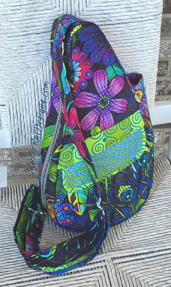
I made this particular sample out of fabric I have had (and coveted) for a very, very long time. It was a HUGE panel print more suited I suppose for a shower curtain than a handbag!
But I pulled it out of mothballs and took a chance that this might be this time (and the bag) to cut into this fabric and I was genuinely pleased with the final look. BUT… as much as this bag speaks to me, it didn’t strike me as a bag that would speak to the majority of our customers…
So for that reason, it was OUT!
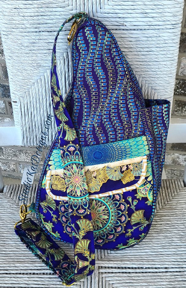
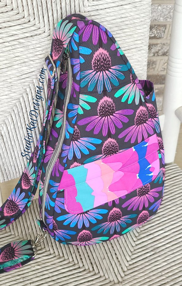
And finally, I first saw these fabrics put together in a quilt being made by one of our customers and was immediately smitten! I ended up using them in a combination completely different from my original concept but I love the final look all the same!
But just like the “Gilded Tiles” sample above, I asked my graphics gal to make me a mock up pattern cover featuring this bag and as much as I wanted to like it, I found it to be unsatisfying… maybe even underwhelming. I’ve never been able to figure out why, but sometimes the most beautiful bags just don’t translate well to photographs,
So for that reason, it was OUT!
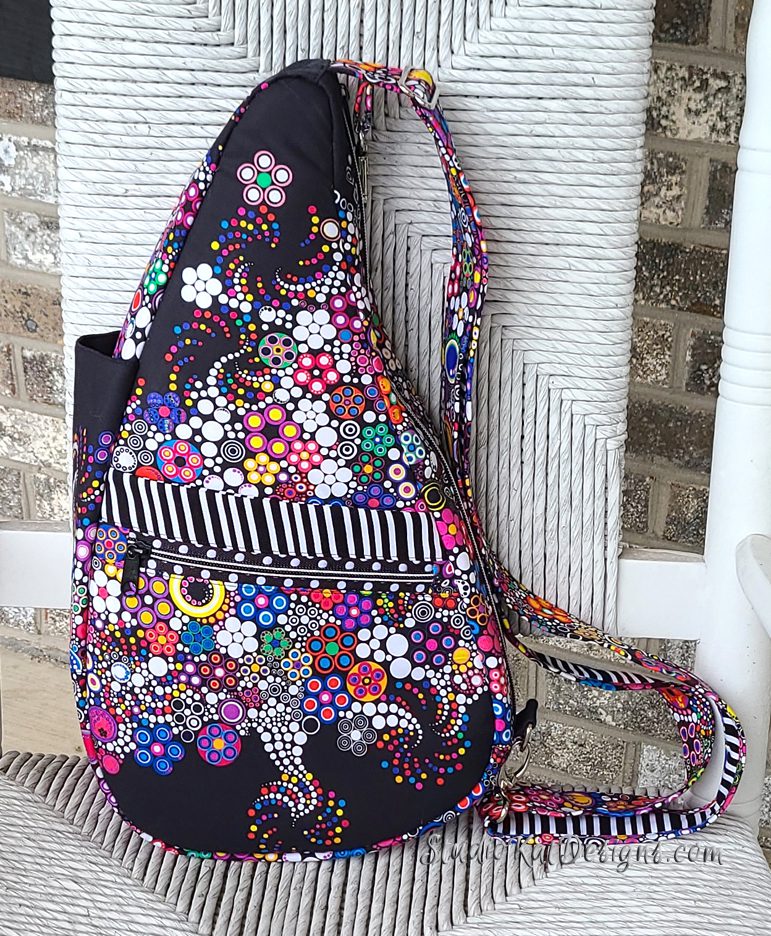
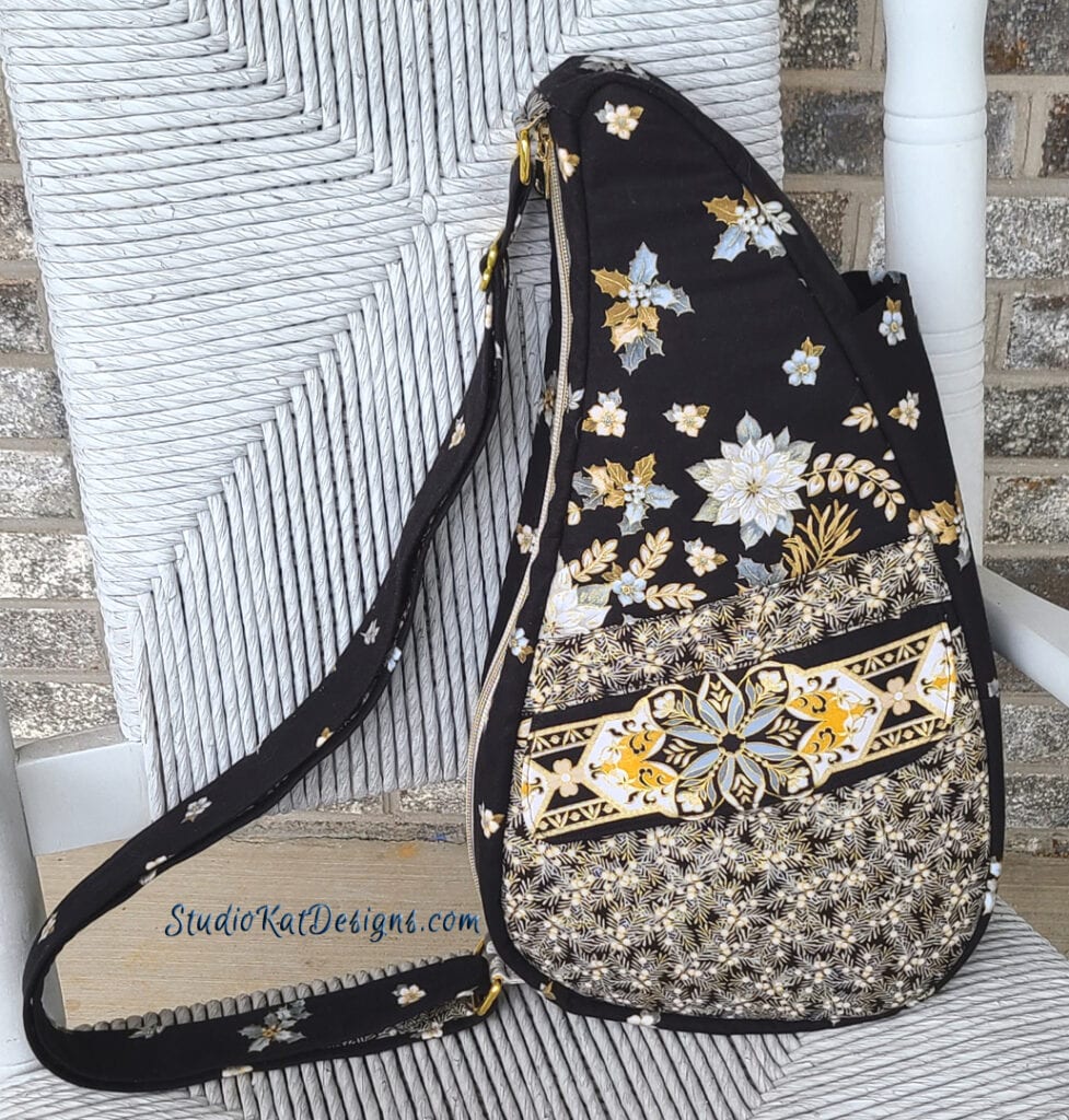
So… of course by now you already know that this is the bag sample we’ve chosen to grace our pattern cover for the ErgoMatic pattern design!
I loved this look immediately even though I had low expectations for it initially. This fabric is actually a DOUBLE border panel and I fussy-cut it in order to draw attention to the various features of this design.
I love this bag and it will be a fantastic representative of the design both on the cover and also in person at the shows we vend at (eventually I hope, hope) for the following reasons…
But now let me tell you WHY we made this choice!
1- The “empty space” (the black areas) and interesting designs at either end of this border print was really fun to work with and really compensated for the “busy-ness” of the bubble section of the print. It’s striking and interesting without being too much “in your face”, and I think it would have a broad appeal across the generations.
2- We have actually used a different colorway of this collection in the Bangle Buddie design but this particular colorway is much more dramatic. I think it looks like something we would create and this is actually a pretty big thing because afterall, this is the 46th pattern we’ve brought to Market and at this point in my career I like to think that our regular customers know my style well enough that they could probably pick out one of my bag exteriors in a police lineup! (And that’s a good thing)
3- It photographs like a dream. No matter what feature I want to highlight in a picture, that feature is easy to see (even if the picture is quite small)! Additionally, this bag is pretty from all angles and that’s important, because remember, a pattern cover needs to tell a story and since we may only get to tell that story once, our goal is for the story to be SO compelling that a customer won’t want to put it down!
So did we make the perfect choice?
Only time will tell. Truth is, the ErgoMatic design has been very well received so far, and I easily could have gone with another choice and it probably wouldn’t make a bit of difference “sales-wise” but I’m pleased with how the cover came out nevertheless.
But you know what?
Call me crazy but I always love knowing if you agree with our selection or if you think we totally blew it! So please feel free to leave your comments and/or questions in the space provided below!
AND PLEASE NOTE!!!! — Just as we did in our last pattern rollout in August, we’ll be announcing our pattern release in our next edition of Kat Bytes, our Newsletter! (Here’s a hint: that’s THIS FRIDAY, 11/13th! YIKES! Friday the 13th? Good thing I’m not superstitious!) The newsletter will be complete with a time-sensitive coupon code, so don’t miss out… you still have a small window of time to get in on the fun and pick up a nifty discount coupon too by clicking here to join our mailing list, OR by joining our brand new FaceBook Group!
Check out the best sewing pins with me on Pinterest, join in on discussions or show off your work in our FaceBook Group, or get your daily sewing fix on our Facebook Business Page or get behind the scenes scoops on Instagram, and be the 1st to know about new patterns, discount codes and sample sales by signing up for our monthly newsletter.
Related Posts

2 Comments

Join Our Mailing List!
Click button below to get 15% off your 1st pattern!

Your final choice is stunning. The design of the bag shows up so nicely, and the fabric is fun, colorful, and bright. It is a winner all around.
Thanks Cheryl! 🙂